| Image |
Comment |
| 04/06/2008 12:19:02 AM |
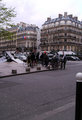
47.jpgby Rainbow-Coloured-SoulComment: I'm not sure what your subject(s) in this shot is supposed to be but if it is people I feel that a crop just below the top of the buildings would bring more attention to them. I also feel that this shot would be a good candidate for b&w. |
 Photographer found comment helpful. Photographer found comment helpful. |
| 04/06/2008 12:14:37 AM |
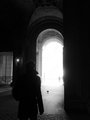
33.jpgby Rainbow-Coloured-SoulComment: I like this shot, probably one of my favs of the series. I like the darkness to light theme in this shot. Message edited by author 2008-04-06 00:14:54. |
| Photographer found comment helpful. |
| 04/06/2008 12:10:34 AM |
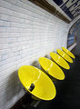
29.jpgby Rainbow-Coloured-SoulComment: I like this shot, I have always found colors in drab places interesting. I wonder what these are, I guess they are chairs but they look like some strange urinals..lol. |
| Photographer found comment helpful. |
| 04/06/2008 12:02:41 AM |
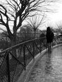
22bw.jpgby Rainbow-Coloured-SoulComment: I like the b&w for this shot as it is effective with the dreary weather. I also like the human element in this shot, which I feel makes the photo. |
| Photographer found comment helpful. |
| 04/05/2008 11:57:51 PM |
|
| Photographer found comment helpful. |
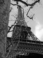
| 04/05/2008 11:52:45 PM |
4bw.jpgby Rainbow-Coloured-SoulComment: This is a different view than you usually see of the Tower so I think it's pretty cool. I feel it would be stronger if the tree trunk wasn't in the frame and just the limbs were visible. |
| Photographer found comment helpful. |
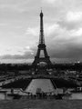
| 04/05/2008 11:48:49 PM |
2bw.jpgby Rainbow-Coloured-SoulComment: A nice shot but the first thing I noticed is that it is slightly tilted. The choice of b&w is nice and there seems to be some grain which helps your timeless feeling. I do fee that there is a lot of detail lost in the blacks and agree that this seems a bit flat. |
| Photographer found comment helpful. |
| 04/05/2008 01:11:20 AM |
#7 - Curlyby colorcarnivalComment: Looks like it's time for a haircut! nice shot and love the textures. I might crop as tight as you can get to eliminate the space on the right. |
| Photographer found comment helpful. |
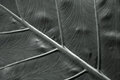
| 04/05/2008 01:07:52 AM |
12 - Veinsby BudComment: I like the composition and the lines in this shot. I'm not sure if the blur was intentional but if you were trying to convey the textures and lines a bit sharper image might help this shot. |
| Photographer found comment helpful. |
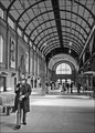
| 04/05/2008 01:05:46 AM |
13.52 Station guyby MelethiaComment: Nice street shot, the old man really adds a nice personalized element to the shot, almost as if he's looking at me. i really like the building and it's architecture. I might bump the contrast a bit but still a cool shot. |
| Photographer found comment helpful. |
Home -
Challenges -
Community -
League -
Photos -
Cameras -
Lenses -
Learn -
Help -
Terms of Use -
Privacy -
Top ^
DPChallenge, and website content and design, Copyright © 2001-2025 Challenging Technologies, LLC.
All digital photo copyrights belong to the photographers and may not be used without permission.
Current Server Time: 06/27/2025 03:53:49 AM EDT.