| Image |
Comment |
| 02/28/2006 02:37:45 AM |
A Watchful Eyeby jmritzComment: Beautifully sharp image, that eye just seems to watch you! Nice choice of duotone colour as well. Perfect lighting to get that lovely white neck |
 Photographer found comment helpful. Photographer found comment helpful. |
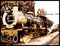
| 02/27/2006 01:04:34 PM |
|
| Photographer found comment helpful. |
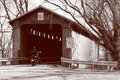
| 02/27/2006 01:02:15 PM |
McCafferty Bridgeby MarjoComment: Nice image, I think the fact that the shadow / darkness in the tunnel isn't completely black. The image looks a little faded but it doesn't take away from the image too much. I also like the lines from the trees and the tunnel. |
| Photographer found comment helpful. |
| 02/27/2006 01:00:49 PM |
Priceless Expressionsby deanaComment: I think pet pictures have to be really really special to get the good marks. This one appears a little washed out, grainy and the focus isn't really nailed. However, it did make me smile so I upped a point |
| Photographer found comment helpful. |
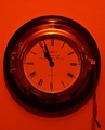
| 02/27/2006 12:59:24 PM |
Clockwork Orangeby j3zzComment: I like the strong duotone colours, probably the richest in the challege. The subject isn't really interesting (to me), and a little grainy on the clockface. |
| Photographer found comment helpful. |
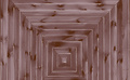
| 02/27/2006 11:53:37 AM |
one way out another back inby krytaComment: I think this photo is lacking something, I like the concentric shape, however the focus isn't very sharp, I also like the duotone colour. Overall, my feeling is that as there is no big wow factor it will struggle, everything looks too flat. |
| Photographer found comment helpful. |
| 02/27/2006 06:48:25 AM |
Of sea and skyby rapidComment: It might be my monitor but the colours are coming across pretty dark, also the image isn't really sharp enough to please the eye |
| Photographer found comment helpful. |
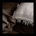
| 02/26/2006 04:37:18 PM |
Couchby aznymComment: Great colours and tones, looks like the effort was made to choose a subject(s) that would work well with a duotone (instead of just converting to B&W). Large border works well but a risky move on DPC :) |
| Photographer found comment helpful. |
| 02/26/2006 05:03:02 AM |
Maureenby zetosComment: I like the old fashioned look to this image. The blown out section in the top right is really harsh though. The soft focus works well here. Also the slightly tight crop is interesting |
| Photographer found comment helpful. |
| 02/26/2006 04:56:32 AM |
Calm eveningby TUBORGComment: Not sure I really get the title, image is nice and sharp though, tree on the left is a bit distracting. |
| Photographer found comment helpful. |
Home -
Challenges -
Community -
League -
Photos -
Cameras -
Lenses -
Learn -
Help -
Terms of Use -
Privacy -
Top ^
DPChallenge, and website content and design, Copyright © 2001-2025 Challenging Technologies, LLC.
All digital photo copyrights belong to the photographers and may not be used without permission.
Current Server Time: 08/23/2025 04:18:21 AM EDT.