| Image |
Comment |
| 04/25/2006 05:28:24 AM |
new to herby busalshotsComment: Superb detail and tack sharp, I would have prefered a deeper DOF because the background is still distracting. But on the whole, great capture. |
 Photographer found comment helpful. Photographer found comment helpful. |
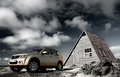
| 04/25/2006 05:26:21 AM |
New Grand Vitaraby BrinComment: a very good product shot, expect to see this in the new catalgoue... |
| Photographer found comment helpful. |
| 03/01/2004 06:44:37 PM |
|
| Photographer found comment helpful. |
| 03/01/2004 06:35:28 PM |
|
| Photographer found comment helpful. |
| 03/01/2004 06:27:20 PM |
|
| Photographer found comment helpful. |
| 12/05/2002 04:39:51 AM |
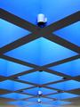
Blue Symmetryby xertionComment: Shapes like these are fun and interesting when taking a shot of them. You have chosen the symmetrical way of portraying these squares. And it paid off. The lighting is good enough to keep the shadow to a bare minimum and your composition is near perfect. (Wild) suggestion: If you had turn this shot upside down, would it still be interesting to keep the viewer's attention? Overall 8. |
| Photographer found comment helpful. |
| 12/05/2002 04:28:15 AM |
Blue Heart Shadowsby erin_m02Comment: There are 2 weak points in this interesting shot. Firstly, your angle of the shot is slightly off. If you had the heart shape bang in the middle, this would have made an intentional interesting symmetrical shot while also portraying the opposite in the shadows on the white wall. Secondly, a further crop on the top till the edge of the heart shape would have finished the composition, creating a deeper impact. Overall 7. |
| Photographer found comment helpful. |
| 12/05/2002 04:18:38 AM |
Peeling Blueby paynekjComment: A good macro shot. You have captured the details well enough. Yet the tiled background does not only disctract the viewer but also does not complement to your subject. Overall 6. |
| Photographer found comment helpful. |
| 12/05/2002 04:02:52 AM |
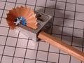
Icy Coldby RiderGalComment: I know how difficult this shot must have been. Macro outdoors. You probably used a tripod. Somehow the focus seems slightly off, but only by a fraction and not really noticable at first glance. Good composition but a further vertical crop on the left would isolat the foreground even more. Overal 7. |
| Photographer found comment helpful. |
| 12/05/2002 03:34:39 AM |
Monopolizingby WesComment: A very good effort in taking a shot that does not follow the theme completely but yet tries to invoke the viewer mind that theme lies in the shot somewhere. And we clearly see that in the title bars of these monopoly cards. It's been years since I've played that game, so I cannot give you a judgement on the concept of shot, but in terms of technicality and composition, it is very good. The DOF is only a fraction off, but the viewer can still read the prints. However, shouldn't all the blue cards be present in this shot if we were to monopolize the game? Overall 8. |
| Photographer found comment helpful. |
Home -
Challenges -
Community -
League -
Photos -
Cameras -
Lenses -
Learn -
Help -
Terms of Use -
Privacy -
Top ^
DPChallenge, and website content and design, Copyright © 2001-2026 Challenging Technologies, LLC.
All digital photo copyrights belong to the photographers and may not be used without permission.
Current Server Time: 07/15/2026 12:42:47 PM EDT.