| Image |
Comment |
| 05/01/2007 09:25:32 PM |
Nice Shotby remboComment: Nice set of shots to show the action, but the editing is too obvious for my tastes. You can the halo around her body and the racquet where you've edited, perhaps where you tried to add a blur to the background or tried to make the ground/wall even up a bit? Just needs a bit more editing to clean it up and make it even better! Still, a fun shot! :) |
 Photographer found comment helpful. Photographer found comment helpful. |
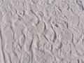
| 03/25/2007 09:12:05 PM |
by melissa111083Comment: Neat collection of footprints... so simple, yet lots to look at. Nicely done! |
| Photographer found comment helpful. |
| 03/21/2007 07:43:27 PM |
Jacquesby BrielleComment: I thought this one was yours when I peeked through them, but I didn't get to vote in this challenge! Fantastic job and congrats on the top 10! :) |
| Photographer found comment helpful. |
| 03/17/2007 09:04:50 AM |
Chair Helpby jblaylockraynerComment: Greetings from the Critique Club!
When this first came up since it wasn't in the context of voting in a challenge, I thought it was from the Street Photography challenge, and I didn't associate it with furniture. The title made more sense after I realized the challenge topic.
The mural here is great, and it took a second for me to find the cleaner. I like that her shirt sets her apart from the dark tones. I like the unique idea for the challenge, but as another commenter mentioned, the furniture seems a bit small in the grand scale of the shot, though it is definately important. With using such a wide lens, it seems to have distorted the girl a bit which makes it feel to me like she is falling in to the middle of the shot. I wonder if a bit of a correction in photoshop would be possible to help correct that? It's difficult to comment further on that since you left no comments in the photographers notes about your thoughts or processing. |
| Photographer found comment helpful. |
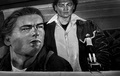
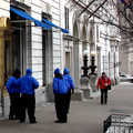
| 03/02/2007 07:05:51 AM |
Primary Colorsby levyj413Comment: Greetings from the Critique Club!
Well, for a shot scoring a 5.5, you have a lot of comments already, which is unique. I like the story that you can tell with this shot and the questions that the shot brings up. Who are the blue guys? Are they talking about the red guy? And the fact that the red guy is in motion towards them is great. The colors are vibrant, but not overdone. I like how the gold frame, the tree branches and the grating all sort of serve as a natural frame to contain the scene.
The first thing that jumped out at me was those 2 lights.. the b/w one and the color one. Editing error or the way the scene really looked? Looking at that made me start examining the edges of the rest of the photo to see if I could figure out how you tweaked the color, which is when I noticed the dark, sharpened edges around the men in blue. My guess is a bit too much sharpening since you said that the shot wasn't as sharp as you would have liked. And, as others mentioned, the lower corner is a bit sloppy.
Overall, a nice shot that I think suffered from a few technical issues. Hope you found this critique helpful! |
| Photographer found comment helpful. |
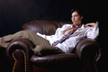
| 03/02/2007 06:55:10 AM |
Hesitant Winter Riderby neophyteComment: Well, I was assigned this shot for the Critique Club... so lets start with my previous comment and see if I can find anything else to add now that I'm taking another look at this shot.
I had mentioned that there was a nice range of tones, and I stand by that. It has a good contrast to it, but taking a closer look, perhaps there are a few areas of the snow which got blown out a bit? As I look at this more, I realize that there are no other people in the photo. I'm not sure if that works for or against the photo... more people keep you looking longer, but also might be too cluttering and take the focus off the rider. I think if we had been able to see the hesitant expression on his face, it would have been more powerful, but sometimes you don't have the time to compose that shot, and I personally wouldn't have had the guts to stick a camera in this guys face if he wasn't up for it. Lastly, considering this was advanced editing, I might have burned that light mark on the back of his jacket.. my eye keeps getting pulled into that area. |
| Photographer found comment helpful. |
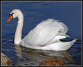
| 03/01/2007 07:16:49 PM |
Mr. Swanby CapeSailComment: I'm usually not very fond of the auto adjustments since they tend to make things look funny for me... I just use them to get some ideas... but this worked out pretty well :) Looks like it might have left a slight halo around the swan? Be careful with that cloning tool.. I'm guessing there was something on the rock on the left... you can see the repetition of the pattern there indicating the cloning. The more I look at it, I'm going to guess that you had to fix the water too, since the pattern repeats and you've lost the reflection of his head? That look he's giving you though... "don't you DARE take my picture!" :P |
| Photographer found comment helpful. |
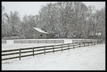
| 03/01/2007 07:11:47 PM |
Snow At Lastby CapeSailComment: Great lines, and I love how you captured the snow falling. I thinkt this type of shot is a good candidate for the b/w or sepia treatment, though it almost naturally looks that way. Beautiful shot! :) |
| Photographer found comment helpful. |
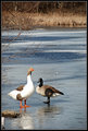
| 03/01/2007 07:09:19 PM |
On Frozen Pondby CapeSailComment: Nice... again, using the rule of thirds works so much better than if you had centered these two. The shallow dof is very nice, and lets the colors and variations in the ice blend nicely and then drift off into the grasses. The tree branches to the left make a nice sort of natural frame too. That one bird down in the lower left corner bugs me though... he should have moved out of your way! :P Nice job on this one! |
| Photographer found comment helpful. |
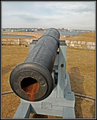
| 03/01/2007 07:05:14 PM |
The Cannonby CapeSailComment: This is nice.. I like the dof and how you used the rule of thirds in this one, but your eye follows the barrel of the cannon out. The textures in the metal are great and show a bit of a history with all the nicks and rust. The processing makes this look older and rustic, which is perfect for the subject. The one thing I find really interesting about this one is how the brick wall looks almost like a drawing. Very nice. |
| Photographer found comment helpful. |
Home -
Challenges -
Community -
League -
Photos -
Cameras -
Lenses -
Learn -
Help -
Terms of Use -
Privacy -
Top ^
DPChallenge, and website content and design, Copyright © 2001-2025 Challenging Technologies, LLC.
All digital photo copyrights belong to the photographers and may not be used without permission.
Current Server Time: 08/16/2025 11:03:02 PM EDT.