|
|
|
Showing 511 - 520 of ~1936 |
| Image |
Comment |
| 03/01/2008 05:38:09 AM | Velvert Staghorn Spore - Day 1by sherpetComment: Beautiful! I have no idea what this leaf looks like, but the macro is unique and fascinating. Love the textures and the contrast in colors. That thin white line at the edge of the leaf really helps this pop. The curving shape is so interesting, and I wonder how this would look if the line went diagonally, giving more space to show off that curvy line! Great start to the month! :) |  Photographer found comment helpful. Photographer found comment helpful. |
| 02/24/2008 07:40:43 PM | Watching, Waitingby HaneckComment: My favorite part of this image is the tiny wag of the tip of her tail. It gives just a hint of passing time and the patient watching that cats are so good at. Beautifully processed, and I think I like the empty space at the bottom. I don't know why, but I do. | | Photographer found comment helpful. |
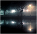
| 02/24/2008 05:05:57 PM | Reflections In The Nightby skasubaComment: Greetings from the Critique Club!
First Impressions: Nice clear reflection and symmetry, and I like the softness of the shot. The cool blues compliment the warm glow of the light nicely (though I wonder if that was done in PS). I like the fence with the triangles too. Adds something different to the shot. Not sure about the visual composition of the shot... it's cut right in half, and while I'm not saying you should always follow the "rules" of photography, but in this case I don't feel that breaking them was helpful. It also feels just slightly tilted down towards the left? I think I would have liked to see a human element in this shot... a silhouetted person walking perhaps?
After reading all of the comments: Ahh, so the coloring was done in post processing. It feels natural (which is a compliment to the way you did it), until you think about it more logically. I'm surprised you only got a few comments, and they didn't really say much, and I also see that you had a spike of voters that gave you a 6. Perhaps that means that technically and visually the shot was good, a little above average, but just nothing that reached out and grabbed the viewer visually or emotionally.
Ideas to improve the shot: First, check to see if it really is tilted. I think the reflection of the fence might be straight, but the ground is tilted? Perhaps trying to tone down the hot spots where the lights are lit would give this shot the ability to have more of a soft, foggy feel, instead of having spots the eye is drawn in to. And, to the left, there seems to be some busy windows, the lamp, the sign... perhaps cropping just a tad from the left to have the shot end with that quiet tree would be a nice change?
Overall, this is a nice shot, and it's lucky you had the weather cooperate so nicely for this challenge. You had a good score and a nice finish with this one, but I think it just lacked that little something extra to get the voters to give you that bump.
Hope this has been helpful, and please feel free to PM me if you have any questions. | | Photographer found comment helpful. |
| 02/24/2008 07:36:35 AM | rainy day catby RobSkogComment: Greetings from the Critique Club!
First Impression: Cute kitty, nice sharp focus on his face. He has a cute expression... looks very intent on something. It can be hard to catch those good expressions, so well done there. The full reflection of the face is helpful for meeting the challenge and shows forethought in the angle it was shot at. The dirty window and blown highlights don't really add to the photo. It almost seems like there are two photos here.. one well thought out as far as pose/focus on the cat, and the other being dirty, out of focus and less pleasant to look at.
After reading the Photographers Comments: First challenge? Well, welcome to the insanity we like to call DPC! :) It seems as though you really put a lot of thought into this setup as far as lighting, angles, focus etc. All of those are very important, and you accomplished many of the pieces that you set out to do.
How to improve the shot? Well, this challenge was about reflections, so that has to be an important part of your photo. You've integrated it into your photo nicely, but I'm not sure that it's an essential part of the shot, as my eye is drawn to the cat since it's in such sharp focus. To clean up the reflection, maybe a quick cleaning of the glass before shooting would have helped to get rid of that muddled look that takes away from the professional feel of this shot. Maybe putting something in that favorite spot where your cat lays (a plant, stuffed animal, whatever) so you could preview what the reflection and lighting was going to look like before the cat came along would have given you the chance to fix some of the things you didn't like? And I'm not sure of the reason for the 1600 ISO, but bumping that down a bit would have helped to get rid of the blown highlights on his white fur (I have a black and white cat... I know it's a challenge with that white fur!!) And lastly, moving that lamp just slightly so that it wasn't in the shot, yet you were still getting the benefits of it in his eyes would give the viewer one less thing to focus in on.
Overall, this is a nice shot, and a great first entry. You'll always have those crowds of voters who are sick of cat, kid and flower shots, and those voters who will give out an extra point for a cute kitty, so be sure to keep your subject in mind when you're preparing to shoot. As far as other ways to improve, be sure to vote and leave some comments for other photographers. Just looking at other peoples work and thinking about what you like and don't like will help you to improve with your own photography.
As far as DPC in general, keep entering challenges, and putting more and more forethought into the setups as you did here, and don't forget about all of those camera settings before you click the shutter. Make sure you are critical of everything you leave in the photo for the viewer to see, because often, they will be critical when they click the score. And when they leave you comments (both positive and negative), make sure you take a step back and try to see the value in what they've said and try to use every comment as a learning experience. Good luck in your future challenges!
I hope you found this critique helpful. Please feel free to PM me if you have any questions about it. | | Photographer found comment helpful. |
| 02/23/2008 08:32:44 AM | Scoopby freakin_hilariousComment: Greetings from the Critique Club!
First Impression: Interesting, funny. I like looking through all the little details in the reflection. The expression and the flannel PJ bottoms just make me giggle. I'm starting to like this type of processing more, and this looks like a well done example. The scoop is a unique surface for the reflection, is nicely placed within the frame, and the background is nice with the slight gradient. The fact that you ended up with the camera/tripod in the shot... well, I think it adds to the fun, but also took away part of the challenge of the challenge, and I can see some people who worked really hard to not include their own camera reflection feeling a bit robbed that this one does. But, that was either a risk you chose to take, or else an oversight of the challenge description on your part.
After reading your Photographer Comments: Good to see your clarification of the DNMC issue. Pretty standard stuff there (though I must say, I have never thought to use USM with those types of numbers, so I'll have to try that some time!)
After reading voter comments: As expected, lots of DNMC comments. I did find it interesting though that everyone commented with those comments at the beginning, and as voting continued on, it seems that less voters seemed to care about that aspect, and started to view the shot for its more artistic and technical sides. I'm not sure if I like this better right side up or upside down. Someone else commented on the harsh spots of light, but I think they add some interest to the shot with the contrast.
To improve for next time? Well, obviously having the camera in the shot got you a bunch of DNMC or lowered votes. The spots of light could have been toned down just a smidge perhaps. I like the ceiling spot, but the one that is on the left part of the flat bottom of the scoop feels stronger than the others. Other than that, perhaps getting rid of some of the background clutter in the room would let the viewer focus more on the fun stuff going on with the people's reflections. I find myself continuing to wonder what the red thing is, and why it has to be there.
Hope this has been helpful! If you have any questions please feel free to PM me! :) | | Photographer found comment helpful. |
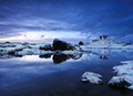
| 02/22/2008 10:13:42 PM | A Winter Afternoon by orvaratliComment: Greetings from the Critique Club!
Well, how much can I really say about a shot that got 2nd place and 11 favorites that hasn't already been said in 40 comments?
It was nice to read your comments, and your experience with the new lens and filters. I'm glad you saw the positives in this shot, and worked to save it after thinking it was no good.
So, lets see if I can find anything I would have changed with this shot, since we already know a lot of the positive aspects from reading all of the other comments. First, comparing the last shot in the free study to this one, one of the things that stands out to me with this shot is the lights in the windows. They give a warm life to this shot in the cold environment. I find the bright spot in the clouds a bit harsh, compared to the rest of the shot, but at the same time the light contrasts the dark shadow under the rock nicely. Lastly, there is a reflection or something in the water down at the bottom. Maybe finding a way to get rid of that, or even cropping the shot a bit at the bottom (would put the horizon not quite centered too which could be nice) would be an option?
Anyway, it's a fantastic shot. Congrats on your 2nd place finish! Well deserved!
Hope this was helpful in some way. Please feel free to PM me if you have any questions. | | Photographer found comment helpful. |
| 02/22/2008 02:55:56 PM | Reflections with windby Rino63Comment: Greetings from the Critique Club!
First Impression: YAY!!! I loved this in voting! Now I get to look at it again and write MORE about it! :) I remember looking at this before during voting, and thinking about how beautiful that top section with the reflection is to look at. I don't even know what the reflections are of... buildings? headstones? It just didn't seem to matter. It left me wondering a bit, but I like that in a photo. The colors are soft and nicely contrast each other, the shapes are interesting to look through, and the ripples in the water are just perfect for an abstract look.
After reading your photographer comments: I don't know what some of those things are, like the sunshine filter, so I'm not sure how they affected the image. Hard to follow the "top" and "bottom" comments too since that all happened before you flipped the shot. Makes my head spin!
After reading the voters comments: I think I like Melethia's suggestion of cropping just a little bit more, but leaving the bricks to anchor the shot. I remember commenting on the coloring of the ground, and it seems as though you did some adjustments to them. Perhaps not adjusting the cyan values quite as much, and the little bit of extra cropping, it would balance out that part of the image?
Overall, I still love this shot, and I'm glad I got another chance to come back and see it again. I hope that you found something in this critique helpful. Please feel free to PM me if you have any questions! | | Photographer found comment helpful. |
| 02/22/2008 02:30:57 PM | Breakfastby HaneckComment: Greetings from the Critique Club!
First Impression: Nice setup, meets the challenge. Now I need a glass of OJ, since that looks yummy, but the toast needs some butter or jelly to go with it. A few wrinkles in the cloth are a little distracting, but the toaster is so shiny. There seems to be some odd stuff in the corners... background behind the toaster and extra dark corners where it's black... burning perhaps? The reflected light on the corner of the toaster kind of catches my eye as I look back and forth between the plate and reflection.
After reading your photographers comments: Oof. I'm the wrong person to ask about lighting setups. I have a few desk lamps, a white sheet and some white posterboard. But let's see. It seems like all of the light is coming from the right side... the left side of the toaster is dark, and almost blends in with the background. I guess putting anything in front of/to the left would have shown up in the reflection? What about a little light behind the toaster instead to give it some separation from the background? Maybe use some color somehow to give a warm glow to the toaster? I guess I'm thinking of those flashes with the colored gels that I've seen people use though, not softboxes?
After reading the voters comments: Seems like I just repeated what some of them have said. Looks like shamer had some good information on lighting. Perhaps try a reshoot with his suggestions and post this shot and the reshoot for some more critiques?
Hope this has been helpful! If you have any questions, please feel free to PM me! | | Photographer found comment helpful. |
| 02/22/2008 02:01:44 PM | Positive Reflectionby tsikakisComment: Greetings from the Critique Club!
First reaction: Interesting, nice visual layout with the dark line and the grey gradient around the little "reflection". I'm not a huge fan of the negative processing, personally, but contrasted with the regular part, it's interesting. How was this accomplished? Did they really use a mirror? No, probably not... I'd like to think people aren't that disrespectful of the challenge topics. So, how? A photo printed out in a frame? Are the colors all in post processing? If so, I'm not really a fan of those editing tricks, but appreciate the creative idea behind the shot.
After reading your photographer comments: Hmm, not a trick with post processing as far as the coloring... the little picture was printed in negative colors? Not a lot of info there for me to go on. But wait... ISO 800 and shutter speed 6 sec.? Huh?
After reading comments from others: Ok, I too had to go and invert the shot in PS... and WOW! Everything makes sense now. That dark line and the gradient all make sense now. Very simple concept, yet it works well. Unfortunately, voters probably either saw this as confusing (since it looks like a mirror), weren't sure how it was done (a post processing trick?), or were not fond of the negative image (or perhaps a combination) and gave it an average vote, leaving you in the middle of the pack at the end.
Like Melethia said, it's quite impressive that you (or perhaps a model?) held still for that long, and completely mimicked the pose in the picture. This shot would be far less effective with regular lighting, and the light ring really helps this image. Unfortunately, voters probably didn't see how much thought had gone into the lighting during voting.
This is one of those shots that I'm ashamed to say I voted a 5 on during the challenge. It clearly was deserving of a higher vote from me now that I have been able to read your setup and see the complexity of it. Thank you for taking the time to explain (and while I'm glad you answered my questions in your comments after voting was over, putting all of that information in the photographers comments section would be helpful so that people don't need to scroll through the comment section at the bottom)
What to do differently next time to improve? Perhaps the answer is simply, nothing. As long as you're doing photography for yourself and not for a high score, please continue to challenge us voters with unique and creative shots like this one. It is technically well done, interesting to look at and creative. This may not be the "DPC eye candy" that makes the front page, but it's definitely an interesting shot, and a reminder to me to slow down when I'm voting, and maybe even skip over shots like this if I'm in a rush, so I can allow them the time they deserve.
Sorry to make this such a long critique, but I hope you find something in it helpful. Feel free to PM me if you have any questions! | | Photographer found comment helpful. |
| 02/18/2008 07:06:42 AM | The Other "Woman"by scalvertComment: Most shots in this challenge that I've seen so far have needed the title to help the viewer "get" the misunderstanding. This one has it all in the visual... tells the complete story. Very well done! :) | | Photographer found comment helpful. |
|
Showing 511 - 520 of ~1936 |
Home -
Challenges -
Community -
League -
Photos -
Cameras -
Lenses -
Learn -
Help -
Terms of Use -
Privacy -
Top ^
DPChallenge, and website content and design, Copyright © 2001-2025 Challenging Technologies, LLC.
All digital photo copyrights belong to the photographers and may not be used without permission.
Current Server Time: 08/13/2025 01:11:57 AM EDT.
|