| Image |
Comment |
| 03/09/2008 06:50:17 PM |
Samsung BlackJackby hsvhoonComment: I like the shallow dof here, though I'm not sure that the tilt feels like it's enough or does much to impact the photo. In fact, I think I might have preferred no tilt here except the front to back tilt... it reminds me of the opening credits to Star Wars! |
 Photographer found comment helpful. Photographer found comment helpful. |
| 03/09/2008 06:48:21 PM |
Fergieby snafflesComment: Not sure that this is tilted enough to make it really have much of an impact on the overall shot. Interesting contrast of colors with the deep blue and yellow. |
| Photographer found comment helpful. |
| 03/09/2008 06:47:24 PM |
As the earth breaks awayby JudiComment: Not sure how the tilt adds any impact to this one, except that you were able to get more of the interesting foreground in the shot without having to have an overabundance of it. Interesting color and textures throughout the landscape too. |
| Photographer found comment helpful. |
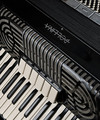
| 03/09/2008 06:46:08 PM |
Musical Designby karenkComment: Love the variety of lines here, straight, curved, thin, thick... combined with the patterns of black and white. Very nice! |
| Photographer found comment helpful. |
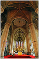
| 03/09/2008 06:45:15 PM |
Inside St Maurice Churchby msieglerfrComment: Interesting to have the tilt going away from the viewer instead of to the left or right. Beautiful church, and very nice job with the lighting. |
| Photographer found comment helpful. |
| 03/09/2008 06:44:11 PM |
Slowly slipping away...by digifotojoComment: I like how the contrails in the sky add shapes to the composition. Not sure how the tilt adds to the image here, but you did a nice job of keeping the reflection in the frame. |
| Photographer found comment helpful. |
| 03/09/2008 06:33:01 PM |
Day 7 : Ripeby ShaneBlakeComment: Great colors and textures. It almost overly ripe to eat from this perspective! |
| Photographer found comment helpful. |
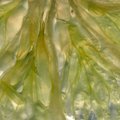
| 03/08/2008 07:12:28 PM |
Backlit Lime AP - Day 8by slaaksoComment: Wow.. that's quite close! I like how this has the lime color, yet still is a bit see through with the backlighting. I enjoy abstract macros that don't really have any main focal point, but I feel like this is lacking somehow. Perhaps a levels or curves adjustment to take away some of that flat, grey feel? A bit more sharpening? Or shooting it with the center of the lime arranged in the corner so that you can see the circular pattern more? Just a few ideas. |
| Photographer found comment helpful. |
| 03/08/2008 05:35:42 PM |
3.32 Dolceby MelethiaComment: This is so much nicer in b/w! Those orange chairs are quite overwhelming! |
| Photographer found comment helpful. |
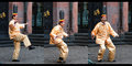
| 03/08/2008 05:33:36 PM |
Spoon guyby MelethiaComment: Wow, that is some talent! I can see why the two little kids were so interested in his performance! You captured the sequence of this very well! I think leaving a bit of blank space between the 3 frames might help here... I'm having a hard time looking through all three shots smoothly with the backgrounds not lining up. |
| Photographer found comment helpful. |
Home -
Challenges -
Community -
League -
Photos -
Cameras -
Lenses -
Learn -
Help -
Terms of Use -
Privacy -
Top ^
DPChallenge, and website content and design, Copyright © 2001-2025 Challenging Technologies, LLC.
All digital photo copyrights belong to the photographers and may not be used without permission.
Current Server Time: 08/10/2025 08:33:40 AM EDT.