| Image |
Comment |
| 03/12/2006 09:09:37 AM |
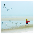
Chasing Fun by CutterComment: The square crop is perfect here and you've caught this moment wonderfully! The viewers eye moves between the boy and the flying birds... yet still catches the birds who are all sitting and watching. Well done! One of my favorites from this challenge! |
 Photographer found comment helpful. Photographer found comment helpful. |
| 03/12/2006 09:06:05 AM |
Square Crop Circleby error99Comment: Great idea.. very simple, yet works perfectly in a square. I love that it's completely continuous and you can't find where the 2 ends are! One of my favorites from this challenge! |
| Photographer found comment helpful. |
| 03/11/2006 04:19:52 PM |
Ugly Mugby RikkiComment: 
The picture is a riot and the comments just put it over the edge. Thanks for the laugh! |
| Photographer found comment helpful. |
| 03/06/2006 08:18:41 PM |
Woosh!by xylkeComment: Perfect title. Love the 'S' shape the lights made and the variety of different patterns in the lights. Well done! |
| Photographer found comment helpful. |
| 03/06/2006 08:08:56 PM |
It's Electricby graphicfunkComment: Is that bubble wrap?? The more I look, the more confused I get.. but it's an interesting and pleasing shot to look at. Can't wait to see what this one is all about after voting is over! |
| Photographer found comment helpful. |
| 03/06/2006 08:07:09 PM |
Threads of Timeby dayberryComment: A bit too chaotic for me with no real focal point, leaving the viewers eyes to kind of wander around. Looks like it might have been a blast making this shot though! |
| Photographer found comment helpful. |
| 03/06/2006 08:04:13 PM |
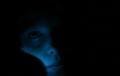
Talking on the Cellby photobytesComment: Interesting idea to use the lights of a cell phone as your moving light source, but overall the shot is a bit too dark. |
| Photographer found comment helpful. |
| 03/06/2006 07:59:22 PM |
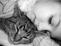
A Cozy Catnapby joycobbComment: Love this shot.. one of my top picks! The little hairs are a bit distracting, and there's a small overexposed spot at the top... but its such an adorable shot, that those things are easily overlookable (is that a word?). You captured some great textures in the sweater and the cat's fur, yet her face is very soft in comparison. And really, the entire key to this shot for me is the complete relaxation and contentment in both of their expressions. If I tried this with my cat, she'd be squirming and squiggling to get away. A fantastic job! |
| Photographer found comment helpful. |
| 03/06/2006 07:01:40 PM |
unpluggedby RikkiComment: Originally posted by kdkaboom:
I really like this! It's obviously well done, regardless of the challenge. I guess what would've made it more obvious to those seeking to fulfill the "odd couple" idea would have been to show a touch more of the outlet......at first glance, it isn't totally visible that it's a 2-prong, and only via the challenge theme did i take a closer look. maybe you could've chosen a more helpful title? hahaha, no no, that's lame. it's a good photo, be proud :) |
I have to agree here... I got the 3 prong/2 prong connection, but the outlet was so shaded that I somehow convinced myself that the sockets must have been somehow rotated on the outlet so that all 3 holes were still there. I never thought that it would actually be just a 2 prong outlet. My thinking was way more out of the box on this one than you intended the shot to be! (If that even makes any sense!) |
| Photographer found comment helpful. |
| 03/06/2006 06:03:10 PM |
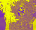
3:50 PM Gothic Mean Timeby obsidianComment: I think the feedback that jhonan provided hit on some of the key points as to why this scored so low. A few degrees of rotation would help this shot, especially in this type of color scheme. I also agree that this color scheme was a bit too out of the box for the dpc voting crowd. As jhonan pointed out, you've made almost a negative of your original by using the light colors in dark places and vice versa and to combine that with the bright and contrasting colors, probably gave many voters a poor initial reaction. I think you have managed to capture some interesting textures in the building and surrounding items which would have made for a great duotone in the more traditional colors. Hope this is helpful! |
| Photographer found comment helpful. |
Home -
Challenges -
Community -
League -
Photos -
Cameras -
Lenses -
Learn -
Help -
Terms of Use -
Privacy -
Top ^
DPChallenge, and website content and design, Copyright © 2001-2025 Challenging Technologies, LLC.
All digital photo copyrights belong to the photographers and may not be used without permission.
Current Server Time: 08/08/2025 05:12:09 AM EDT.