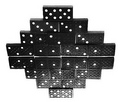
DPChallenge: A Digital Photography Contest You are not logged in. (log in or register
 
Browse Settings
Currently viewing:
Registered Userkteach

Show comments:

Per page:

Order:

Comments:


Comments Made by kteach
Pages:   ... [125] [126] [127] [128] [129] [130] [131] ... [194]
Showing 1271 - 1280 of ~1939
Image Comment
No man is a Island
08/01/2006 09:20:44 AM
No man is a Island
by Agcowie

Comment:
Great use of negative space and I love the wispy clouds... feels just a bit tilted though.
Photographer found comment helpful.
Calm In The Storm
08/01/2006 09:17:54 AM
Calm In The Storm
by MPRPRO

Comment:
She looks like she is definately in her own little world here amongst all the busy people. As far as a zen photo for this challenge though, I find that womans angry glance towards the photographer especially un-zen. I would have cropped just a tad off the left, just leaving her hair. That would leave me to focus more on the zen subject of the shot.
Photographer found comment helpful.
Just Iced
08/01/2006 09:12:52 AM
Just Iced
by zxaar

Comment:
I like the idea of the melting ice cubes, but the coloring is just too intense for me... some cooler shades of blue would have worked well I think to portray the simple silence of a zen challenge.
Photographer found comment helpful.
IMG_1626.jpg
07/31/2006 09:35:15 PM
IMG_1626.jpg
by Agaricus

Comment:
Just something about this one that I like.. the complete range of shades from black to white and the simplicity of the shot. Nicely done!
Photographer found comment helpful.
Refresh
07/31/2006 08:38:00 AM
Refresh3rd Place
by Tej

Comment:
Great yet simple setup! Congrats on the belated yellow ribbon!
Photographer found comment helpful.
Twin Bridges, est. 1959
07/29/2006 06:51:42 PM
Twin Bridges, est. 1959
by CVette

Comment:
Just ran across this one... considering what they look like as you drive over them, this is amazing! :) Well captured!
Photographer found comment helpful.
Floating in colors
07/28/2006 03:32:20 PM
Floating in colors
by TUBORG

Comment:
Greetings from the Critique Club!

First Impression:
Very bright and bold colors, almost a bit hard to look at. I like the swirls of reds and how all the colors seem to mix into each other. The kiwi is a great focal point with all the little black seeds. I like that it is abstract yet you still know what you're looking at.

Composition/Background:
The portrait orientation here just feels a bit awkward to me. Thinking in the rule of thirds, this one seems to be almost split in half with the kiwi and the red colors, and the kiwi is almost centered in the top. Perhaps a slightly different crop would help?

Technicals:
The one thing that stand out to me technically is the focus. I like how the focus on the kiwi and bubbles is sharp, yet the rest of the photo is very soft.

Post Processing:
You didn't mention any of your post processing in your photographers notes which makes it difficult to comment on what was done. It looks as though the saturation was boosted, and the yellows are a bit overdone for my taste. There are also a few little dark spots of red that I might have cloned out if possible.

Hope you found this critique helpful! Please feel free to PM me if you have any questions.
Photographer found comment helpful.
10 Butterflies
07/20/2006 05:31:33 AM
10 Butterflies
by Pano

Comment:
Greetings from the Critique Club!

First Impression:
Creative idea and a clean and simple setup. I find the crop a bit distracting with the cut off face taking away focus from the butterflies, and the lighting is a bit too focused on one area for me.

Composition/Background:
Good choice of background color. I like the slightly curved line of the butterflies being off center. I hadn't noticed that the shape of her back was supposed to mimic the butterfly shape as you mentioned in your photographer's comments, but that does hold true to some extent. I like how the butterflies get smaller as they go down, but that one little blue one seems a bit out of place.

Technicals:
I think the lighting here has both its pros and cons. It does have a nice warm glow to it, which is exactly what you wanted for this shot, but it does seem a bit harsh and focused on one spot. I wish a wider part of her back was lit instead of it being focused mainly on the lower back. Having it focused in that one area brought out shadows along the ribs and other muscles/bones that distract from the line of butterflies.

Post Processing:
I find the crop to be distracting here. I'm not a fan of having her head and ear both cut in half. I would probably prefer to have just a bit of the chin left in place so that it's not just a back, but it's also a very anonymous shot at that point, leaving the entire focus to be on her back and not who she is. It's difficult to comment too much on the processing, since you didn't include any information about what you did in your photographers comments.

Last Thoughts:
After reading the other comments that were made during the challenge, it seems like you had a few others who mentioned some of the same issues that I have. Overall though, it was a clever and simple setup which was enough to get people to give it that little bump to a 6 the majority of the time instead of their average 5 with their first impression, with no really low votes. Congrats on the 16th place.

I hope this was helpful. Please feel free to PM me if you have any questions, and good luck in your future challenges!
Photographer found comment helpful.
10x10 = 100
07/19/2006 09:16:13 AM
10x10 = 100
by Neuferland

Comment:
Greetings from the Critique Club!

First Impression:
I remember voting on this one, and taking a few seconds to figure out how you set it up with the mirror, and then counting all the dots in the rows to make sure there were 10. When I looked at the title, I understood where you were going with it, but felt like I missed something since there were only 8 rows. I realize there aren't enough small number dominoes to do a full 10x10 version, but perhaps a different title might have been better... "Rows of 10" or something? I like the illusion aspect, but technically it suffers a bit.

Composition/Background:
The composition with the stacked dominoes and mirror is nice, I like these kinds of photos that make you stop and think about how it was set up. White background to make a simple black and white photo is very clean, but I wonder what would have happened had you done this on a different color. Might have had a different result with the metering of the light and avoided some of the blown out highlights and areas that were to dark?

Technicals:
I find it difficult to shoot on white and get the whites perfectly white while also keeping the subject well lit. The flash seems a bit harsh, which ends up blowing out the white dots and making the dominoes on the bottom of the frame too bright, but it also doesn't adequately light the top. I think you might have had more luck if you'd shot in some kind of softbox. I have a small table that I use and drape a white sheet over. Some posterboard underneath that curls up from the bottom along the back, and a desk lamp on either side. Keeps the light from being too direct and blowing out the highlights, but I can usually get it bright enough if I adjust some camera settings.

Post Processing:
The hue/sat adjustment was a good idea... it's not even noticable that you did it, but it probably made big difference in how clean the shot looks. I'm wondering if splitting the image in half and processing just the dominoes in the top/bottom slightly differently as far as the levels/curves would have worked to get rid of some of the too bright/too dark areas? Then again, it might have just looked too unnatural.

Summary:
Overall, I think it was a good illusion, and a unique idea for the challenge. After reading the comments you received during the challenge, it seems like the technical issues are where you probably suffered most.

I hope you found this helpful. Please feel free to PM me if you have any questions, and good luck in your future challenges!
Photographer found comment helpful.
Hi, I'm Floyd
07/19/2006 08:48:25 AM
Hi, I'm Floyd
by BlackNewfs

Comment:
Originally posted by ladymonarda:

What an absolutely delightful pose. Tell Floyd he has won my heart. so very cute. Could be a friendship card or one of those "just dropping a line to say hi"


So true! I can absolutely see Floyd on that greeting card! Getting a card like that would make anyone smile! :)
Photographer found comment helpful.
Pages:   ... [125] [126] [127] [128] [129] [130] [131] ... [194]
Showing 1271 - 1280 of ~1939


Home - Challenges - Community - League - Photos - Cameras - Lenses - Learn - Help - Terms of Use - Privacy - Top ^
DPChallenge, and website content and design, Copyright © 2001-2025 Challenging Technologies, LLC.
All digital photo copyrights belong to the photographers and may not be used without permission.
Current Server Time: 06/21/2025 12:05:55 PM EDT.