| Image |
Comment |
| 08/02/2006 01:30:50 AM |
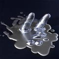
Condimentaryby JengaComment: Going back through the images from this challenge, I found this one to be underrated as far as my voting. I thought the creative use of light and shadows was fantastic with the unique shape of the objects. I can see the voters points though about cleaning things up a bit before shooting. Either way, I think this shot should have scored higher. Keep up the great work! |
 Photographer found comment helpful. Photographer found comment helpful. |
| 08/02/2006 01:25:38 AM |
|
| Photographer found comment helpful. |
| 08/01/2006 10:16:55 AM |
Floatingby cloudsmeComment: Ahh, fantastic! Love the use of the negative space here, but even better is that it contains relaxing shapes of reflection. The model looks relaxed and peaceful, and the gentle curves of the foam floaters adds yet another element. Wonderful! |
| Photographer found comment helpful. |
| 08/01/2006 10:16:51 AM |
|
| Photographer found comment helpful. |
| 08/01/2006 10:12:53 AM |
escarpment at twilightby hopperComment: Lovely colors... I like the hint of green in the bottom that keeps the entire foreground from being a total silhouette. My first thought was that it looked like the escarpment in Thatcher Park in NY. I'll be back after voting to see where this was taken! :) |
| Photographer found comment helpful. |
| 08/01/2006 10:04:47 AM |
Over and Underby Nikolai1024Comment: Love the slight contrasting curves of the boat and bridge... they sort of fit together like the symbol for yin/yang, supporting and balancing each other in the frame. |
| Photographer found comment helpful. |
| 08/01/2006 10:04:16 AM |
s e r e n i t y NOWby alfrescoComment: Like the use of negative space and the backlit leaves... not crazy about the neon green border though. |
| Photographer found comment helpful. |
| 08/01/2006 09:20:44 AM |
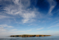
No man is a Islandby AgcowieComment: Great use of negative space and I love the wispy clouds... feels just a bit tilted though. |
| Photographer found comment helpful. |
| 08/01/2006 09:17:54 AM |
Calm In The Stormby MPRPROComment: She looks like she is definately in her own little world here amongst all the busy people. As far as a zen photo for this challenge though, I find that womans angry glance towards the photographer especially un-zen. I would have cropped just a tad off the left, just leaving her hair. That would leave me to focus more on the zen subject of the shot. |
| Photographer found comment helpful. |
| 08/01/2006 09:12:52 AM |
Just Icedby zxaarComment: I like the idea of the melting ice cubes, but the coloring is just too intense for me... some cooler shades of blue would have worked well I think to portray the simple silence of a zen challenge. |
| Photographer found comment helpful. |
Home -
Challenges -
Community -
League -
Photos -
Cameras -
Lenses -
Learn -
Help -
Terms of Use -
Privacy -
Top ^
DPChallenge, and website content and design, Copyright © 2001-2025 Challenging Technologies, LLC.
All digital photo copyrights belong to the photographers and may not be used without permission.
Current Server Time: 08/09/2025 07:20:14 AM EDT.