| Image |
Comment |
| 07/10/2010 07:32:54 AM |
Rafa Sheds a Tearby PetRockComment: The light looks very flat. There isn't even a shadow under his chin. The beads behind him are slightly distracting since they are so detailed, and they also contrast too much against his expression. |
 Photographer found comment helpful. Photographer found comment helpful. |
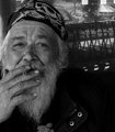
| 07/10/2010 06:03:56 AM |
relativityby tnunComment: I wish you had brightened this a little. There are no whites in this image. The brightest parts are actually light gray. I'd like to see the white of his beard and the white of his headband a bit lighter. That would help put more focus on his face. |
| Photographer found comment helpful. |
| 07/10/2010 03:37:58 AM |
Bill...A Remarkable Guyby dtallaksonComment: This image looks tone mapped/topazed, which definitely helps balance the spots of bright sunlight with the shadows, but I think this brought out too much detail in his skin, making him look much older and dirtier. I'm not sure that is terribly nice to make someone look like that. The sign and any other elements in the image should be able to convey his situation without the added "dirt" of post-processing. |
| Photographer found comment helpful. |
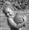
| 07/10/2010 03:33:56 AM |
July 4th in the Parkby tfarrell23Comment: This is a cute photo, but the light isn't so great. It's direct sunlight coming from above, which makes harsh shadows in her eyes. The eyes are usually the focus in a portrait, so you don't want them to be so dark. Shooting early in the morning or later in the afternoon would have better light.
I also don't think the black and white helps this. She's young, smiling, playful, carrying a balloon, and wearing a bathing suit. Color and vibrancy would have better fit the mood of the image. |
| Photographer found comment helpful. |
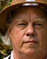
| 07/10/2010 03:30:52 AM |
The Birderby JuliBocComment: I think the crop is a little too tight. I don't mind missing the side of his face, but cutting him off at the neck kinda looks like he's been beheaded! Putting a white or reflective card just out of the frame would have added a nice catchlight in his eyes, which would make this photo pop. |
| Photographer found comment helpful. |
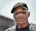
| 07/10/2010 03:28:46 AM |
The Veteranby EBJonesComment: It looks like you might have done topaz or something to bring out the detail in his face, since his face was in shade. I think you balanced the bright parts of the image and the shade on his face very well, but all the detail in his skin makes him look much older than he probably is. That could be interpreted as negative, which I'm guessing you probably didn't intent (based on the title). There is also something bouncing light on his face from below (maybe even the ground?). Lighting from below is called "monster lighting" (no, I didn't make up that name), which also adds to that unintended (or so I assume) negativity in this image. He has a wonderful face, but I think these two elements that create a negative atmosphere are hurting the image...unless, of course, you intended to do that, in which case it works very well. I apologize for my bluntness and I hope I didn't offend you. |
| Photographer found comment helpful. |
| 07/10/2010 03:21:57 AM |
Khalilby mattmacComment: I generally like the partially desaturated look, but I wish there was the tiniest bit more color in his face so he wouldn't look so pale. The angle of his head works well, but I can't decide if I like the wink or not. |
| Photographer found comment helpful. |
| 07/10/2010 03:12:44 AM |
Servi-Carby SHALIGAComment: I like having the car window and the man both in focus, but I wish the rest of the background had been blurred. Using auto focus, the camera will focus on the man, putting about a third of the rest of the "critical sharpness" in front of him and the other two thirds behind him. For a shot like this, you'd have to manually focus so you can set the focus on just the window and the man. Sharpening this image in post-processing would also help bring out his face, which should be the focus of the image in a portrait. |
| Photographer found comment helpful. |
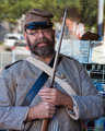
| 07/10/2010 03:09:04 AM |
Confederate on the Streetby agrimaceComment: His costume is very well done, but being able to see the cars in the background take away the "suspension of disbelief." There is also a little too much blue/cyan in his skin. You can correct that by changing the white balance or by using the separate channels of the curves function. |
| Photographer found comment helpful. |
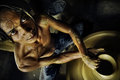
| 07/09/2010 08:32:43 AM |
The Sidewalk Potter by librodoComment: Between the angle of the camera and the expression on his face, there is a lot of tension in this image. That tension makes this photo memorable, but I half wish the mood was much calmer, especially since using a potter's wheel is most often associated with relaxed feelings. A wonderful shot, nonetheless. |
| Photographer found comment helpful. |
Home -
Challenges -
Community -
League -
Photos -
Cameras -
Lenses -
Learn -
Help -
Terms of Use -
Privacy -
Top ^
DPChallenge, and website content and design, Copyright © 2001-2025 Challenging Technologies, LLC.
All digital photo copyrights belong to the photographers and may not be used without permission.
Current Server Time: 08/13/2025 06:15:11 AM EDT.