| Image |
Comment |
| 01/16/2003 01:54:40 PM |
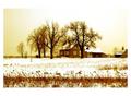
Winter Treesby jab119Comment: focus more on our foreground to reduce blur. fg blur is more distracting than bg most of the time. |
 Photographer found comment helpful. Photographer found comment helpful. |
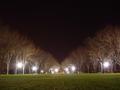
| 01/16/2003 01:52:48 PM |
|
| Photographer found comment helpful. |
| 01/15/2003 07:07:04 PM |
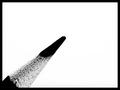
Contrastby AaronComment: CRITIQUE CLUB REVIEW
Question. Did you shoot this in 'whiteboard' mode? Just wondering how it came out the camera looking like that :). Was it a conversion post shoot to black and white?
Graphic design wise, this is excellent. Stark , reduced to essential elements. My eye wants the pencil to project farther into the frame tho, and maybe not QUITE at such a steep angle.
I think it could have been improved a bit if you had moved your lighting in such a way that you got a bit more of a high light off the pencil point. Would have given it more 3 dimensionality.
Your DOF is narrow, and I also wonder what it would have looked like with a smaller aperature (more of the pencil in focus). If you are using a tripod, then you shouldnt have a prob with a slower shutter speed.
Great pic! |
| Photographer found comment helpful. |
| 01/15/2003 09:36:13 AM |
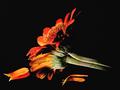
Reflectionby TerryGeeComment: CRITIQUE CLUB REVIEW
Exposure is great and the shadowy lighting adds a touch of drama. Focus is good on the stem and side of the flower but a but soft on the 'middle part' of the flower (in the center between the petals). It might have been stronger had that been the focus target. Bold colors really make the image come alive.
However, I feel that the image is too close to the reflection, making it hard to see what's actually happening there. It is hard to tell what is the flower and what is the reflection. Moving it maybe another inch away (suspend it by fishing line?) might make the difference in terms of making it more visual clean.
Overall a pretty picture :). |
| Photographer found comment helpful. |
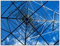
| 01/14/2003 02:01:50 PM |
"Something Electric" - All Together Separateby TarbiniComment: CRITIQUE CLUB REVIEW
Sharpness and focus: excellent. Good deep DOF.
Subject Matter: the tower is good but the blue sky doesnt complement the electric theme.
Composition: would have preferred the central point to be alittle more off center to the left.
Conclusion: All in all a very well shot, striking photo. Unique and original. A little static. |
| Photographer found comment helpful. |
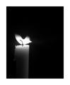
| 01/14/2003 11:34:44 AM |
"Candle In The Wind" By Elton Johnby redfigComment: CRITIQUE CLUB REVIEW
A striking image. Great use of negative space. If it had been the only one doing this idea it would have been stronger. A testament to Elton John's popularity that so many people did this song!
Good bonus to add the wind blowing the flame. I might have liked to see: sharper focus, maybe some direct tie-in to either Marilyn Monroe or Elton. However, the 'lost in the darkness' quality is effective.
Overall good work, but needs more context than the title. |
| Photographer found comment helpful. |
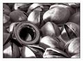
| 01/14/2003 10:51:07 AM |
Am I Nuts by redfigComment: CRITIQUE CLUB REVIEW
A conceptually excellent photo. Funny and witty. Great delineation of texture and the black white works very well. Good choice of pistachios as the 'real' nuts, with the way they pop open.
I feel the composition is just a bit busy. You have used DOF well to isolate the metal nut from the others but i feel it might need a little something more to get it more distinct. It might have helped for your light to catch high light on the metal nut instead of leaving it dark.
Or maybe use a spotlighting effect (cone of paper over a desklamp works well) to single out the metal nut, while leaving the pistachios darker.
Overall a fine effort, and one you should be proud of :). |
| Photographer found comment helpful. |
| 01/14/2003 10:22:01 AM |
''Take Me Out To The Ballgame''by David EyComment: CRITIQUE CLUB REVIEW
I'm struck by how good the image quality is on this picture. The color balance and sharpness are very good. Your really did a good job in bringing out the texture of the leather.
The macro works well on this image. It fills the frame and avoids any extraneous clutter.
I like the light highlight on the letters but I think that might have been toned down a shade. Maybe the letters could be a little lower in the frame to show more of the words.
Overall, a fine effort. |
| Photographer found comment helpful. |
| 01/13/2003 08:48:47 AM |
|
| Photographer found comment helpful. |
| 01/13/2003 07:53:30 AM |
|
| Photographer found comment helpful. |
Home -
Challenges -
Community -
League -
Photos -
Cameras -
Lenses -
Learn -
Help -
Terms of Use -
Privacy -
Top ^
DPChallenge, and website content and design, Copyright © 2001-2025 Challenging Technologies, LLC.
All digital photo copyrights belong to the photographers and may not be used without permission.
Current Server Time: 08/11/2025 01:29:22 PM EDT.