| Image |
Comment |
| 11/16/2002 06:12:00 PM |
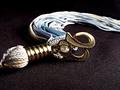
Class of 86by karmatComment: Great shot. I'm just not too sure what the colors of the tassel are supposed to be. They look like bule purple and gold, but faded out. Other than that I really like this. The colors drop it down from a 9 to a 7. Sorry. That's just my opinion. PTL |
 Photographer found comment helpful. Photographer found comment helpful. |
| 11/12/2002 07:26:00 PM |
What's the point?by goodtempoComment: I have a tin full of old pens. Love this. Different idea. Good focus, good color of background to compliment the different shades of nibs. Great job. 8 PTL |
| Photographer found comment helpful. |
| 11/16/2002 11:24:00 PM |
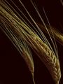
Golden Grainby joannsComment: Great picture of stalk of wheet. I like the simplistisity of it. Maybe a little lighter. But is still a great 9. PTL |
| Photographer found comment helpful. |
| 11/15/2002 05:10:00 PM |
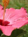
Missed details after the rainstormby xertionComment: Like the bits of pollen left on the leaf and the water droplets. Good crop for me. I don't know what details you are speaking of but I like the details of the petals. Very nice clear details. Great solid 7. PTL |
| Photographer found comment helpful. |
| 11/12/2002 07:03:00 PM |
Wedlockby MustbelostComment: I LOVE IT. You couldn't have picked a better lock either. This is number 1 in my book and will be added to my favorites. PERFECT. I give it an 11. PTL |
| Photographer found comment helpful. |
| 11/16/2002 06:44:00 PM |
my dinner with ackbarby johnny_justjohnnyComment: Too soft and don't like the back ground. Missing "wow", focus, good lighting - of course this is my opinion. Doesn't have that appeal for me. 5 is tops for me, but that's not too bad. PTL |
| Photographer found comment helpful. |
| 11/13/2002 02:05:00 AM |
Too Close For Comfortby ambakerComment: I've looked and looked at this and am still convinced it is hot charcoal. If so how did you get the picture without burning your hands or camera? I must be wrong. It's still looks like that though. 7 based on being charcoal. PTL |
| Photographer found comment helpful. |
| 11/16/2002 06:22:00 PM |
Negativity Sucksby crabappl3Comment: Who woulda thought. I love the colors and the title sure fits. Wasn't sure at first but this one grows on you the more you look at it. At first I thought a 5 but the more I look it is a 7 for sure. PTL |
| Photographer found comment helpful. |
| 11/13/2002 12:31:00 AM |
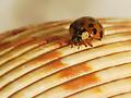
Another Damn Bugby alanfreedComment: Or is it another sea shell? Is that a real bug. Some how doesn't quite look real. A little too reddish orange. But real good focus. But for some reason what it is one seems to swallow up the photo. Hope you can understand what I mean. It detracts from the bug. 5 is about the tops for me. PTL |
| Photographer found comment helpful. |
| 11/14/2002 10:56:00 PM |
Autumn Laceby LindaLeeComment: Good B & W. Almost makes you want to cry. Don't know why it brings out so much emotion. Am surprised at that. Nice 8. And I don't like B & W that much. They have little "wow" for me but this one does. Great job. PTL |
| Photographer found comment helpful. |
Home -
Challenges -
Community -
League -
Photos -
Cameras -
Lenses -
Learn -
Help -
Terms of Use -
Privacy -
Top ^
DPChallenge, and website content and design, Copyright © 2001-2025 Challenging Technologies, LLC.
All digital photo copyrights belong to the photographers and may not be used without permission.
Current Server Time: 08/04/2025 05:55:42 PM EDT.