| Image |
Comment |
| 12/24/2002 06:24:56 PM |
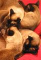
Two by two.by mykolearyComment: Kittens? They are beautiful. I don't particularly like the red pillow they are on. If it had been lighter you could have lightened the whole photo and gotten a better photo of them, because of their dark faces and feet. Still a good shot. Worth a 7 any day. PTL |
 Photographer found comment helpful. Photographer found comment helpful. |
| 12/24/2002 06:16:03 PM |
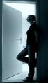
4by ndsComment: Very simular to one in another challenge. Personally feel that the light in the room is a little too bright. Also think the face should have been shadowed in darkness like the rest of the body, but that's just my opinion. Still will give it a 6. PTL |
| Photographer found comment helpful. |
| 12/24/2002 06:12:46 PM |
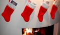
Ready for Santaby vtruanComment: Unique looking fireplace. Think you should have moved back and gotten more of it in the photo. Would have given some warmth to the photo. As is is just 4 plain stockings hanging. With more of the fireplace would have said a home with 4 anxious little ones excitedly waiting. But will give it a 5. PTL |
| Photographer found comment helpful. |
| 12/24/2002 06:09:28 PM |
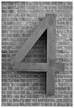
BIG Fourby DougPazComment: Probably should have done this in color to give it some dazzle to keep it from being so plain. Bet the bricks look nice. The show up so clearly. The 4 looks like it could be a nice wooden one. Nice crop right in the morter joints. Technically right but lacks appeal. 6 is as high as I can go. PTL |
| Photographer found comment helpful. |
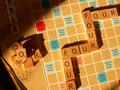
| 12/24/2002 05:55:52 PM |
4X4by catpixelComment: x4x4. You forgot 2 of them. I really hate to comment on a photo with such good focus and thought put into it. BUT here goes. I do not like the angle of the board; the shadows are terribly distracting, especially on the upper left hand corner; the lighting could be much better; the cropping is for I don't know what. The left hand corner should have been cropped out, as well as the dark place on the left upper corner, and right lower corner. I realize you cropped at an angle to keep from having a boring straight up and down square but it just didn't work here, in my opinion. If you were going for thirds, you could have accomplished that with cropping from just one square outside the up and down fourto one square below the whole thing to the right one square outside the r to one square above the top right four. That would have worked better in my opinion. Just a thought, but I will give you a 4 for the focus. PTL |
| Photographer found comment helpful. |
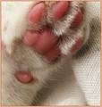
| 12/24/2002 05:12:08 PM |
Put Your Tiny Paw in Mineby magnetic9999Comment: This print is so clear I can see his/her paw print (fingerprints) clearly. Looks like a tiny baby's. Does "it" have a body and name to go with it? My only complaint is that maybe you should have put it on a different colored blanket, a soft color, so the white fur would show better. And that's not a complaint, just a thought. Really, what is it? Good shot and I like it enough to give it a 7. PTL Might have been higher if the whole body had been there, but the challenge was 4. (4 feet) |
| Photographer found comment helpful. |
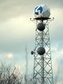
| 12/24/2002 01:12:33 AM |
Channel 4 Doppler Radarby alanfreedComment: Awesome photo. I sure hope the radar sees the storm that appears to be coming. But I have a great big question. What are the two grey things sticking up from the bottom of the photo, on each side of the tower. At first I thought it might be a tornadoe trying to form, then it looked like a finger mark on a negative. Now I'm not too sure. But it is really distracting. I'd like to see further down to see what they are. In fact on the left there are actually two of them connect about the second wrung up the tower. I hate this because they knock the score down from a 10 to a 6. And I really like how it looks like a storm coming. PT> |
| Photographer found comment helpful. |
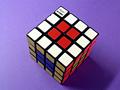
| 12/24/2002 12:34:13 AM |
Four Cubedby paynekjComment: I am amazed that you did this. Or did you? I really like the composition: the focus, the cropping, the placement. Only thing I question is the background color, with the colors on the cube. It seems to steal your site away from the cube. In my opinion black or maybe a soft or light red or blue would have done better. They wouldn't be so distracting. Other wise good one. I'll still give it an 8. PTL |
| Photographer found comment helpful. |
| 12/23/2002 03:50:43 PM |
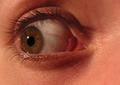
The Fearby KonadorComment: I love the reflection of the eye lashes in the eye itself. This definitely speaks fear. The detail in the eye is unreal. I wish it had been just a little lighter. I find myself struggling to look at the color of the eyes and into it. But it is an awesome 10. PTL |
| Photographer found comment helpful. |
| 12/23/2002 03:38:01 PM |
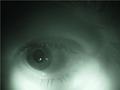
Window to the Soulby ambakerComment: This is wild. The coloring makes it, as much as I hate to say that. There's another in B&W that actually helps this one, by contrasting the difference. Lucky for you. Yes, the eyes are th window to the soul and this one speaks volumns. Great job. PTL It's a 10 as far as I'm concerned. |
| Photographer found comment helpful. |
Home -
Challenges -
Community -
League -
Photos -
Cameras -
Lenses -
Learn -
Help -
Terms of Use -
Privacy -
Top ^
DPChallenge, and website content and design, Copyright © 2001-2025 Challenging Technologies, LLC.
All digital photo copyrights belong to the photographers and may not be used without permission.
Current Server Time: 08/06/2025 10:45:54 PM EDT.