| Image |
Comment |
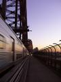
| 02/07/2003 12:48:57 AM |
hit the point...by neoathematrixComment: Took me a minute to understand your title. Now I get it. Would have been a little easier if the photo had been a little lighter. And that's all it needs. Everything else is great. Love the motion. Great motion shot. Lighten it a little and you have a winner. |
 Photographer found comment helpful. Photographer found comment helpful. |
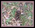
| 02/07/2003 12:46:23 AM |
Pineconeby OneSweetSinComment: The light brown border being so close to the color of the pine cone makes it a little hard to see the pint cone. It draws your eye out so that you see the whole photo as a unit rather than being able to look at the pine cone. The brown leaves add to this affect. I truly believe the border really hurt you this time. The black one alone would have forced your eyes inward toward the center. Don't get me wrong. It is a well focused photogaph, nicely done. But the border prevents you from seeing this, and acutally makes it look like just almost a messy piece of grass. It actually takes this from a 9 to a 4. |
| Photographer found comment helpful. |
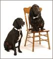
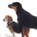
| 02/07/2003 12:40:01 AM |
Bahsworth & Brodamireby GotchaComment: Should have done it in sepia tone. Go back and do one in it. They are posed like the old fashioned photos. What breed is the one on the chair. Looks bassett hound, blood hound, chocolate lab, all three which is it. They are beautiful and the is a beautifully done photo. Great lighting and background Like how it's almost shadow free. Great job there. This is a reall good composition. I love the bow ties. Couldn't you find any white shoes to slip on them? This is an 8 for sure. |
| Photographer found comment helpful. |
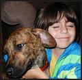
| 02/06/2003 11:50:55 PM |
Are We "There" Yet?by GeneralEComment: Not sure I understand what you title has to do with the photo. But you met the challenge with out the title. Beautiful, well done photo. Good focus, color, composition, lighting, etc. Some will have a problem with the chair arm, but it is of no consequence in the photo. Doesn't add to or take away from. The kid and the dog hold your eyes fine. Nice one. Congratulations. |
| Photographer found comment helpful. |
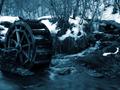
| 02/06/2003 11:47:23 PM |
The Cold Wheelby YomiComment: I love the little falls coming down from the right top to the bottome center. The motion there is the only proof that it is not frozen over. The wheel is a little dark. Would look better if it showed up more, since it is your subject. I like thei midnight blue color better than a black and white. But it is a little too dark. Lightened up it is a winner. Photo has nice focus and cropping. like your choice of color. |
| Photographer found comment helpful. |
| 02/06/2003 11:30:49 PM |
Tuzik and Maxby basia03Comment: Where are the ears of the bigger dog? I also am missing one of his front legs. I can't tell for sure but it looks like the bigger is straddling the smaller. Neat idea of way of taking the photo, It is either out in the snow, or you spot edited. And I don't think you would break the rules. Nice sharp focus with very vivid colors. Would like to have seen all of the dogs, feet and tails. But nice job. |
| Photographer found comment helpful. |
| 02/06/2003 12:14:56 PM |
Ears and viskersby dimitriiComment: Beautiful blue eyes and looks like he would just as well you get lost and leave him alone. Looks like he has a mind of his own and owns you. This is a beaufiful cat and well photographed. It's a shame about the dark corner on the top right side. Even with the background out of focus it still should have been smoothed out. But I do realize that to get the scene we have to put up with the scenery sometimes and won't take off points for the wrinkles. This is a beautiful photo. |
| Photographer found comment helpful. |
| 02/06/2003 12:07:14 PM |
Hello yesterday....by niwedimagesComment: Great title. Very ingenius. I really like the photo and the concept of it. But personally, and I said personally I have some problems. I don't really go for this DOF thing so many like. To me this whole thing should have been in as good of focus as the can on thel eft. It is great. Also the rounded background leaves dark triangles at the top two corners, very distracting. The shadows on the focused can are too dark, as is the end of the can. I realize you went with a loft of "correct' photography techs. This is why I believe they are rules of thumb and not laws, as do a lot of people. To me this one, because of the concept and your obvious photographic abilities, could have been a 1st place winner, with a score of 10. As it is it really should be scored very low. But I am going to give it a 6 because the concept is so good, it meets the challenge, it is different and unique, I really do love the whole idea, and I can see a lot of potential that is obvious you have thea ability to do. This is not my norm on comments or score but feel is warranted by this photo. I really wish you the best. This one is a perfect example why we should shot what we really like. |
| Photographer found comment helpful. |
| 02/05/2003 10:35:15 PM |
Two Classics by JackoComment: I don't understand this one. But I don't really like what I see. It's just not appealing to me. I think it is supposed to be water, thats why the background is not smooth. And I don't know what is in the center. It's just not personally my kind of photo. |
| Photographer found comment helpful. |
| 02/05/2003 10:24:51 PM |
Happy Valantine's day, dear! by miracComment: I've got to know why put the water on a rose. I, personally, think it is as pretty without and don't feel it adds anything. Just wandering. To the photo. Personally I feel there is too much stem, without anything on it. I would have cropped it just below the rose itself or left some of the green sticking up the stem. I do like the background and think the rose is beautiful and in great focus. I personally like to see the photo from the end of the rose or angled so I can see the end. But that's just me. This is a really good photo of a great flower. |
| Photographer found comment helpful. |
Home -
Challenges -
Community -
League -
Photos -
Cameras -
Lenses -
Learn -
Help -
Terms of Use -
Privacy -
Top ^
DPChallenge, and website content and design, Copyright © 2001-2025 Challenging Technologies, LLC.
All digital photo copyrights belong to the photographers and may not be used without permission.
Current Server Time: 12/21/2025 11:42:18 AM EST.