| Image |
Comment |
| 01/10/2007 10:52:28 AM |
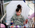
My Patient Daughterby amsterComment: The lighting is not very flattering, and the conversion to b&w doesn't really hide the snapshot feel of the photo. The centred composition and high angle also don't flatter much. |
 Photographer found comment helpful. Photographer found comment helpful. |
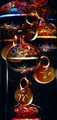
| 01/10/2007 10:50:53 AM |
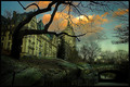
Temperature-Risingby outafocusComment: Wow. I've never seen these things before in my life, and yet I've already seen two of them in this challenge. They do seem like interesting subjects for photography. |
| Photographer found comment helpful. |
| 01/10/2007 10:27:13 AM |
Because Of Youby Shan2112Comment: Very strong composition. Nice tones, which must have been difficult to acheive given that flat lighting. |
| Photographer found comment helpful. |
| 01/10/2007 10:19:34 AM |
|
| Photographer found comment helpful. |
| 01/10/2007 10:15:01 AM |
Lips of an Angelby angela_packardComment: Clever idea - the angel is unconventional. The way the skin fades into the white background is almost ethereal - just like an angel should be. However, apart from the post-processing for red colour, the lips don't quite grab the viewer as much as I would like them to, to support the title of the shot. Still, well taken. |
| Photographer found comment helpful. |
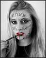
| 01/10/2007 10:11:44 AM |
So Sickby gwreckerComment: Nice idea. Composition is a bit cluttered though (pink arm is distracting) and it has a bit of a snapshot feel. Also, I think you used a high ISO for the indoor lighting - be careful of that, it creates a lot of noise in your pic. Although in this case I think it helped the pic a bit - it lessened that cheap snapshot feel of the pic. |
| Photographer found comment helpful. |
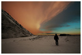
| 01/10/2007 10:09:16 AM |
Walk Awayby APComment: The person walking away is so small and so dark that the casual viewer might easily overlook it, and without that, the picture doesn't really convey the title well. Also, many elements of the composition are distracting, rather than interesting. |
| Photographer found comment helpful. |
| 01/10/2007 09:58:40 AM |
Walk Awayby StructorComment: There was another almost identical shot that came out a bit better than this one, simply because it had leading lines moving the viewers eye as if they were 'walking away' with the subject. If you'd been able to compose the shot with similar leading lines, it might have improved the pic. However, the colours in your pic are fabulous and the silhouette is strongly composed. Nice shot. |
| Photographer found comment helpful. |
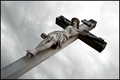
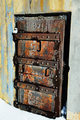
| 01/10/2007 09:54:26 AM |
What’s Left Of Meby docjonnyComment: Interesting colours coming out of this shot. Somehow the composition doesn't feel quite right for it though. Maybe a square-on angle would have given the heavy door more weight. Or maybe it's just that patch of white (snow?) at the bottom that is bothering me. Still, it's a nice representation of the title. |
| Photographer found comment helpful. |
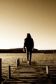
| 01/10/2007 09:52:37 AM |
Walk Awayby luddeComment: Nice clean lines, and well composed. I also like the tones, leaving the subject almost in silhouette, but with just enough detail to give him depth and show the walking. A bit of noise and banding detracts a bit from the sky, but other than that minor issue, it's a great photo. |
| Photographer found comment helpful. |
Home -
Challenges -
Community -
League -
Photos -
Cameras -
Lenses -
Learn -
Help -
Terms of Use -
Privacy -
Top ^
DPChallenge, and website content and design, Copyright © 2001-2025 Challenging Technologies, LLC.
All digital photo copyrights belong to the photographers and may not be used without permission.
Current Server Time: 06/20/2025 07:39:54 AM EDT.