| Image |
Comment |
| 01/27/2007 05:32:42 AM |
|
 Photographer found comment helpful. Photographer found comment helpful. |
| 01/27/2007 05:32:09 AM |
|
| Photographer found comment helpful. |
| 01/27/2007 05:31:40 AM |
minimal possibilities by h2Comment: Pity the perspective of the lens distorts the tiles a bit so that the ones on the left don't look as vertical as the ones on the right (or maybe that's just because of faulty building contractors :-) ). Anyway, that's minor, because this is a great shot. Minimalist indeed. And the subject is interesting (unlike many of the 'small object on a white background' shots). Very well done. Focus, sharpness and DOF are good, composition is good. And lighting is very nicely controlled. One of my favourites of this challenge. |
| Photographer found comment helpful. |
| 01/27/2007 05:26:08 AM |
Sphereby adeldeganComment: A brighter background might have allowed the sphere to stand out more. Right now the lighting just feels a bit murky. |
| Photographer found comment helpful. |
| 01/27/2007 05:25:05 AM |
cheetosby arsenalComment: Very nice shot. I like how the colours of the shirt compliment the backgroud. Not really sure about the minimalist element, but it certainly is a simple composition. |
| Photographer found comment helpful. |
| 01/27/2007 05:23:51 AM |
Nouvelle Cuisineby GreetmirComment: Funny idea. A more overhead angle might have allowed for more detail on the food arrangement. |
| Photographer found comment helpful. |
| 01/27/2007 05:22:30 AM |
|
| Photographer found comment helpful. |
| 01/27/2007 05:21:39 AM |
Aboveby TiberiusComment: All that stuff going on in the background on the left is distracting. Could have simplified the composition a bit by going for a tighter crop. |
| Photographer found comment helpful. |
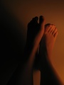
| 01/27/2007 05:20:25 AM |
Nakedby MeGoobieComment: Nice idea for the minimalism challenge. Somehow I don't think it was executed perfectly. Would have liked to have seen the feet more 'posed', using them to the fullest advantage to explore the interplay between the light and shadows. The bottom left is just too dark - it throws off the balance of the image. |
| Photographer found comment helpful. |
| 01/27/2007 05:17:02 AM |
Regalby tomcatComment: Not a great photo. The central composition isn't very strong, and you can hardly make out any details of the subject. |
| Photographer found comment helpful. |
Home -
Challenges -
Community -
League -
Photos -
Cameras -
Lenses -
Learn -
Help -
Terms of Use -
Privacy -
Top ^
DPChallenge, and website content and design, Copyright © 2001-2025 Challenging Technologies, LLC.
All digital photo copyrights belong to the photographers and may not be used without permission.
Current Server Time: 06/22/2025 05:55:30 PM EDT.