| Image |
Comment |
| 11/01/2006 09:41:26 PM |
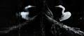
Distorted Symmetryby zaflaboutComment: 0 = Poor, 0.5 = Fair, 1= Good, 1.5 = Great, 2= Perfection
Creativity = 1.5
Composition = 1
Lighting = 0.5
Contrast = 1
Focus = 1
---------------------
Total Score = 8 |
 Photographer found comment helpful. Photographer found comment helpful. |
| 11/01/2006 09:40:12 PM |
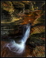
Streamlinesby NeilComment: 0 = Poor, 0.5 = Fair, 1= Good, 1.5 = Great, 2= Perfection
Creativity = 1.5
Composition = 1.5
Lighting = 1.5
Contrast = 1
Focus = 1.5
---------------------
Total Score = 7 |
| Photographer found comment helpful. |
| 11/01/2006 09:37:50 PM |
|
| Photographer found comment helpful. |
| 11/01/2006 09:36:47 PM |
Daydreamby justin_hewlettComment: 0 = Poor, 0.5 = Fair, 1= Good, 1.5 = Great, 2= Perfection
Creativity = 1.5
Composition = 1.5
Lighting = 1.5
Contrast = 1.5
Focus = 1
---------------------
Total Score = 7 |
| Photographer found comment helpful. |
| 11/01/2006 09:35:28 PM |
|
| Photographer found comment helpful. |
| 11/01/2006 09:34:46 PM |
Roseby JeniYComment: 0 = Poor, 0.5 = Fair, 1= Good, 1.5 = Great, 2= Perfection
Creativity = 1.5
Composition = 1
Lighting = 1
Contrast = 1
Focus = 1.5
---------------------
Total Score = 6 |
| Photographer found comment helpful. |
| 11/01/2006 09:33:30 PM |
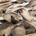
Will someone PLEASE move over!by cislanderComment: 0 = Poor, 0.5 = Fair, 1= Good, 1.5 = Great, 2= Perfection
Creativity = 1.5
Composition = 1
Lighting = 1
Contrast = 1
Focus = 0.5
---------------------
Total Score = 5 |
| Photographer found comment helpful. |
| 11/01/2006 09:29:41 PM |
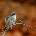
Loggerhead Shrikeby sailracer_98Comment: 0 = Poor, 0.5 = Fair, 1= Good, 1.5 = Great, 2= Perfection
Creativity = 1.5
Composition = 2
Lighting = 1.5
Contrast = 1.5
Focus = 1.5
---------------------
Total Score = 8
Excellent shot. One of the best in the challenge so far. Great background and perfect DOF. |
| Photographer found comment helpful. |
| 11/01/2006 05:38:28 PM |
popby inspir8tionComment: This is a cool shot, however, I'm afraid there is just a little too much glare on the flower. I polarizer would have worked well here to reduce the glare. Also, the background is a little distracting. |
| Photographer found comment helpful. |
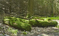
| 09/08/2006 11:20:33 PM |
Mossy Logsby keoneComment: I think this capture could use some more contrast. It looks like a really cool spot, but the contrast isn't hight enough. Nice take though. |
| Photographer found comment helpful. |
Home -
Challenges -
Community -
League -
Photos -
Cameras -
Lenses -
Learn -
Help -
Terms of Use -
Privacy -
Top ^
DPChallenge, and website content and design, Copyright © 2001-2025 Challenging Technologies, LLC.
All digital photo copyrights belong to the photographers and may not be used without permission.
Current Server Time: 06/17/2025 05:52:51 PM EDT.