| Image |
Comment |
| 04/27/2005 11:52:40 AM |
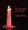
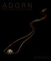
Be the light...by ShamanComment: I know it' snot easy to shoot a candel and I think you did it very well! Personaly, I wish the fire was more elongated vertically. I think it would make the candle more powerful. Nice use of the black and the reflection. The text is big and annoying to me, but I'm difficult when it comes to the use of fonts. I wish we were not limited to 640 pixels because I'd love to see the detail on the jewel. ;-) Nice shot. Well done. |
 Photographer found comment helpful. Photographer found comment helpful. |
| 04/25/2005 05:51:11 PM |
|
| Photographer found comment helpful. |
| 04/25/2005 05:50:21 PM |
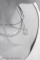
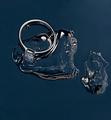
Diamond Cuff Linksby cajayComment: nice use of DOF. Good try with the lighting to set a mood. I think lighting could have use more modeling on the background to give a more dramatic effect, but maybe it's just me. The center composition is throwing me off a bit... Fonts could be a darker shade of grey to give back some forcus to the jewels. Good job overal! Cheers! |
| Photographer found comment helpful. |
| 04/25/2005 05:48:04 PM |
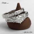
a diamond is forever by hopperComment: Funny idea. Nice details. Uninspiring lighting. Font could use a better selection to complement the design of this image. Good luck! |
| Photographer found comment helpful. |
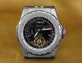
| 04/25/2005 05:44:57 PM |
Bentleyby ChinabunComment: Very well captured details. i see what you tried to do with the background color to complement the gold items on the watch, but to me it doesn't really work. Something in the silver or bluish tones might have made the watch stand ou more... I don't know. Also, the center composition seems to be missing something for me. Overall well done. Good luck! |
| Photographer found comment helpful. |
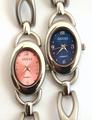
| 04/25/2005 05:43:29 PM |
One Gucci is never enoughby SteveinnzComment: nice use of the two complementary colors. The composition and lighting is missing some 'humf' in there... The white bgr migth be better if it was indeed white (without the yellowish cast on it). good luck! |
| Photographer found comment helpful. |
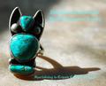
| 04/25/2005 05:41:13 PM |
Southwesternby vtruanComment: Interesting jewel. Nice use of DOF. Annoying fonts sorry. Lighting could use some finesse to create mood. Good luck. well done. |
| Photographer found comment helpful. |
| 04/25/2005 05:40:32 PM |
Ocean's Mystery Braceletby SondaComment: Interesting idea. Nice use of silhouette and mirror effect. I find the composition to be a bit odd and the jewel uninspiring. Font is annoying to me, sorry. Good job overall. Good luck! |
| Photographer found comment helpful. |
| 04/25/2005 05:39:27 PM |
MAMBAby aznymComment: Love the lines. Excellent choice of font and font color. Composition might have worked a bit better if the front end of the jewel was placed with an angle instead of a straight horizontal line... Good work! |
| Photographer found comment helpful. |
| 04/25/2005 05:38:01 PM |
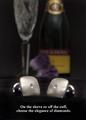
Forever Iceby MatthewComment: Good idea! Unfortunately, I do not think this shot in particular works. I can imagine how hard it must be to capture the right shot. A+ for effort, that's for sure! |
| Photographer found comment helpful. |
Home -
Challenges -
Community -
League -
Photos -
Cameras -
Lenses -
Learn -
Help -
Terms of Use -
Privacy -
Top ^
DPChallenge, and website content and design, Copyright © 2001-2025 Challenging Technologies, LLC.
All digital photo copyrights belong to the photographers and may not be used without permission.
Current Server Time: 08/23/2025 08:58:19 AM EDT.