| Image |
Comment |
| 06/13/2003 01:35:35 PM |
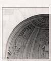
Architectural Digestby TarbiniComment: Maybe use a little more Unsharp Mask on this. I don't know if I like the border for a magazine cover. Nice contrast between the light wall on the outside and the inner part. |
 Photographer found comment helpful. Photographer found comment helpful. |
| 06/13/2003 01:32:29 PM |
Cigar Aficionadoby crabappl3Comment: Pretty good shot. But maybe instead of the black background you should have used an abstract, soft background to give the mag cover more interest. |
| Photographer found comment helpful. |
| 06/13/2003 01:22:54 PM |
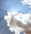
Guidepostby OneSweetSinComment: Thanks for explanation of the photo! The dark clouds and bright Sun have a nice strong contrast. |
| Photographer found comment helpful. |
| 06/13/2003 02:27:41 AM |
|
| Photographer found comment helpful. |
| 06/13/2003 02:22:24 AM |
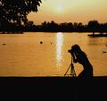
Outdoor Photographerby progersctComment: Nice, but you really should have cropped out 1/3 of the left of this shot. That would make it portrait and 10 times better. |
| Photographer found comment helpful. |
| 06/13/2003 02:20:25 AM |
|
| Photographer found comment helpful. |
| 06/13/2003 02:18:16 AM |
|
| Photographer found comment helpful. |
| 06/13/2003 02:14:26 AM |
|
| Photographer found comment helpful. |
| 06/13/2003 02:13:34 AM |
|
| Photographer found comment helpful. |
| 06/13/2003 02:02:48 AM |
|
| Photographer found comment helpful. |
Home -
Challenges -
Community -
League -
Photos -
Cameras -
Lenses -
Learn -
Help -
Terms of Use -
Privacy -
Top ^
DPChallenge, and website content and design, Copyright © 2001-2025 Challenging Technologies, LLC.
All digital photo copyrights belong to the photographers and may not be used without permission.
Current Server Time: 06/25/2025 03:31:02 AM EDT.