| Image |
Comment |
| 03/23/2004 12:39:27 AM |
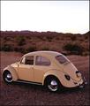
HotVWby tfarrell23Comment: Very good. The yellow of the bug goes very well with the background. 8. |
 Photographer found comment helpful. Photographer found comment helpful. |
| 03/23/2004 12:35:37 AM |
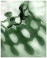
Fortune Magazineby dsidwellComment: Did you get this idea from an existing maganize? If not, it is very creative. And it's also very well done. 8. |
| Photographer found comment helpful. |
| 03/23/2004 12:33:36 AM |
|
| Photographer found comment helpful. |
| 03/23/2004 12:26:19 AM |
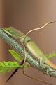
National Geographicby jas0420Comment: Where's the big yellow border!!!! JK, this is very nice. The blurred leaves in the background look kinda weird. Did you blur them manually in PS? If so, you should not have. The rest is great. |
| Photographer found comment helpful. |
| 03/23/2004 12:24:25 AM |
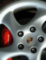
Car and Driverby thelselComment: Wow that is very nice. :) If you could have rotated the wheel a little to show the "p" on the calliper that would be even better. Or maybe shot it from a little higher. |
| Photographer found comment helpful. |
| 03/23/2004 12:19:50 AM |
Easy Home Cookingby KonadorComment: Nice except for the shadows. Very creative in my opinion. Althought you should have arranged the 3 items so that the left one was parallel to the grains in the upper left, and then so the other two are perfectly aligned with the right and bottom edges of the image. |
| Photographer found comment helpful. |
| 03/23/2004 12:17:57 AM |
Wby AleciaComment: What is "W"? Is it like a Playboy type of thing? You should have cloned out the freckles on her arm. |
| Photographer found comment helpful. |
| 03/23/2004 12:16:37 AM |
Metropolisby flip89Comment: More contrast!!! I want to see dark black and whiter whites here but don't. :( The composition is very interesting however. |
| Photographer found comment helpful. |
| 03/23/2004 12:15:13 AM |
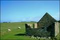
Country Livingby xburnerxComment: Ack it's tilted to the left. :( Not more but it's noticable for sure. Otherwise it's really cool. What I really like about this (and which fits the "magazine title" thing) is the how there is green in the bricks of the building which I think fits the theme well and blends in with the green of the pasture. |
| Photographer found comment helpful. |
| 03/23/2004 12:12:39 AM |
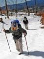
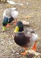
Ducks Unlimitedby nsoroma79Comment: Real magazine? Sometimes I think people make up these mag names. :) If this really is a magazine, this would be a GREAT cover shot. The only thing would be to remove that rock in the foreground near the ducks right foot. |
| Photographer found comment helpful. |
Home -
Challenges -
Community -
League -
Photos -
Cameras -
Lenses -
Learn -
Help -
Terms of Use -
Privacy -
Top ^
DPChallenge, and website content and design, Copyright © 2001-2025 Challenging Technologies, LLC.
All digital photo copyrights belong to the photographers and may not be used without permission.
Current Server Time: 08/27/2025 02:24:55 PM EDT.