| Image |
Comment |
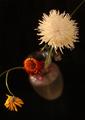
| 02/24/2003 10:40:02 AM |
Sullenby RiderGalComment: Excellent lighting and composition. This is a very strong photo! The dof is used well to help create your mood. |
 Photographer found comment helpful. Photographer found comment helpful. |
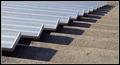
| 02/23/2003 02:27:11 PM |
Grandstand Piano Keysby DougPazComment: Very unique perspective. This is a good shot with very good leading lines. It's in my top 10 this week! |
| Photographer found comment helpful. |
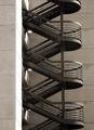
| 02/23/2003 02:26:01 PM |
Up The Wallby ShiiizzzamComment: The curves presented here in contrast to the hard lines of the building make for a nice composition. I also like the crop at the top and bottom, it is a very pleasing symetery. Your decision to desaturate was also good, it makes the steel of the stairs seem that much cooler. Great shot, in my top 10 this week! |
| Photographer found comment helpful. |
| 02/23/2003 02:22:57 PM |
|
| Photographer found comment helpful. |
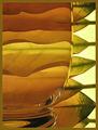
| 02/23/2003 02:21:30 PM |
Harmonyby JeanComment: Excellent use of refraction. The pattern is unique and so clear. Excellent lighting. Perfect shot! In my top 10 this week! |
| Photographer found comment helpful. |
| 02/23/2003 02:16:26 PM |
Structures of an Old Factoryby nathaliedooComment: Critique Club Comment:
You really have a nice perspective here. The combination of the cold steel with the cool blue sky are a nice combination. Without being able to modify the perspective in post processing, this angle is good. Your decision to square the tunnel at the end works well. My eye is drawn to it and it makes me wonder whats beyond. Your technical skill is good. There are no artifacts or over sharpening problems. I like the colors here, they make me feel small within this structure. I'm not sure a square crop was the best decision here, but you probably chose it to exclude some undesirable building on the right.
You have a strong shot here! Good Job!
-danny |
| Photographer found comment helpful. |
| 02/17/2003 12:30:16 AM |
She Measures Upby ShiiizzzamComment: Tone and lighting are perfect. Your off center crop with the tailing tape off the edge of the frame lead the eye through the frame nicely. Well done! |
| Photographer found comment helpful. |
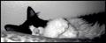
| 02/11/2003 10:18:09 AM |
Caught Nappingby AnnidaComment: Critique Club Comment:
Knowing the camera you're working with, I will try to address what you can do from a composition stand point more then from a technical stand point.
What you can work most with is composition. That means to me, filling the frame with just enough content to make your statement. Less is usually more. In this shot it's not a matter of too much content, but perhaps the angle from which it is taken. Being that the camera is limited in its DOF and focus range, having the low angle with the pillow in the foreground is not as pleasing to the eye. Perhaps a higher camera angle to capture more of the cat's head and less pillow and would have made a stronger composition. This too would have had you shooting down at the cat some causing the less glare from the wall behind it. With the lighting coming from what appears to be an on camera flash, you will have a challenge with lighting indoor subjects well. You will need extra light to fill in where the flash can't. In this shot you can see that the right part of the photo is much darker then the rest. Working with a sleeping cat is tough enough, but maybe putting a reflective white surface out of sight above the cat so as to bounce some light down on her would have evened your lighting across her. Color, or lack of it. I appreciate the pink nose and the desaturation of color, but in this case, I think either a complete black and white with a good gradient, or full color would have been stronger. What you have now looks like the camera is unable to correctly capture colors. I'm all for artsy shots, just make sure that you pull it off to the rest of your audience. Post processing is critical too. Learn to use curves, brightness contrast, hue/saturation and unmask sharp. These are invaluable with any photo, be it a $50 webcam or a $2000 DSLR.
I like the crop on this photo, and the cat looks cute.
You have a strong desire to push your photography further, just start with paying attention to composition and lighting. The rest will follow.
Good Luck! |
| Photographer found comment helpful. |
| 02/10/2003 08:49:43 AM |
|
| Photographer found comment helpful. |
| 02/10/2003 08:49:05 AM |
Two Classics by JackoComment: Beautiful shot! Well deserved win. The pattern in the drop really makes this shot!
-danny |
| Photographer found comment helpful. |
Home -
Challenges -
Community -
League -
Photos -
Cameras -
Lenses -
Learn -
Help -
Terms of Use -
Privacy -
Top ^
DPChallenge, and website content and design, Copyright © 2001-2025 Challenging Technologies, LLC.
All digital photo copyrights belong to the photographers and may not be used without permission.
Current Server Time: 06/16/2025 07:44:26 PM EDT.