| Image |
Comment |
| 10/30/2008 10:19:59 AM |
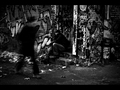
Grafitti Alley Rejectby VitaminBComment: While it may not have been, this image looks a little bit contrived and planned. That being said, the post processing is great. I like the b/w conversion. I do think your shutter speed may have been just a little slow as the person is just a bit too blurred. Also, the area to the right of the image does not add to it. A square crop, cropping out the right 1/4 of the image will bring the viewers eyes to the subject on the left. As it is now, I drift off to the right and don't return. |
 Photographer found comment helpful. Photographer found comment helpful. |
| 10/29/2008 10:11:49 PM |
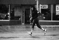
Lonely Mondayby SandyPComment: Moving the browser size I cropped off the top of the image from above the white wall on the right, making it almost a square composition, and I find that it is a stronger image keeping the eye down to your subject matter. Don't be afraid to crop out things that pull the eye away from your main subject. |
| Photographer found comment helpful. |
| 10/29/2008 10:04:09 PM |
Black and Whiteby BlackboxComment: What are you telling me with this photo? I see a leg out an open door. Not much else going on here. The composition is ok, but without a main subject the image doesn't hold the viewer's interest. |
| Photographer found comment helpful. |
| 10/29/2008 09:56:24 PM |
Mobile Homeby ButterflyGirlComment: Capture the face and convert to black and white and you have a strong picture. As it is with the high sun, the subject looking away, we can almost feel his pain, but there is too much left for us to try and figure out. |
| Photographer found comment helpful. |
| 10/29/2008 09:39:19 PM |
The Sparkle in Her Eyesby muur88Comment: I like the composition with the lady coming up the stairs, but your post processing has me distracted with the halos around the hand and feet. |
| Photographer found comment helpful. |
| 10/29/2008 09:32:00 PM |
getting acrossby posthumousComment: Rain drops are nice, otherwise the image feels like a random capture entered into the challenge. |
| Photographer found comment helpful. |
| 10/29/2008 09:30:27 PM |
|
| Photographer found comment helpful. |
| 10/29/2008 09:25:41 PM |
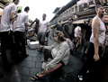
Conversation & Coffeeby iMacDaddyX2Comment: Focus in on the main subject by cropping off the edges of the image. They pull my eyes off the people. Also, while not easily done, if you captured her with the cup to her mouth it'd have added life to the shot. As it is, it's a pretty dormant image. |
| Photographer found comment helpful. |
| 10/29/2008 09:20:37 PM |
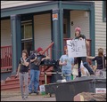
Sign of the Timesby fuzzytComment: I think having the subject looking at the camera adds interest, but otherwise I feel this shot is a shot you took while walking by. There appears to be little post processing to enhance the main subject, which I take as the person holding the sign. There is a lot of distraction going on. Zoom in, crop, dodge and burn, do something to bring your subject as the main focal point so the viewer doesn't just wander through the shot. |
| Photographer found comment helpful. |
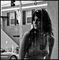
| 10/29/2008 09:17:40 PM |
You Don't Know Meby JuliBocComment: While I like the square crop, I think the traffic light and wire at the top pull the eye away from your subject. The image otherwise is outstanding and a great capture with good post processing. Crop it down just a little on the top, and you have a frameable photo to be proud of. |
| Photographer found comment helpful. |
Home -
Challenges -
Community -
League -
Photos -
Cameras -
Lenses -
Learn -
Help -
Terms of Use -
Privacy -
Top ^
DPChallenge, and website content and design, Copyright © 2001-2025 Challenging Technologies, LLC.
All digital photo copyrights belong to the photographers and may not be used without permission.
Current Server Time: 12/21/2025 12:13:36 AM EST.