| Image |
Comment |
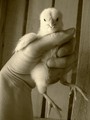
| 03/24/2006 03:07:47 PM |
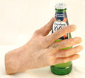
Last Beerby KHoltComment: Nice idea, composition, sharpness on bottle. Wish that the hand were clearer or real. |
 Photographer found comment helpful. Photographer found comment helpful. |
| 03/24/2006 03:07:08 PM |
Messiah Complexby blackenedwhiteComment: Nice idea, strong and emotive. Writing looks more orange than red to me, and faded out. More sharpness on hand and clean red lettering would be better, and maybe consider adding a blood drop or two below the target. |
| Photographer found comment helpful. |
| 03/24/2006 02:55:32 PM |
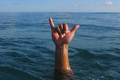
Local Motion - Hanglooseby gliphixComment: Nice idea and composition, clarity, color. I think that the additional element of a surfboard behind the hand would really make the shot. |
| Photographer found comment helpful. |
| 03/24/2006 02:53:51 PM |
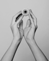
Hand Eye Coordinationby dsa157Comment: Nice idea and composition. Nice duotone choice, but feels too midtone gray, consider brightening the levels to compensate, e.g., real white in the whites of the eye. Would be really effective if you retained the blood-shot red color. |
| Photographer found comment helpful. |
| 03/24/2006 02:28:29 PM |
|
| Photographer found comment helpful. |
| 03/24/2006 02:27:20 PM |
|
| Photographer found comment helpful. |
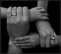
| 03/24/2006 02:23:48 PM |
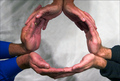
Family Unityby FotoMunkiComment: Nice idea ala Oppenheimer Funds. Nice duotone choice, but overall image feels too gray - please consider adjustment to brighter levels. |
| Photographer found comment helpful. |
| 03/24/2006 02:23:41 PM |
Handheldby pepitoidComment: Nice pose, hand and arm position, head tilt. Body makeup seems striking but unnecessary given pose. Slightly brighter levels and crop-out some left and bottom might be better. |
| Photographer found comment helpful. |
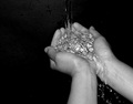
| 03/24/2006 02:19:59 PM |
let it flowby NikmaComment: Nice duotone choice, but feels too midtone gray, consider brightening the levels to compensate. |
| Photographer found comment helpful. |
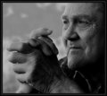
| 03/24/2006 02:18:20 PM |
Worryby espy2Comment: Nice capture full of character. Nice duotone choice, but overall image feels too dark - please consider adjustment to brighter levels. |
| Photographer found comment helpful. |
Home -
Challenges -
Community -
League -
Photos -
Cameras -
Lenses -
Learn -
Help -
Terms of Use -
Privacy -
Top ^
DPChallenge, and website content and design, Copyright © 2001-2025 Challenging Technologies, LLC.
All digital photo copyrights belong to the photographers and may not be used without permission.
Current Server Time: 08/28/2025 04:21:00 PM EDT.