| Image |
Comment |
| 06/12/2003 12:15:38 AM |
NATIONAL GEOGRAPHICby MorganComment: nice photo. I would like to have seen the image more in the shape of the magazine and the border looks a little green on my monitor rather than gold. I like the tounge too. |
 Photographer found comment helpful. Photographer found comment helpful. |
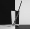
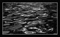
| 05/26/2003 11:32:02 PM |
Black & white H2Oby ladpupmoeComment: nice compostion, a little dark or dull, could be improved with levels to increase contrast and a little sharpening might help. |
| Photographer found comment helpful. |
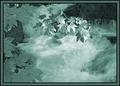
| 05/26/2003 11:30:03 PM |
Inkyby marcoComment: great composition, the foreground is interesting with the flowers and the large shape, but not overpowering because of the overall tone of the image, good midrange and the curve off into the distance. nice placement of the flowers in the lower left and the edge of the bank on the lower right, the buildings in the upper left and the distant curve in the upper right. 10 |
| Photographer found comment helpful. |
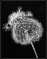
| 05/26/2003 11:25:29 PM |
Bad Hair Dayby SonifoComment: it doesn't look natural, i would have liked it much better without the extra seeds on top. |
| Photographer found comment helpful. |
| 05/26/2003 11:24:25 PM |
|
| Photographer found comment helpful. |
| 05/26/2003 11:18:24 PM |
Rock Creek Runningby kavamamaComment: interesting lighting, almost abstract. it looks almost like a solarization filter was applied to it. |
| Photographer found comment helpful. |
| 05/26/2003 11:11:39 PM |
Aria, 10 days oldby RobroComment: the lighting puts a little too much accent on the clothing and i would have preferred the subject looking at the camera. i generally like to look into the eyes of people, especially babies eyes that show the innocence and wonder and joy. 6 |
| Photographer found comment helpful. |
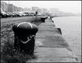
| 05/26/2003 11:07:01 PM |
Mooringby crabappl3Comment: i like the dof and the image has great tone to it, although it\'s too busy. 6 |
| Photographer found comment helpful. |
| 05/26/2003 11:05:42 PM |
Water Sculptureby wayne9232Comment: this image has a nice quality to it with the separation of the highlights, midtones, and shadow areas. it's neat to look and is a really good abstract. |
| Photographer found comment helpful. |
| 05/26/2003 10:57:49 PM |
The Loneliest Oneby BigSmilesComment: you gambled a little with an artsy presentation and i like it. it looks a little like an ice storm and a little like an infared image. the light and dark layers: sky, distance, midground, and foreground make this a very interesting image. 8 |
| Photographer found comment helpful. |
Home -
Challenges -
Community -
League -
Photos -
Cameras -
Lenses -
Learn -
Help -
Terms of Use -
Privacy -
Top ^
DPChallenge, and website content and design, Copyright © 2001-2025 Challenging Technologies, LLC.
All digital photo copyrights belong to the photographers and may not be used without permission.
Current Server Time: 08/04/2025 05:55:22 PM EDT.