| Image |
Comment |
| 10/07/2005 08:46:39 PM |
African Violetby holyfamComment: Brilliant bold colors on the yellows, purples and yes, greens. The lighting is very good. Techniqually good but the composition is weak. The only thing that weakens the strength of the shot is that the straight eye level shot does not hold the eye's interest for long. It has no 'umph' or pizzaz that makes it unique. A change in shooting angle (i.e. a side shot with the camera looking up at this floral arangement) can add a whole new dimension/ a new way of looking at this flower that will make the viewer stop, stare, and smell the flowers. |
 Photographer found comment helpful. Photographer found comment helpful. |
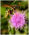
| 10/07/2005 08:41:39 PM |
Bee's Dinerby BKerrComment: Very nice close-up. The yellows and purples do well together here. The sharpness and clarity on the hornet and the flower is "sharp as a tack". My only critique is that a square crop might frame this shot and the action going on far better than the vertical rectangle here. A closer crop would get the viewer even more "up close" and personal with this nature scene. |
| Photographer found comment helpful. |
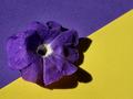
| 10/07/2005 08:36:29 PM |
My Petuniaby KarenNfldComment: Nice bold hues on the purple and the yellow. I like the beginnings of the abstract which has a "still life" (the flower) thrown in for added interest. However I think the placement of the flower weakens the composition. I would have been better to have moved the purple flower to be in the yellow triangle area - giving the impression that the purple is escaping outside the confines/border of it's color. Not to mention it would give an off balance presentation in the colors and their positions such that it captures and holds the eye's attention. If you wanted to go for a fully balanced symetry shot it would have contained a yellow flower in the purple triangle and the purple flower in the yellow triangle. |
| Photographer found comment helpful. |
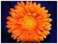
| 10/07/2005 08:30:57 PM |
Orange Beautyby stekComment: Brilliant, bold orange zinnia that just jumps out at the viewer's eye. While beautiful it is not as sharp in details as it could be especially around the petals. I would have preferred a cropped version that had the whole flower captured within the frame - as it stands here it the edges are chopped off both top and bottom. The blue background is a tad too dark and some of that beautiful shade of royal blue is lost in the shadows. |
| Photographer found comment helpful. |
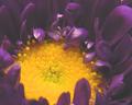
| 10/06/2005 10:25:22 AM |
Mum's the Wordby mkalandrosComment: Better lighting could have really made this image "pop" off the screen. As the picture stands the lighting gives it a dull flat look especially to the purples which I envision as really being a deep rich purple hue. Not to mention some of the sheen on the purple petals causes them to appear "plastic". |
| Photographer found comment helpful. |
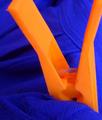
| 10/06/2005 10:22:39 AM |
Complementary Hang Out.by Penny LaneComment: The colors are bold and vibrant and the idea is good, but it could have been composed better. Since the title plays on the idea of "clothes hanging out to dry" it might have improved the image if you had used the orange clothes pin to hold this blue cloth on a clothesline (or at least just give it the appearance of such) that actually shows a bit of that clothesline in the shot. It would still be a close-up shot but it would show the sceen from a different angle in that the viewer is given the impression that they are standing at eye level and zeroing on just a small portion of viewing clothes hanged outside to dry. |
| Photographer found comment helpful. |
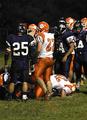
| 10/06/2005 10:15:38 AM |
Blue 45 Orange 14by LN13Comment: I am rather confused at the title for when looking at the image itself I see the player numbers of 25 and 22 primarily that I don't think of the team scores. I think a tighter focus on those two numbered players would have made for a better capture. The oranges on the team uniform are definately vibrant and bold but the blue hues on the other teams is just too deep and dark to be really noticeable in this light other than what we see in the highlighted sheen coming off the pants and shirt sporadically. |
| Photographer found comment helpful. |
| 10/06/2005 10:11:06 AM |
Low Tideby MichaelCComment: A tighter focus on the boats with less "empty space" of the sandy beach surrounding them would have immediately called our attention to the colors within the boats. As the image stands now, the viewer notices the beach and two boats sitting there at first glance. Then after we look at it for short while we notice more of the details. A tighter composition that primarily just contains the two boats within the frame would capture our attention more readily. |
| Photographer found comment helpful. |
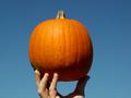
| 10/06/2005 10:05:44 AM |
Orange on Blueby HighwayFlowerComment: You know I had thought about doing a pumpkin with a carved face and lit from within by a blue light on a black background:-) The orange of the pumpkin could be a richer hue if it was paired with a blue that is not a flat blue seen here in the sky (just a thought, perhaps if you had laid the pumpkin on a velvet cloth of royal blue it would have made for a richer hue on both colors). Also the hand holding the pumpkin detracts from the main focus which would have been just the pumpkin with the blue sky as a backdrop. |
| Photographer found comment helpful. |
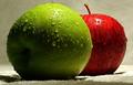
| 10/06/2005 09:58:58 AM |
Natural Complementsby havy2008Comment: I like the water drops on the apples for it invokes the idea of natural juices and gets the taste buds watering to take a bite out of the apples pictured. Lighting on the apples is good and compliments them well with regards to illumination and play of shadows. The main thing that robs the strength of this image is the choice of background and floor plane. The beige white does not compliment the composition. Perhaps a deep black one would have because it would have made the green and red "pop" off the page. Or possibly a deep rich brown one could have added some 'warmth' to the scene. |
| Photographer found comment helpful. |
Home -
Challenges -
Community -
League -
Photos -
Cameras -
Lenses -
Learn -
Help -
Terms of Use -
Privacy -
Top ^
DPChallenge, and website content and design, Copyright © 2001-2025 Challenging Technologies, LLC.
All digital photo copyrights belong to the photographers and may not be used without permission.
Current Server Time: 09/04/2025 02:54:57 PM EDT.