|
|
|
Showing 541 - 550 of ~781 |
| Image |
Comment |
| 10/01/2006 10:39:09 AM | Summoningby LouisComment: gorgeous. very nice. hope this one ribbons. 8 |  Photographer found comment helpful. Photographer found comment helpful. |
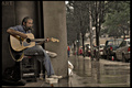
| 10/01/2006 10:38:05 AM | Milk Crates Hold A Legacyby Vapor63Comment: great image. looks a lot like eric clapton. good luck w/ this. only thing i would have fixed is straightened the vertical line of the building, but that's just a nitpic. great great job. 7 | | Photographer found comment helpful. |
| 09/22/2006 03:19:42 PM | | | Photographer found comment helpful. |
| 09/16/2006 10:50:47 AM | | | Photographer found comment helpful. |
| 09/15/2006 07:06:00 PM | | | Photographer found comment helpful. |
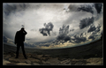
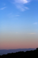
| 09/15/2006 06:19:00 PM | TV towerby gocComment: Hello from the Critique club, my name is Jon Rowe, and i will be looking at your image this evening :)
i love minimalistic photos such as this. this was done very well. i think that the colors go very well together, and that the contrasts from the dark tress to the bright, vibrant blue is great.
only thing i would have probably done is maybe dodge the hightlights/midtones of those clouds a little. that would make them pop, but on the other hand you have that taking away from the minimalistic feel of the entire image, so either way, this is great.
i guess what i'm trying to say is that this photo was greatly underrated, and should have scored higher. but. that being said, you should definitely be proud of this image, and it's a fine addition to an already fantastic portfolio :) great job
Keep on shootin!
Good luck on your future challenges:)
-Jon Ed Rowe | | Photographer found comment helpful. |
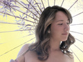
| 09/15/2006 06:16:18 PM | Yellow Umbrellaby Breeee123Comment: Hello from the Critique club, my name is Jon Rowe, and i will be looking at your image this evening :)
your model, and the pose, is absolutely breathtaking. such beauty. the only nitpic is it's overexposed. maybe if you could have defused the lights a little more, the backlighting wouldn't have taken over so much. i really think that possibly a faster shutter speed than 1/60th would have been better, maybe around 1/120 or so. this would have given a lot more crisp focus on her hair, and on her face as well, and toned down the lighting coming through the umbrella.
nonetheless, this is an absolutely gorgeous photo, and you did very well on it :) great score too :)
Keep on shootin!
Good luck on your future challenges:)
-Jon Ed Rowe | | Photographer found comment helpful. |
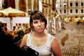
| 09/15/2006 06:13:07 PM | "a light, pale tint of color".by LokiComment: Hello from the Critique club, my name is Jon Rowe, and i will be looking at your image this evening :)
this is a great image, and i think the skintone and the background work well together to fit the challenge. i honestly can't think of anything to improve this picture. gotta love that 50mm 1.8, huh? very sharp/fast lens. only thing that grabs my attention is the pose, maybe having her right arm up as well, for it looks somewhat uncomfortable and unnatural, but that's nitpicking, because i have to right? :) this is an incredible picture. great job :)
good luck on your future challenges :)
-jon ed rowe | | Photographer found comment helpful. |
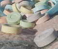
| 09/15/2006 05:45:16 PM | Pastel Candiesby snafflesComment: Hello from the Critique club, my name is Jon Rowe, and i will be looking at your image this evening :)
Composition/Lighting : The composition is very interesting in this photo. i like it, but i believe the "ground" or "bottom" of this shot could have been a better material. maybe a black felt sheet or something like that. this would really bring out the pastel colors, where they get lost in the busy background with this. The lighting on this is rather harsh. too much direct like, maybe? maybe a softer, more diffused light could be used to really get some shadows going. very flat light used here. great photo nonetheless, you did very well.
Challenge : it definitely fits the challenge. the colors are beautiful. i like the assortment of colors you chose as well. they just, like said earlier, tend to get lost in the background, which is a close color to the candies. try it w/ a black background and softer light, and i think you'll be impressed w/ the outcome.
Conclusion : very nice job here, and not a bad score. keep on shooting and see what you get w/ this idea. i think you had a great idea, and executed it quite well.
Keep on shootin!
Good luck on your future challenges:)
-Jon Ed Rowe | | Photographer found comment helpful. |
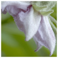
| 09/15/2006 05:38:34 PM | Powder Puffby SherwinJamesComment: Comment:
Hello from the Critique club, my name is Jon Rowe, and i will be looking at your image this evening :)
Composition/Lighting : lighting and composition on this image really seems to be great. i think the only nitpick i can think of would be would be that it's just so soft, no real visible focus point, which throws the eye all over the place looking for a subject. great picture though. real nice abstract feel to it, and great colors.
Challenge : this without a doubt really meets the challenge. those colors are beautiful. they really pop. very nice job.
Conclusion : very nice score w/ this poetic image. i really enjoyed viewing your submission. might try some more dramatatic, darker lighting with this, and see what you think. i like it as is, but it's always fun to play around,especially with such a beautiful subject.
Keep on shootin!
Good luck on your future challenges:)
-Jon Ed Rowe | | Photographer found comment helpful. |
|
Showing 541 - 550 of ~781 |
Home -
Challenges -
Community -
League -
Photos -
Cameras -
Lenses -
Learn -
Help -
Terms of Use -
Privacy -
Top ^
DPChallenge, and website content and design, Copyright © 2001-2025 Challenging Technologies, LLC.
All digital photo copyrights belong to the photographers and may not be used without permission.
Current Server Time: 06/20/2025 12:14:13 PM EDT.
|