| Image |
Comment |
| 10/10/2005 09:40:41 AM |
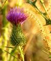
Autumn In Bloomby GolferDDSComment: Fine closeup shot of the thistle, great depth of field. Unfortunately, the green in the shot destroys the complementary colour contrast between the violet and the yellow colours. |
 Photographer found comment helpful. Photographer found comment helpful. |
| 10/10/2005 09:39:15 AM |
I used to be green too, you know !by maessengerComment: Complementary colours are pairs of colours that contrast strongly when compared to each other.
The blue-green of this car calls out for more red rather than yellow in the picture, or else the orange-yellow in the trees requires more blue tones in order to demonstrate the complementary colour contrast.
Check some of the forum discussions on complementary colours for suggestions on using colour for contrast.
|
| Photographer found comment helpful. |
| 10/10/2005 09:35:52 AM |
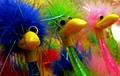
Coloured figuresby mannjuditComment: There are too many complementary pairs here to demonstrate the effect of one colour contrasted against its opposite. If your shot showed only the blue and yellow toys, with the same composition and depth of field, you would have had a fine demonstration of complementary colour contrast.
But just looking at the birds with their wierd expressions, I like them better with all their colours... more energy and more fun for carnival toys! |
| Photographer found comment helpful. |
| 10/10/2005 09:30:57 AM |
Blue or Brown ?by gaurawaComment: Actually, the yellow tone in the lower right takes away from the red/green complementary colour contrast in this photo. |
| Photographer found comment helpful. |
| 10/10/2005 09:29:23 AM |
lightsby erainmanComment: Complementary colours are pairs of colours that contrast strongly when compared to each other.
The colours are so desaturated that the blues and the oranges do not demonstrate the effect of complementary colour contrast. Your image demonstrates a duotone effect rather than the effect of complementary colours.
|
| Photographer found comment helpful. |
| 10/10/2005 09:26:16 AM |
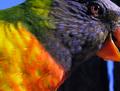
POLLYby megryanComment: Unfortunately there are too many complementary pairs here to demonstrate the effect of one colour contrasted against its opposite. If the shot had shown more of the bird's orange eye and beak against the blue feathers of its head, and the photo been cropped to remove the green, yellow and red tones in the body, that would have been a better demonstration of complementary colour contrast.
Nevertheless, I love the colourful look in the bird's eye! |
| Photographer found comment helpful. |
| 10/10/2005 09:22:24 AM |
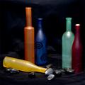
Missing One ...by tonyvComment: Unfortunately there are too many complementary pairs here to demonstrate the effect of one colour contrasted against its opposite. If you had selected, say the blue bottle with the spirals and either the yellow bottle or the orange bottle, you would have had a good demonstration of complementary colour contrast. Nice blue tones in the background and in the rocks would have added to the effect.
|
| Photographer found comment helpful. |
| 10/10/2005 09:19:31 AM |
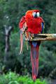
Pretty Pollyby Mr_PantsComment: Unfortunately there are too many complementary pairs here to demonstrate the effect of one colour contrasted against its opposite. If the foliage behind the bright red bird had been the bright green that it is at the bottom, that would have been a great demonstration of complementary colour contrast.
Nevertheless, this is a nice photo of a colourful bird. |
| Photographer found comment helpful. |
| 10/10/2005 09:17:54 AM |
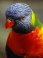
red and blueby slonkoComment: Fantastic shot of the bird's plumage!
Unfortunately there are too many complementary pairs here to demonstrate the effect of one colour contrasted against its opposite. If the bird's eye and beak could have shown more orange against the blue feathers on its head, that would have been a great demonstration of complementary colour contrast.
Nevertheless, this is a great photo of a colourful bird. |
| Photographer found comment helpful. |
| 10/10/2005 09:11:33 AM |
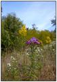
Wildflowersby sibelingComment: Your photo would have demonstrated the effects of complementary colour contrast if you had changed your angle to show the violet flower in the middle against the goldenrod, and then cropped tightly to show just the violet and the yellow colours. |
| Photographer found comment helpful. |
Home -
Challenges -
Community -
League -
Photos -
Cameras -
Lenses -
Learn -
Help -
Terms of Use -
Privacy -
Top ^
DPChallenge, and website content and design, Copyright © 2001-2025 Challenging Technologies, LLC.
All digital photo copyrights belong to the photographers and may not be used without permission.
Current Server Time: 07/31/2025 04:34:09 PM EDT.