| Image |
Comment |
| 10/16/2005 04:20:15 PM |
Mr. Jackby opticoComment: I cannot make a personification, either physical or emotional, out of this image. |
 Photographer found comment helpful. Photographer found comment helpful. |
| 10/16/2005 04:19:46 PM |
Untitledby InnaNComment: I cannot make a personification, either physical or emotional, out of this image. |
| Photographer found comment helpful. |
| 10/11/2005 10:50:11 AM |
rock starby parrotheadComment: Nice photo of a cup of coffee, but sorry, I don't see the connection between this photo and the challenge topic. |
| Photographer found comment helpful. |
| 10/11/2005 10:40:18 AM |
San Quirico d' Orciaby GordonComment: I love the desaturated look that puts attention on the figures near the doorway, but I am disappointed that the woman's face is blurred. Wouldn't mind so much if it were just her hands that were blurred. |
| Photographer found comment helpful. |
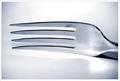
| 10/11/2005 10:32:10 AM |
Forkby SimonkasprzakComment: Nice photo of a fork, but sorry, I don't see the connection between this photo and the challenge topic. |
| Photographer found comment helpful. |
| 10/11/2005 10:31:57 AM |
Baseballby hstegComment: Nice photo of a baseball, but sorry, I don't see the connection between this photo and the challenge topic. |
| Photographer found comment helpful. |
| 10/11/2005 10:24:52 AM |
|
| Photographer found comment helpful. |
| 10/10/2005 09:49:56 AM |
Fairly Funby TammerComment: Too many complementary pairs here to demonstrate the effect of one colour contrasted against its opposite. This is a great demonstration of a primary colour scheme with red and blue and yellow. |
| Photographer found comment helpful. |
| 10/10/2005 09:44:14 AM |
The Observant Redheadby CutterComment: If the greens in the foliage weren't so bright, and if the yellow flowers in the foreground were cropped out, this would be a better demonstration of the effect of complementary colour contrast. |
| Photographer found comment helpful. |
| 10/10/2005 09:41:59 AM |
Ready for vaseby shamrockComment: Too many complementary pairs here to demonstrate the effect of one colour contrasted against its opposite. |
| Photographer found comment helpful. |
Home -
Challenges -
Community -
League -
Photos -
Cameras -
Lenses -
Learn -
Help -
Terms of Use -
Privacy -
Top ^
DPChallenge, and website content and design, Copyright © 2001-2025 Challenging Technologies, LLC.
All digital photo copyrights belong to the photographers and may not be used without permission.
Current Server Time: 07/31/2025 04:34:23 PM EDT.