|
|
|
Showing 111 - 120 of ~177 |
| Image |
Comment |
| 10/08/2005 02:45:56 PM | At The Orchardby popdeepopComment: Complementary colours are pairs of opposite colours that contrast strongly when compared to each other. The challenge called for two complementary colors to compose your photograph but in your photo I see a range of reds, oranges, yellows, greens and blues that give a brilliant effect of colour, but not the effect of tones of a single predominating colour against tones of its opposite or complementary colour.
I think your submission would have been a stronger demonstration of complementary colours if you had chosen a subject with two main colours that are complementary to each other. For example, perhaps you could have cropped the subject to show the scarecrow's blue pants with orange pumpkins in front, or if you had shown green vegetables against the red barn, or the bales of hay with some brighter yellow produce against the sky.
|  Photographer found comment helpful. Photographer found comment helpful. |
| 10/08/2005 02:41:30 PM | Butterflies are Freeby neenee1999Comment: Complementary colours are pairs of opposite colours that contrast strongly when compared to each other. The challenge called for two complementary colors to compose your photograph but in your photo I see reds, oranges, yellows and blues as well as a range of greens, and those colours gives a different effect from tones of a single predominating colour against tones of its opposite or complementary colour.
I think your submission would have been a stronger demonstration of complementary colours if you had cropped the image to show just the girl in her blue/black dress with the goldenrod flower, eliminating the greens altogether, and the butterfly wings, which do not contribute to the complementary colour effect.
| | Photographer found comment helpful. |
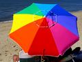
| 10/08/2005 02:28:51 PM | Beach Colorsby jrjrComment: Complementary colours are pairs of opposite colours that contrast strongly when compared to each other. The challenge called for two complementary colors to compose your photograph but in your photo I see an entire spectrum of colours, and that negates the desired effect of a single predominating colour against its opposite or complementary colour.
I think your submission would have been a demonstration of complementary colours if you had chosen a subject, for example, a beach umbrella in red and green, or in blue and orange, with two main colours that are complementary to each other.
As it is, this is a fine photograph of a brilliant spectrum of colours, but it doesn't do what the challenge required.
| | Photographer found comment helpful. |
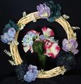
| 10/08/2005 12:01:07 PM | A Bouquet of Complimentsby Melly8522Comment: This was a difficult challenge to work on... people's opinions differ on what the complementary colours are, mainly depending on whether they are working with a system based on Red, Yellow and Blue as their primary colours (subtractive colour) or a system of Red, Green and Blue (additive colour) as their primary colours.
For this challenge, I believe either system is acceptable.
Complementary colours are pairs of opposite colours that contrast strongly when compared to each other. The challenge called for two complementary colors to compose your photograph but in your photo I see red and blue as well as violet and yellow, and that dilutes the effect of tones of a single colour (violet) against tones of its opposite or complementary colour (yellow).
I think your photo would have been a stronger demonstration of complementary colours if you had replaced the central flowers with another bouquet of flowers closer in tones to violet.
Nevertheless, this is a great shot of the textures in the wreath.
| | Photographer found comment helpful. |
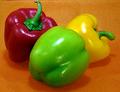
| 10/08/2005 11:52:37 AM | An Exercise in. . .by drydocComment: This was a difficult challenge to work on... people's opinions differ on what the "complementary colours" are, mainly depending on whether they are working with a system based on Red, Yellow and Blue as their primary colours ("subtractive colour") or a system of Red, Green and Blue ("additive colour") as their primary colours.
For this challenge, I believe either system is acceptable.
Complementary colours are pairs of "opposite" colours that contrast strongly when compared to each other. The challenge called for "two complementary colors to compose your photograph" but your photo shows yellow and orange as well as red and green, and that dilutes the effect of a single colour (green) against its opposite or complementary colour (red).
Nevertheless, this is a fantastic shot of the peppers and I think it's mouthwatering good, to boot!
I think your photo would have been a stronger demonstration of complementary colours if you had replaced the yellow pepper with another red or green one and shot against a neutral background of black, white or grey.
| | Photographer found comment helpful. |
| 10/08/2005 11:44:44 AM | Blue and Red, with a dash of Lemonby fredandaudComment: This was a difficult challenge to work on... people's opinions differ on what the "complementary colours" are, mainly depending on whether they are working with a system based on Red, Yellow and Blue as their primary colours ("subtractive colour") or a system of Red, Green and Blue ("additive colour") as their primary colours.
For this challenge, I believe either system is acceptable.
Complementary colours are pairs of "opposite" colours that contrast strongly when compared to each other. The challenge called for "two complementary colors to compose your photograph" but your photo shows reds, blues, yellows and greens, and it gives the vibrant effect of primary colours, rather than the effect of a single colour against its opposite (complementary) colour.
I think your photo is a great demonstration of primary colour and texture, but not of complementary colours. Sorry!
| | Photographer found comment helpful. |
| 10/08/2005 11:38:19 AM | Black and Whiteby banditComment: Complementary colours are pairs of colours that contrast strongly when compared to each other.
Black and white are neutrals and not colours at all, and therefore they cannot be complementary colours... white shows the presence of light, and black shows the absence of light. Black and white areas next to each other do demonstrate high contrast, but high contrast gives a different visual effect than complementary colours do in a picture.
Check some of the forum discussions on complementary colours for suggestions on using colour for contrast.
| | Photographer found comment helpful. |
| 10/08/2005 11:36:16 AM | Black and White: Fear of Shadowsby TheLittleIslandComment: Complementary colours are pairs of colours that contrast strongly when compared to each other.
Black and white are neutrals and not colours at all, and therefore they cannot be complementary colours... white shows the presence of light, and black shows the absence of light. Black and white areas next to each other do demonstrate high contrast, but high contrast gives a different visual effect than complementary colours do in a picture.
Check some of the forum discussions on complementary colours for suggestions on using colour for contrast.
| | Photographer found comment helpful. |
| 10/08/2005 11:35:48 AM | B&W Theoretical Complimentsby iamkmaniamComment: Complementary colours are pairs of colours that contrast strongly when compared to each other.
Black and white are neutrals and not colours at all, and therefore they cannot be complementary colours... white shows the presence of light, and black shows the absence of light. Black and white areas next to each other do demonstrate high contrast, but high contrast gives a different visual effect than complementary colours do in a picture.
Check some of the forum discussions on complementary colours for suggestions on using colour for contrast.
| | Photographer found comment helpful. |
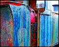
| 10/08/2005 11:33:28 AM | Tidy Catby Bear_MusicComment: Complementary colours are pairs of colours that contrast strongly when compared to each other. The complementary colours I see in your image are
blue/yellow.
The challenge called for "two complementary colors to compose your photograph" but your photo shows more than two colours, violet, green, as well as neutrals black, white and greys... and that dilutes the visual effect of a single colour against its opposite (complementary) colour.
I think your photo would have been stronger if you had grouped the yellow containers with the blue labels and cropped tightly around them. The resulting photo would have been a very interesting geometric composition.
| | Photographer found comment helpful. |
|
Showing 111 - 120 of ~177 |
Home -
Challenges -
Community -
League -
Photos -
Cameras -
Lenses -
Learn -
Help -
Terms of Use -
Privacy -
Top ^
DPChallenge, and website content and design, Copyright © 2001-2025 Challenging Technologies, LLC.
All digital photo copyrights belong to the photographers and may not be used without permission.
Current Server Time: 08/02/2025 05:15:21 AM EDT.
|