|
|
|
Showing 331 - 340 of ~431 |
| Image |
Comment |
| 10/23/2005 03:28:34 PM | |  Photographer found comment helpful. Photographer found comment helpful. |
| 10/23/2005 03:20:23 PM | Fall Funby holyfamComment: I wish I could see more of her face! She looks liks she's really deep on thought, which conflicts with the "fun" feeling of the scene. Nice and sharp and colorful though. | | Photographer found comment helpful. |
| 10/23/2005 03:18:19 PM | | | Photographer found comment helpful. |
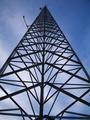
| 10/23/2005 03:17:23 PM | Radio Towerby Penny LaneComment: There's nothing very interesting about this photo, other than the geometry. I wish there was a little more detail (lighting) in the structure. | | Photographer found comment helpful. |
| 10/23/2005 02:49:24 PM | | | Photographer found comment helpful. |
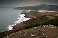
| 10/23/2005 02:32:02 PM | Autumn at the coastby tazzaComment: A very pretty scene, though I might wish for a little more contrast. Also, the falloff in the top corners distracts noticibly. | | Photographer found comment helpful. |
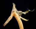
| 10/19/2005 01:21:55 AM | It kept looking at me!by sfaliceComment: Greetings from the Critique Club! :)
My first impression when I look at this photo: "What is that, and what does it have to do with personification?"
Relation to the Challenge: This is the biggest problem with this photo for me. Of course there are different definitions of �personification,� but the one listed in the challenge details was to photograph something that �shows human characteristics" (emphasis mine). Personally, when I look this photo, it looks more like an animal: a horse, or a sea-horse, or something. I would have voted this picture down a bit for that reason. Also, as I alluded in my �first impression,� it takes a minute to get the picture.
Composition: This photo is well composed. It follows the normal �laws� of composition, and the �eye� is square on one of the Rule of Thirds intersections. Also, the strong lines of the different stems lead the eye cleanly around the picture.
Background: The plain black background is perfect for this picture. Since there�s important detail in the subject, any background would have distracted the viewer; your choice of plain black prevents that from happening. Great choice here.
Photographic Technique: The lighting is very good. It is at just the right level, it is even, and consistent. The shot is sharp and well focused. Good use of depth of field. I like how the spiral piece of the stem on the right fades out of focus. A minor nit to pick is that the �nose� in the foreground (bottom left) also fades out of focus, where I think it should stay in focus through its entire length. That�s a minor nit though, and I wouldn�t have detracted from your score for it.
Post-Processing: Also well done. Not over sharpened, not over saturated, just right. You didn�t do anything excessive, and it shows.
Overall Opinion: You have captured a neat image, but it�s a bit like the woman who sees the Virgin Mary in a slice of toast� you�ve got to stretch a bit to make it work. Without the link through the title, I wouldn�t ever think of personification when I look at this photo. A photo that stands on its own, without needing the title to provide the link, is always going to be a stronger photo that scores better. You scored as well as you did on the technical merit, which is very strong, but it�s not a totally appropriate photo for the challenge.
Finally, I'd like to ask you to consider critiquing the critique. :) Just as you're here to learn about photography, I'd like to learn about giving better critiques. If you have any comments, even if it's just "Thanks!" please drop me a PM.
Good Luck with your future entries!
| | Photographer found comment helpful. |
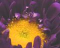
| 10/18/2005 04:24:38 PM | Mum's the Wordby mkalandrosComment: Greetings from the critique club! :)
First impression: This looks almost like it was taken through a microscope or something. The petals look plastic, and there's almost TOO much dimensionality here!
Relation to the Challenge: A great use of Complementary Colors. Fits the challenge perfectly.
Composition: As I hinted at in my "First Impression" I don't care for the composition of this shot. I do like the petals in the foreground at the bottom left. They add an element of 'grounding' to the photo. I think with a slightly different angle, or perhaps some out-of-focus background, the shot would feel better. Finally, there's a little bit of yellow at the top right corner of the picture that should either be cropped out or explored further.
Background: Not much to say here, as you didn't use one. I think if you had used a lower angle and included some backdrop (out of focus) it would have given a better feel to the photo. As it is I feel almost like i'm looking through a microscope at the flower.
Photographic Technique: The image seems soft overall, as if there's nothing in focus. That is one of the most troubling aspects to this photo, it lacks overall sharpness. Second, the lighting seems off overall, the reflectivity of the petals just above the center of the flower is distracting. Perhaps this was shot too close to the subject, closer than the minimum focusing distance for your camera/lens?
Post-Processing: No details given, so I can't comment much. I'd suggest some Unsharp Mask to give more definition to the edges of the petals.
Overall Opinion: A good effort, but the technical faults detract too much for it to be a ribbon contender. The subject has a lot of promise, I espically like the texture of the center of the flower, but the lack of sharpness prevents me from exploring it fully.
Finally, I'd like to ask you to consider critiquing the critique. :) Just as you're here to learn about photograpy, I'd like to learn about giving better critiques. If you have any comments, even if it's just "Thanks!" please drop me a PM.
Good Luck with your future entries!
---livitup | | Photographer found comment helpful. |
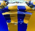
| 10/12/2005 10:48:18 PM | Fragmentationby MarkComment: Greetings from the critique club! :)
First impression: Interesting.
Relation to the Challenge: As others have commented, yellow and blue are not complementary colors. I won't beat that horse any further into the ground. I do think that it's an interesting study of colors, and the refraction inside the crystal makes an interesting juxtoposition of colors.
Composition: As is usually the case with abstract photos there's no naturally clear focal point, so it's up to the photographer to provide one. That's something that you really didn't do here. When I first looked at the picture my eyes were immediatley drawn to the two marks in roughly the center of the image (I imagine they are manufacturer's marks that are refracting as well). Since there are two identical ones right next to each other, my eyes hop back and forth between the two. Next, I'm drawn to the strong vertical line down the center of the photo, which leads me down to the bottom, and back up the side where the edge of the candlestick makes the colors appear to change. Follow that line up to the top, down the other side, and we're back at the beginning again. Whew! A good example of a strong focal point in an abstract/macro is this shot from istockphoto. Notice how, when you look at it, your eye is "grounded" on the white oval at the top right. You may search around, but that's always your resting place. Finally, the distortion, which shows up as a bright white spot, at the top of your photo is very distracting, and probably could have been cropped out.
Background: Not much to say here, as the background was integral in making the shot, and you did a great job of that. I might have moved the paper up a little bit, so that the color went all the way to the top of the shot, or just cropped down to remove the part with the white background.
Photographic Technique: The shot is lit well. Exposure is good, and the edges of the crystal are in sharp focus. Good job! This would have been a hard subject to light, and technically you didn't quite pull it off. There are mutliple reflections of lights, equipment, etc. that really don't belong in the shot. I'm sure that if you had played around with different light sources and positions, you might have been able to eliminate those a little bit.
Post-Processing: You don't say what you did here, but I imagine that you didn't need to do much. This is the part of the process I still struggle most with myself, so I'm not totally sure what to suggest, but one thing I do notice is that there is grey mottling of the yellow paper. Try a tool like NeatImage, which would do wonders for clearing up some of the JPEG noise and artifacts that are present in your version.
Overall Opinion: I'm sticking with "Interesting." :) It's a shot with potential, but with the really high reflectivity of the crystal it's going to be VERY hard to get it just right. I think you did well, and your final score reflects that. Good job.
Finally, I'd like to ask you to consider critiquing the critique. :) Just as you're here to learn about photograpy, I'd like to learn about giving better critiques. If you have any comments, even if it's just "Thanks!" please drop me a PM.
Good Luck with your future entries! | | Photographer found comment helpful. |
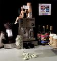
| 10/11/2005 03:57:53 AM | Where Juan Valdez Meets Benjamin Franklinby Art RoflmaoComment: Heh, a bit of commentary on the cost of coffee at the average "shop" today?
Perhaps abit under lit, especially in thearea around the coffee beans on the left. I like it otherwise, and I can certainally appreciate how long it took to set this one up, not to mention how much it must have cost. :) | | Photographer found comment helpful. |
|
Showing 331 - 340 of ~431 |
Home -
Challenges -
Community -
League -
Photos -
Cameras -
Lenses -
Learn -
Help -
Terms of Use -
Privacy -
Top ^
DPChallenge, and website content and design, Copyright © 2001-2025 Challenging Technologies, LLC.
All digital photo copyrights belong to the photographers and may not be used without permission.
Current Server Time: 08/04/2025 11:28:24 PM EDT.
|