|
|
|
Showing 791 - 800 of ~1193 |
| Image |
Comment |
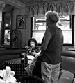
| 05/10/2007 09:49:44 AM | Could you hurry up, Louise?by AliciaComment: I love what you've captured with this images, and how you can see so clearly that you can present to us what you've seen. Wonderful tones, not afraid to leave the highlights in place (diners almost always have windows like those, bright sun coming in, and you've captured it perfectly), and wonderfully composed. Nice. |  Photographer found comment helpful. Photographer found comment helpful. |
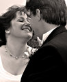
| 05/10/2007 09:40:31 AM | Day-9-BW-j-taime.jpgby JerseyGenieComment: I think the processing is fine, too, though you may want to play with toning this (I think toned wedding pictures, in a light sepia or split tone, are awesome, but that can be a very personal preference). As for the focus, softness can give a nice feel of movement to an image, but I agree that increasing the f-stop (which I'm pretty sure you can do with the powershot g5) to get more in focus here, or maybe picking up the shutter speed by one, would give it a bit more clarity while not losing the movement. Lovely moment that you've captured! | | Photographer found comment helpful. |
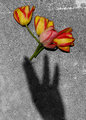
| 05/10/2007 09:34:52 AM | The Flower Fairy (Day 8)by colorcarnivalComment: Wonderful story, and great shot, nicely conceived and composed. One possible suggestion: I like to see some adjustments to the colors in selective desats; either going a bit brighter through selecting the colored bits and playing with levels/curves on a new layer, or by muting them in the same way. Hope the planting went well (want to come to my house when you're done? I hate planting, and it shows in my poor garden)! | | Photographer found comment helpful. |
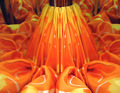
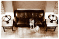
| 05/09/2007 04:51:06 AM | The Fabric Flowerby KliopatraComment: I promised to come and comment on your image (in the scores thread), so here I am :) I am in "critique mode," so please don't take anything I write as being overly critical; they are just my observations and opinion, and I am being intentionally critical (much more so than I might normally be) so that it is hopefully helpful!
Okay, initially, the focus on this is very, very soft, and much of the image actually looks out of focus. This is possibly the biggest issue voters had with the shot. DPC voters like sharp, crisp focus. If you look at the winners in any challenge, they are all sharp without being too sharp; it's one of the hallmarks of a winning shot here. You would probably have needed to use a higher aperture to bring more of the shot into focus and avoid the overall soft appearance you have here. There should be a way to do that with your camera (it might require you shooting in landscape mode or something similar, or you might be able to manually choose the aperture).
It also appears this is a "setup" shot, that is, something you've specifically put together for the challenge and photographed. Because there are so many excellent photographers on DPC with advanced photographic studios and lighting, setup shots generally need to be near perfect technically. They need to be very well composed, focused, and well lit. I tend not to do setup shots because they are so competitive. Here, the focus issues come up again, and while the mirrors are present, the composition/crop of the shot minimizes them to a certain degree. The colors, while bright, are not really vibrant. Some work in processing to add saturation or play with curves/contrast might give the image more impact.
I hope these two points help you see some of what I saw in your image (and maybe what some other voters might have seen). You have a good eye for what is visually interesting, and with some more attention to how you shoot and processing for impact after, your scores will steadily improve here. Good luck! | | Photographer found comment helpful. |
| 05/09/2007 02:17:20 AM | In To My Soul by SaraRComment: Congratulations, Sara, looks like you were right to be so upbeat throughout the challenge (on the scores thread; I was really waiting to see which shot was yours, there were so many good ones in this challenge). Great subject, wonderfully shot, and perfectly presented. Definitely deserving of your blue! | | Photographer found comment helpful. |
| 05/09/2007 02:07:51 AM | I'm over here, Mom!by MelethiaComment: I had to come back and see this. I'm so pleased this was your shot, Deb. I gave you a ten on this, and am really surprised and somewhat mystified that it didn't do better. I can't explain it. It was so perfectly seen, captured and presented, and such a unique take on the challenge. Oh, that's it! Unique. Silly person, thinking a unique and thoughtful take on a challenge was a good idea (just joking). Anyway, I love it. | | Photographer found comment helpful. |
| 05/08/2007 09:04:01 AM | | | Photographer found comment helpful. |
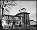
| 05/08/2007 08:31:03 AM | Memoriesby HipychikComment: Neat shot, and even though some of the whites are blown out, this makes it look intentionally harsh, rather than overexposed. The building does seem to be leaning back or to the left a bit, but overall the tones and the textures make this a really nice image. | | Photographer found comment helpful. |
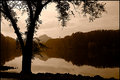
| 05/08/2007 08:24:09 AM | Black and White - Day 8by alexjackComment: The toning here is really nice, and gives a unique appearance to the shot, different than any other choice you could have made. The subtle appearance of the clouds in the sky along with the golden tones along the treeline make this shot flow really nicely. | | Photographer found comment helpful. |
| 05/08/2007 04:46:22 AM | Day 5 - the Candleby dreamyComment: I like what you've got here, and I think b&w is perfect for this kind of low-key shot. You might think about cropping it a bit (maybe off of the right a tad) to bring the subject in line with the right third, but that might give you a square image (some people don't like that; I don't mind if it fits); you could also crop from the left, but you lost the arm which is a nice compositional element. It is also just a touch soft in the face, though I think a light sharpening might be enough to really give us sharp focus on the eyes. This is a good example of saving an existing color image that you didn't like and making it work in B&W. Nicely done. | | Photographer found comment helpful. |
|
Showing 791 - 800 of ~1193 |
Home -
Challenges -
Community -
League -
Photos -
Cameras -
Lenses -
Learn -
Help -
Terms of Use -
Privacy -
Top ^
DPChallenge, and website content and design, Copyright © 2001-2025 Challenging Technologies, LLC.
All digital photo copyrights belong to the photographers and may not be used without permission.
Current Server Time: 06/19/2025 11:05:07 PM EDT.
|