| Image |
Comment |
| 05/28/2007 03:14:46 PM |
The Blue Dragonby jeannybeanyComment: I don't get why this didn't place higher; I gave it a ten, and obviously really liked it. I thought it was (as one commenter said) the perfect use of selective desat, adding to the image through a splash of color rather than defining the image. Nice lines where the arms come together, and in the tattoo. Nice. |
 Photographer found comment helpful. Photographer found comment helpful. |
| 05/28/2007 03:12:08 PM |
Holding on to Hopeby brownsmComment: I gave this a ten during the challenge; that it didn't do better sort of astounds me (but I'm regularly out of sync with DPC voters, as my own scores show). It tells an incredibly powerful story, and I found the composition, the tones in the conversion, and the technicals to support that story (which does overshadow the image somewhat, but in a good way). Sorry it didn't do better. |
| Photographer found comment helpful. |
| 05/28/2007 02:58:00 PM |
Road to...by karinnComment: I gave this a ten during the challenge; I obviously loved it. I don't have a problem with the yellow at all, and think the wonderful B&W conversion with the minimal (though not necessarily subtle) selective desat is really effective. Thought it would have placed higher (but I only picked two of the ten best as my tens, so I'm not the typical DPC voter, I guess). |
| Photographer found comment helpful. |
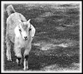
| 05/25/2007 06:41:59 AM |
Dreamy Goatby AliciaComment: Interesting effects here, but it makes me feel like I'm on drugs, not that the goat is. Not that I would know anything about what it feels like to be on drugs, of course :) I like the effects you've chosen and the layered feel, with the fence/bubbles overlaid, and the ice/shards behind. Nice positioning of the head, as well, but it's watching me wherever I move :) |
| Photographer found comment helpful. |
| 05/25/2007 06:39:37 AM |
Baby Goatby AliciaComment: Wonderful shot, and a delightful conversion. Composition is spot on, though I agree the graduated white border is a bit distracting -- I've used them before, but I think I've finally stopped :) The only thing that catches my attention is the overblown right ear (left as you look at it, of course); a tiny bit of dodging (burning? I always get them mixed up) just on the edge, to separate it from the body and give it an outline feel, might help -- but maybe not, too :) |
| Photographer found comment helpful. |
| 05/25/2007 06:27:01 AM |
Day 25(2) - Little Geisha.jpgby MonicagdComment: This is a lovely image, and the expression and pose you have captured are quite good. There is quite a bit of noise in the background, probably due to your camera adjusting the ISO to get a sharp enough shot. Some noise removal might help that, but I here I think it is not too distracting. The shot also has an overall soft appearance, but again, for this subject matter -- a Japanese dancer in a theater -- I think it's particularly appropriate and effective (though a tiny bit of sharpening might leave the generally soft feel while tightening the image up a bit).
When I first looked I thought the whites were a little bright, but remembering that the dancer's face would be painted white, I think it's perfect; her face is bright, some highlights on the fan she's holding are a bit blown, and the overall effect (in combination with the soft focus throughout) is quite nostalgic and gentle. Another one I like! |
| Photographer found comment helpful. |
| 05/25/2007 06:21:54 AM |
Day 24(1).jpgby MonicagdComment: Monica, I really like this image. It's an interesting object both in trying to figure out exactly what it is, but also visually. It appeals to me in both ways. I like the movement from lower right to upper left, and the focus helps lead the eye to the main subject. I might have tried to get a few more of the little black thingies (seeds?) in sharp focus. You may want to try another, very light sharpen on the reduced version, as some resizing can affect sharpening. I like the use of negative space here, the white background and soft shadows are quite effective. |
| Photographer found comment helpful. |
| 05/21/2007 04:30:32 PM |
Day 13:court houseby Elvis_LComment: Another really good conversion, capturing excellent tones in the stone. Brings you really into the feel of being at this courthouse, and the lighting is excellent. I find the reflections in the glass a bit distracting, but I don't have any clue what you could do about them! |
| Photographer found comment helpful. |
| 05/21/2007 04:28:42 PM |
Day 14:bankby Elvis_LComment: Great subject, wonderful lines, excellent conversion with nice tones. I might have liked to have seen the bottom of the door, but as the lines lead the eye upward, I didn't even realize it wasn't there until the fourth or fifth look! Well captured and presented. |
| Photographer found comment helpful. |
| 05/21/2007 04:24:59 PM |
More Fenceby ElaineComment: Lovely image, with wonderful diagonal lines complementing each other nicely. The contrast is a bit low across the whole image, with the sky a bit gray, and it looks like you're losing some tree detail in the sky. You might try selecting the sky and doing some work in curves/levels, or alternatively doing some dodge and burn might bring that up a bit. Great image with lots of additional potential! |
| Photographer found comment helpful. |
Home -
Challenges -
Community -
League -
Photos -
Cameras -
Lenses -
Learn -
Help -
Terms of Use -
Privacy -
Top ^
DPChallenge, and website content and design, Copyright © 2001-2025 Challenging Technologies, LLC.
All digital photo copyrights belong to the photographers and may not be used without permission.
Current Server Time: 06/20/2025 03:14:32 AM EDT.