| Image |
Comment |
| 01/28/2007 07:26:37 AM |
Cardby aznymComment: Interesting approach, but it doesn't really do much for me, especially with the "extra" shadow at the bottom center and the scattered extra marks. Still, looks better on second look than it did on first (I vote before I comment), so a bump up is warranted. |
 Photographer found comment helpful. Photographer found comment helpful. |
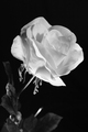
| 01/28/2007 07:25:13 AM |
Redby DrakeComment: Too much going on here for a minimalist shot in my eyes; I'm not sure I buy the "red" as the subject matter where it's almost entirely out of the depth of field and so is largely out of focus. |
| Photographer found comment helpful. |
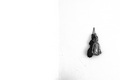
| 01/28/2007 07:24:28 AM |
cheetosby arsenalComment: An interesting take on minimalism, but with so much going on in the image, it just doesn't work for me for this challenge; the framing is a bit off for my eye (I think I would have tried to shoot so that only the right side of the face showed, and none of the left). |
| Photographer found comment helpful. |
| 01/28/2007 06:33:58 AM |
The Pennyby CyBri2000Comment: A very busy image, one that doesn't seem minimalist to me; the lighting doesn't work for my eyes, either, as is very harsh across many of the coins, especially the penny. |
| Photographer found comment helpful. |
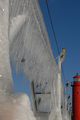
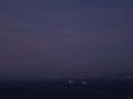
| 01/28/2007 06:17:55 AM |
Ships at Duskby craigesterComment: The overall look of this shot didn't appeal to me; the minimalist elements are caught up in the imprecise focus on the ships and problems with contrast in their lights, and the distracting rocks in the lower right corner. |
| Photographer found comment helpful. |
| 01/28/2007 06:16:40 AM |
Simply Beautifulby littlegettComment: A beautiful shot, but it's not minimal to me (either within the challenge description or within my understanding of the technique). |
| Photographer found comment helpful. |
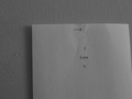
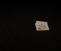
| 01/28/2007 06:11:16 AM |
The Message is simpleby TlemetryComment: This didn't work for me; minimal, but with elements that detracted from that for me (the size of the paper, the nail, the texture on the wall). |
| Photographer found comment helpful. |
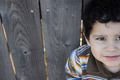
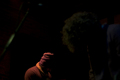
| 01/28/2007 06:10:22 AM |
hatby shamerComment: I was unsure what was going on with this shot; the image on the right (Hendrix?) detracts from the minimalism for me, and turns it into a different kind of shot; the diagonal on the right distracted me from the main subject(s) here. |
| Photographer found comment helpful. |
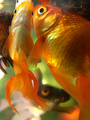
| 01/28/2007 05:48:40 AM |
Feed Meby drz01Comment: Nothing minimalist about this for me, a very busy, confusing shot, though well lit with some nice highlights, the focus seems off to me for the subject matter. |
| Photographer found comment helpful. |
| 01/28/2007 04:00:04 AM |
Note to selfby griz210Comment: Minimal, but the placement of the subject doesn't work for me, and choice of subject isn't particularly appealing to me, either. I would have made the background black either completely flat or with more texture; I find the one fold toward the left out of place. |
| Photographer found comment helpful. |
Home -
Challenges -
Community -
League -
Photos -
Cameras -
Lenses -
Learn -
Help -
Terms of Use -
Privacy -
Top ^
DPChallenge, and website content and design, Copyright © 2001-2025 Challenging Technologies, LLC.
All digital photo copyrights belong to the photographers and may not be used without permission.
Current Server Time: 06/16/2025 07:38:15 PM EDT.