Judgingby
angela_packardComment: ::: Critique Club :::
Hi Angela, this is the in-depth critique you asked for from one of the CC members, I'm delighted I drew it.
First Impression - the most important one:
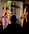
Interesting but not that gripping. I saw a cutout of a man but I didn't see him as singled-out
Composition:
Even though he's centred, which would normally count against good composition, his framing by the two dancers in identical poses really overrides that. You've also got just the right ratio of judge to background.
Subject:
I find the image appealing because of the contrast between the dancers and the silhouette and I believe in another challenge it would have scored better. Because this was a singled-out challenge, I suppose the expectation is that you get to see the one singled out. I suspect that voters may have gone the same way.
Technical (Colour, focus, and light):
The DOF here is really really good. If it hadn't been so extreme, the risks of the dancers dominating the shot would have been very high. I'm sure just a hint of bounce light onto the back of the subject would have done a lot for the finished product. As it is, he's like a cutout, just a hint of fill would have given him 3D form. It would have still satisfied those who liked the different take on the challenge but also those who had a problem with the silhouette.
To grow its vote?:
A score of 5.5 s not a bad score, nor is a top-50 placing. Perhaps if voters had a bit of a look at the subject you would have jumped a lot of places.
Summary:
A really good imaeg which may have fallen slightly foul of the DNMC crowd but one that I would be proud to have in my protfolio.
Brett