| Image |
Comment |
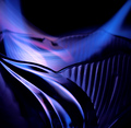
| 02/09/2006 07:34:10 PM |
The Space Betweenby typologicComment: Mmm nive. The flow and the ngles combined with the subdued blue/black/pink are really zappy. I find not being able to find a point that's focussed a little frustrating |
 Photographer found comment helpful. Photographer found comment helpful. |
| 02/09/2006 07:29:39 PM |
Its Whats Insideby neenee1999Comment: Great stuff. Very creative and refreshingly simple. The neutral space forms the composition and it is the composition which makes this really work |
| Photographer found comment helpful. |
| 02/09/2006 07:28:32 PM |
Ufo Attackby foxyfoxComment: Great subject and colour! The metallic red thru grey thru blue is enticing. I don't know where these were but I'm guessing in a public place so cleaning them was probably a real issue. However cleaned they must be. It just doesn't work as it is. Apart from anything else, the dust particles reveal the scale and spoil the mystery. |
| Photographer found comment helpful. |
| 02/09/2006 07:26:14 PM |
|
| Photographer found comment helpful. |
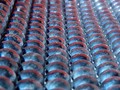
| 02/09/2006 07:25:40 PM |
Encompassby adineComment: Good wrok keepinh the rings nice and sharp top to bottom. The contrast with their background blurriness suggests they're in orbit. It's a good fun image. |
| Photographer found comment helpful. |
| 02/09/2006 07:24:21 PM |
ISNT ABSTRCT 7by rhipsterComment: The angles and curves along with the fat pipe vs small pipe makes for an intersting abstract. I think you've maybe pushed the contrast and colour a little too hard because of the way the highlights have blown out. If you puch the contrast hard you can sometimes then lessen Brightness and avoid this. |
| Photographer found comment helpful. |
| 02/09/2006 07:22:23 PM |
Abstractureby MelethiaComment: Even though I can tell what it is, I rather like the symmetry and compositon. The colours work too. What doesn't work quite so well is the depth of field. Since you were some distance (6ft?) from the lower cornice and perhaps 9ft from the roof edge, you should have been able to get all the planes in focus. You'd have to use the smallest aperture that you have available, at least F8.0. With the amount of light available, you'd still have had a shutter speed that wouldn't blur. |
| Photographer found comment helpful. |
| 02/09/2006 07:19:03 PM |
Summerby BebeComment: I would hang that on our office wall. Well done. |
| Photographer found comment helpful. |
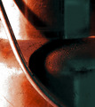
| 02/09/2006 07:18:25 PM |
Distortionby amberComment: Well set up. The depthe of the objects makes it really interesting and draws you into looking at it further. I'm not sure that I am comfortable with the colour treatment or the blown highlights. |
| Photographer found comment helpful. |
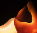
| 02/09/2006 07:16:52 PM |
Fire and Iceby wheeleddComment: Well composed and lit. I can imagin that this object, whatever it is, could be really boring. That you've turned it into something interesting is testament to your skill. |
| Photographer found comment helpful. |
Home -
Challenges -
Community -
League -
Photos -
Cameras -
Lenses -
Learn -
Help -
Terms of Use -
Privacy -
Top ^
DPChallenge, and website content and design, Copyright © 2001-2025 Challenging Technologies, LLC.
All digital photo copyrights belong to the photographers and may not be used without permission.
Current Server Time: 08/28/2025 12:31:48 PM EDT.