| Image |
Comment |
| 02/09/2006 08:44:29 PM |
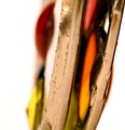
Texture and Colourby QikiComment: Sweet subject. I like the angled feature bits and the DOF is good too. Am not so sure about the pink holder but clearly there's nothing you could do about that |
 Photographer found comment helpful. Photographer found comment helpful. |
| 02/09/2006 08:43:01 PM |
digtal blueby garlicComment: That's rea;;y very cool. I don't know what it is, but I do like it. Maybe a little overdone in the blue, but it certainly has impact as is. |
| Photographer found comment helpful. |
| 02/09/2006 08:42:08 PM |
Ghostly Fanfareby lentilComment: Great colours but I think fot it to grab a viewer at least something needs to have the point of interest. It could be a focussed item or highlighted by composition. There's just nowhere to look with this image. |
| Photographer found comment helpful. |
| 02/09/2006 08:18:09 PM |
Elegantby spydrComment: Very well done. Yes it speaks elegant and it is. |
| Photographer found comment helpful. |
| 02/09/2006 08:17:27 PM |
Marvinby ggbudgeComment: Marvin? Well I don't know who or what he is, but I like the simple clear colours and composition. |
| Photographer found comment helpful. |
| 02/09/2006 08:12:35 PM |
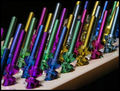
The Business Endby CEJComment: Perhaps just a little too busy. The eye is having trouble settling on a central point of interest and is trying to find a home |
| Photographer found comment helpful. |
| 02/09/2006 08:11:08 PM |
Smell the Shade!by usiaComment: This is a really cool advertisement pic but I don't see it fitting well with an Abstract theme - which is a pity, I rally really like it. |
| Photographer found comment helpful. |
| 02/09/2006 08:10:08 PM |
Prettyby jsasComment: Great sharpness and clarity, that makes it work properly |
| Photographer found comment helpful. |
| 02/09/2006 08:07:04 PM |
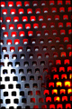
Space Invadersby hotpastaComment: Cool use of light and object. Just what Abstract is all about. I'd have preferred it without the surface flare but I haven't marked it down because of it. I HAVE marked it a point down though because you haven't rotated it and squared it up. It looks like a sloppy job even though I know it wasn't because of the work in lighting and setup. |
| Photographer found comment helpful. |
| 02/09/2006 08:04:45 PM |
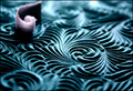
Waveby gurlwithapenComment: The out of focus areas bother nme and seem to detract from the really clever part in the centre. I wonder if a tighter crop would hold up? It depends on your megapix and how much you've alreqdy cropped I guess. Also, for the pink thing to count in the image, you needed to bring it forwward into the focal plane as well. |
| Photographer found comment helpful. |
Home -
Challenges -
Community -
League -
Photos -
Cameras -
Lenses -
Learn -
Help -
Terms of Use -
Privacy -
Top ^
DPChallenge, and website content and design, Copyright © 2001-2025 Challenging Technologies, LLC.
All digital photo copyrights belong to the photographers and may not be used without permission.
Current Server Time: 08/28/2025 09:57:38 AM EDT.