| Image |
Comment |
| 10/06/2005 08:05:49 PM |
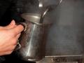
Steamin'by GoscheComment: I like the idea here as the subject has the ability to do wonderful things with light but this treatment is just slightly unappealing |
 Photographer found comment helpful. Photographer found comment helpful. |
| 10/06/2005 08:04:35 PM |
|
| Photographer found comment helpful. |
| 10/06/2005 07:59:16 PM |
|
| Photographer found comment helpful. |
| 10/06/2005 07:57:29 PM |
|
| Photographer found comment helpful. |
| 10/06/2005 07:54:51 PM |
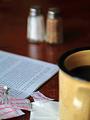
Sugar Packetsby DiComment: Its a pity you couldn't wring more DOF out of this because the sugar sachets just don't look like the right point of interest. |
| Photographer found comment helpful. |
| 10/05/2005 05:43:48 PM |
Thinking Of Youby cools98Comment: ::: Critique Club :::
We love our kids like nobody else and we love our kids photos like nobody else can. So don't be surprised that it didn't blue. Having said that, this is a great image for the card!
Firstly, he has that wonderful far-away expression (probably thinking "has she finished yet?" ... LOL). The desat of the colour also works. It gives the image a sort of meancholy look which I feel is very appropriate to the subject and challenge. In terms of a commercial card, kids sell. So for all sorts of reasons, yes the image did deserve to score higher. That it didn't I believe is not a reflection on what it would sell like.
If there is any fault I can find with it , it might be in the lighting. It is well lit, maybe too well lit. I suspect you used the on-camera for some fill? The result often of this is a flattening of an image because all the shadows are gone. If its not fill flash then it is maybe half a stop overexposed.
To ribbon? I dislike the option of having to create a wow factor just for the sake of a score when you already have something that does the job it set out to do. I would try a little thirds in the composition whcih would mean moving him down and right in frame until the gross between his eyes fell on the top right thirds intersecting lines.
Brett Message edited by author 2005-10-06 01:57:57. |
| Photographer found comment helpful. |
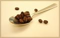
| 10/05/2005 04:28:11 PM |
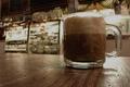
spoon of perksby shadowComment: Sweet. the colouring and border are great. That light coffee colour really works, especially where it is reflected in the handle and you held a fine DOF. The composition is a bit off , be interesting if you played around with some thirds options. I would suggest at least lowering the centre of the spoon to the horizontal thirds line. I'm goign to score it well, but there is probably another point in there yet. |
| Photographer found comment helpful. |
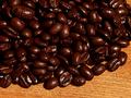
| 10/05/2005 04:21:09 PM |
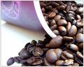
Fresh Coffee Beansby HornOUBetComment: Good and sharp (yay). I like the beans glow. I'm a bit unexcited by the composition although I can't suggest how to improve it without messing around with it |
| Photographer found comment helpful. |
| 10/05/2005 04:18:09 PM |
Cup of Goodnessby blackhatComment: I like the way you've worked your light to get the best dramatic effect. It's somewhat let down by the composition which results in a bit of a ho-hum image where it is potentially not ho-hum at all. |
| Photographer found comment helpful. |
| 10/05/2005 04:16:04 PM |
AKA "Organic Coffee"by Eagle EyeComment: Very very good. Simplistic, clean and interesting with the leaves from overhead. Tghe dappled light on the paintwork just balances it nicely. I know you can't do anything about the car's reflection, it's going to bug some people. If the image would look better without it (jury's still out), in a commercial shoot we would have a massive black cloth stretched onto a frame behind the camera amd that would ill the reflection. |
| Photographer found comment helpful. |
Home -
Challenges -
Community -
League -
Photos -
Cameras -
Lenses -
Learn -
Help -
Terms of Use -
Privacy -
Top ^
DPChallenge, and website content and design, Copyright © 2001-2025 Challenging Technologies, LLC.
All digital photo copyrights belong to the photographers and may not be used without permission.
Current Server Time: 08/29/2025 01:55:30 PM EDT.