DPChallenge: A Digital Photography Contest You are not logged in. (log in or register
 
Browse Settings
Currently viewing:
Registered UserKiwiShotz

Show comments:

Per page:

Order:

Comments:


Comments Made by KiwiShotz
Pages:   ... [98] [99] [100] [101] [102] [103] [104] ... [216]
Showing 1001 - 1010 of ~2151
Image Comment
thecanyon4me
01/02/2006 03:16:08 AM
thecanyon4me1st Place
by Brent_Ward

Comment:
Looks like a Peter Jackson CGI backdrop, take that as a great compliment

Brett
Photographer found comment helpful.
M C R O C H I P
01/02/2006 03:13:29 AM
M C R O C H I P
by Rikki

Comment:
::: Critique Club :::
From a busted DVD comes all sorts of goodies, here's one of them :)

First Impression - the most important one:
Totally engaging. This is an image that demands inspection. It conveys super hi-tech and could be used to illustrate magazine articles quite successfully. A very good stock image.

Composition:
Although it doesn't look to have composition in the traditional sense, it does. The angle of the board to frame is very clever as it creates leading lines and pathways for the eye to follow bottom-left to top-right. Excellent. Imagine how boring it would be square in the frame.

Subject:
The subject is great and the challenge context is 100%. The essence of this image however is not in the subject per se but in its treatment.

Technical (Colour and light):
Your lighting and treatment of this board is just superb. The under-lighting that brings out the fluro green is stunning and the first attractio to the image. The second is the use of the colours in your top lighting. Here is the true genius of the image because the colours impart a warmth and a quality to the image that clear light just cannot do.

If I have the right to long for any change it would be to see more of that lovely subdued coloured light down in the bowels of the chips n bits but it's presumptuous to suggest that it would be 'better' for it.

To grow its vote?:
Why would you? This is a technically perfect shot. Just trying to do something else to it for ribboning would destroy the essence of it. This is not a people-wower, nor should it be. Not every photograph is taken for a popular vote, some haave more important work to do.

Summary:
A great image, one to submit for stock skots somewhere. Some people forget that images have a story to tell or a mood to impart or a point to make. To make them 'wow' is to cheapen them and deny them the role they're meant to play. This is one such image.

well done

Brett
Photographer found comment helpful.
"Watch Dog"
01/02/2006 12:43:40 AM
"Watch Dog"
by Kita

Comment:
::: Critique Club :::
Hey Kita, it's great to critique images that have a touch of humour. I'm loving Visual Puns for just that reason and yours looks more fun than most.

First Impression - the most important one:
The first impression is that this is a badly cut out dog that was probably on a coloured background. Closer inspection reveals this isn't the case of course. She's cute and attractive and clearly is loved by the voters too.

Composition:
Perfect use of the Rule of Thirds with the teeth right on the intersection. I'll talk about lens use in Technical but the visual part of the result is that it looks as if she has no back end which has added to the feeling that this is a bad cut out - which if course it isn't.

Subject:
She's great. She's 'smiling', you can tell she loves hamming it up for the cameras. Despite them being the most attractive and popular of subjects, using animals and children have risks in DPC. This is because some peole use their cat/dog/child for every single challenge whether it fits or not. They just change the title. This is silly and it spoils it for perfect use that you have made of Misty here. The voters are not silly though, they have seen this too and have scored you well, very well.

Technical (Colour and light):
Misty against the stark white is a very good idea given her colour and the contrast that makes. Looking just at her skin tones, she may be just a fraction overexposed, it's difficult to tell because on the other hand you don't want to loose the detail of her coat. It may be that the background is just too white, too stark. You've had lots of those comments from the voters too.

As mentioned before, one of the things that has contributed to the feeling of the cut out is the complete loss of her behind the shoulders. I suspect that the lens was quite wide angled which in portrait work this distorts heads making them appear much bigger than they are. In portraits the most common lens to use is surprising quite a long one between 85mm and 130mm. These lenses fore-shorten things like noses and puts them in their correct perspective. In this case, a longer lens may have given Misty a more normal proportional look whilst half a step to th e left would have shown a little rump and made the whole thing look more real.

To grow its vote?:
With a vote of 6.1 and 28th place, it's boggling to imagine what this pic is capable of if people hadn't thought of it as a cutout.

Summary:
Great pic, good fun, well punned.

Brett
Photographer found comment helpful.
Peek-a-boo.  Aisle of You!
01/01/2006 11:21:20 PM
Peek-a-boo. Aisle of You!
by IndigoButterfly

Comment:
::: Critique Club :::
Hi Tilly, my first critique of Visual Puns, a challenge I think that has stood out for its quality and humour against almost all others since I've been on DPC

First Impression - the most important one:
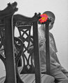
I was stopped by this image as opposed to 80% which are easy to pass by. That is a quality first off that makes it an important entry. The flower and the hidden face are the two elements that get your attention initially. That I didn't notice or care what the foreground was means that I have been drawn into the image. I wasn't wowed by I but wanted to investigate. Good start.

Composition:
I find this an interesting composition because the boy and flower being the Points Of Interest are nicely placed yet there are all these chair bits in the foreground. That they don't interfere had me exploring further to determine why. The answer is that they provide leading lines to the boy and flower. Because they do that they add to the image rather than detract from it.

Subject:
As I said in first impressions, this is one of those images that draws you into it. It requires you to study it a little. I think the obscured face is part of that curiosity. The de-saturation and the luminous flower really make this a different image.

The partly obscured face? I like it. I like the mystery of what you don't see. I like the subtlety of it. I like the way it forces you to peer at the image to see whats going on back there. Having said that, clearly it may have cost you votes - I just don't happen to think that votes are everything. Vote catching can get in the way of a very good image.

Apart from my comments below in Scoring Better about the pun, I'm really surprised this didn't make 5. As I said above, this challenge was an uncommonly quality one with a really tough field so dont' be too downheartened by the score on a photographic level.

Technical (Colour and light):
I like the de-sat and coloured flower, they 'ping' but I'm puzzled. There's a lot of voter comments about a) The grainyness and b) the flower being blown out. I have to confess that i can find neither. The wall behind the boy is textured as is his sweatshirt but in studying the wood of the chairs, the trouser fabric and the chair fabric I can see no grain or noise at all. Similarly with the flower it's possible to see every petal and the detail in every petal.

All is not roses though. You do have focus issues. The boy and the flower appear to be OOF whilst the wall is crystal sharp. Sometimes (if your camera allows) you have to go to manual focus.

To grow its vote?:
I really really didn't get the pun - at all. I think this is where you have been marked down. My partner finally got the "I Love You" connection but even then I couldn't see where the "Aisle" was and "Peek-a-Boo" completely stumped me so sorry, a bit of a bust there.

Summary:
I applaud the effort and the risks you took to do this. Looking for new angles, looking for new techniques, pushing the boundaries are just terrific things to be doing. You say in your profile that's why you're here ... Go Girl!

Brett
Photographer found comment helpful.
Piering Out
12/24/2005 03:54:42 AM
Piering Out
by Mr_Bond

Comment:
Great pic, gotta love water lights and darkness. The pun's not mega strong, but i get it :)
Photographer found comment helpful.
Online Bulletin Board
12/23/2005 07:14:07 AM
Online Bulletin Board
by Art Roflmao

Comment:
Damned clever, good pun, good photographic values - well done
Photographer found comment helpful.
Heading for Glory
12/23/2005 02:01:22 AM
Heading for Glory
by owen

Comment:
Oh yes. Good pun, great capture - only a photographer would understand how diofficult this was to capture.
Photographer found comment helpful.
what a fine pair...
12/23/2005 01:59:34 AM
what a fine pair...
by idemaerschalk

Comment:
I think you might have spoiled a really good pun and idea with the background. It seems to detract from the simplicity and impact of the elements.
Photographer found comment helpful.
Cereal Killer (aka Cheerio Woody!)
12/23/2005 01:58:27 AM
Cereal Killer (aka Cheerio Woody!)
by froglet

Comment:
This annoys me which is totally irrational. The pun is good too. Perhaps the puppet has been overused.
Photographer found comment helpful.
Postage Dew (Due)
12/23/2005 01:56:06 AM
Postage Dew (Due)
by Rikki

Comment:
Smart pun, well done
Photographer found comment helpful.
Pages:   ... [98] [99] [100] [101] [102] [103] [104] ... [216]
Showing 1001 - 1010 of ~2151


Home - Challenges - Community - League - Photos - Cameras - Lenses - Learn - Help - Terms of Use - Privacy - Top ^
DPChallenge, and website content and design, Copyright © 2001-2025 Challenging Technologies, LLC.
All digital photo copyrights belong to the photographers and may not be used without permission.
Current Server Time: 06/23/2025 06:32:45 PM EDT.