| Image |
Comment |
| 09/15/2005 07:36:42 PM |
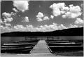
Rowby jenesisComment: I like the balance of the picture. The sky is quite lovely, too. |
 Photographer found comment helpful. Photographer found comment helpful. |
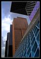
| 09/15/2005 07:34:00 PM |
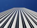
Picasso Towerby RedsnapComment: I like the lines and wish the sky weren't so dark blue. However, the lines are not entirely going to the middle, and I feel that I see more of one side of the facade than the other, which bothers me, because it's so close to being centered, but not quite. |
| Photographer found comment helpful. |
| 09/15/2005 07:32:04 PM |
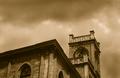
Corner of the Stormby ACheltonComment: I want to see a little more building and a little less sky. And I wish the colors were more black and blue, like a storm, than brownish. But I guess the brown also works if you're trying to convey an old, faded sort of feeling. |
| Photographer found comment helpful. |
| 09/15/2005 07:30:42 PM |
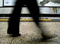
mind the gapby jmogensenComment: Wow that's freaky how the shin is missing for the forward foot. I rather wish it was whole. |
| Photographer found comment helpful. |
| 09/15/2005 07:29:27 PM |
Architectural Splendorby JayWalkComment: I like the colors and placement. The sky is awesome. The buildings are almost on the point of being too sharp, but I guess that makes its message more powerful. |
| Photographer found comment helpful. |
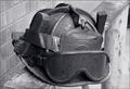
| 09/15/2005 07:27:36 PM |
Oh Captain, My Captainby DottieDComment: That is quite an interesting helmet. I think the helmet could be a little more sharp and the background a little more blurred. And also I think you should move the helmet more to the side or something; I don't really like things in the middle and there's not exactly a distinguishable focal point. |
| Photographer found comment helpful. |
| 09/15/2005 07:25:42 PM |
Untitledby CLarson557Comment: I had an idea somewhat like this....What IS that thing? Anyway, I like the soft feel of the sky, but it doesn't really fit with the...whatever it is. I see some noise on the closest balck stripe, but it's not too bad. |
| Photographer found comment helpful. |
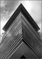
| 09/15/2005 07:23:56 PM |
cornerby arlanbartComment: I'd give a higher rating if the photo was more silvery and smooth, because it's on the verge of being so, but not quite. |
| Photographer found comment helpful. |
| 09/15/2005 07:23:12 PM |
solitude amidst scurryby irish_eyesComment: I like your title, but I don't see much scurrying in the picture. I like the colors and the detail of the wood bench. But I feel like the person's supposed to be the sharpest point. Or maybe I'm just completely lacking in any artistic sense. (The latter could very well be true). xD |
| Photographer found comment helpful. |
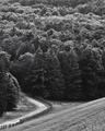
| 09/15/2005 07:21:34 PM |
valley roadby dragonladyComment: No focal point, but I like the scene...The trees should be blurred or something. |
| Photographer found comment helpful. |
Home -
Challenges -
Community -
League -
Photos -
Cameras -
Lenses -
Learn -
Help -
Terms of Use -
Privacy -
Top ^
DPChallenge, and website content and design, Copyright © 2001-2025 Challenging Technologies, LLC.
All digital photo copyrights belong to the photographers and may not be used without permission.
Current Server Time: 08/04/2025 08:15:15 PM EDT.