| Image |
Comment |
| 09/04/2005 05:58:24 PM |
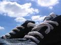
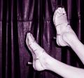
Sun drying sneakersby pacpintoComment: NIce composition although without the title the image doesn't make sense. The focus seems to be more on the clouds than the shoes. |
 Photographer found comment helpful. Photographer found comment helpful. |
| 09/04/2005 05:54:56 PM |
Retired...by ahaywehComment: A very strong image with great potential. It seems like the viewer isn't square on to the window, and is looking up at it. If the shot had been taken straight on, and the top had been cropped to remove the distracting roof details and the bottom cropped to even out the border this would have made the window the canvas and the silhouette would have been even stronger. 5 |
| Photographer found comment helpful. |
| 09/04/2005 05:36:49 PM |
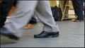
Distant shoe, near shoeby sersalComment: Looks too much like a snapshot and isn't telling me anything about the "distant shoe" or the "near shoe", and why the crop in the closest shoe? Just seems like an exercise in use of DOF (which incidentally was done well). |
| Photographer found comment helpful. |
| 09/04/2005 05:22:46 PM |
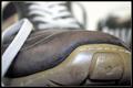
years in the making - or - insufficient careby marxusComment: Make up your mind about the title, and then use a suitable subject. These shoes are only ever so slightly scuffed, the stitching is all perfectly intact, and there's no holes. This approach with such a close shot and use of narrow DOF could have been pulled off if you were picking out something like a hole in a battered old pair of trainers or something. |
| Photographer found comment helpful. |
| 09/04/2005 05:19:05 PM |
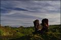
"These boots are made for walking"by StructorComment: The title is off-putting since the boots are unoccupied and unlikely to do any walking. They're also cloaked in darkness with the exception of some obvious hotspots while the patchy grass proceeding them is bathed in light. |
| Photographer found comment helpful. |
| 09/04/2005 05:14:15 PM |
Shoe w/ a freckle viewby TheStickComment: The leather curtain takes away from the subject here. Less is more, and just the shoes and freckle of the title would have been stronger on their own. The composition would be vastly improved by moving the shoes further left and rtemoving the superfluous empty space there. It's a classic 'snapshoit type' mistake to place the subject bang in the center. Considering the title I would have liked to see more effort to make the freckle the focus of the shot. Closing the aperture down a 1/2 a stop or so could have made the form of the feet stand out more and seem less flat. |
| Photographer found comment helpful. |
| 09/04/2005 04:52:52 PM |
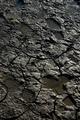
Muddy too shoesby Netwalker100Comment: A beautiful textural shot, well lit giving a good contrast which accentuates the form nicely and really picking out the footprints. The compositon could be stronger (slightly) by coming in tighter to the further footprints and giving a tiny bit more space between the closer pair and the viewer, although I feel I'm nitpicking with that point. My biggest problem is that your idea although very well executed, could be just a little too far "outside the box". There's a fine line between that and missing the point; ie: not fulfilling the brief. 5 |
| Photographer found comment helpful. |
| 09/04/2005 03:57:38 PM |
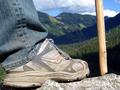
What a Viewby mahobbesComment: At least there's a foot in this shoe, unlike some of the other examples on this theme with shoes hiking up mountains by themselves. The focus on the shoe could be a bit sharper. |
| Photographer found comment helpful. |
| 09/04/2005 03:55:34 PM |
Vodka and Shoelacesby th3ph17Comment: The idea is superb, and has lots of potential. I love the double vision effect created. But... the fact that nothing in the image makes sense without the title brings it down in my estimation. The tight close up loses any potential for setting a scene as it were. Could have really played on the drunk theme more by taking the shot in a bar with neon beer lights in the background, pulling the viewpoint back from the shoe a bit so it's still the dominant subject even though it's out of focus. And maybe rotate the image 90º to play on the fact that the viewer is drunk, and resolve the odd positioning created by such a low down viewpoint. |
| Photographer found comment helpful. |
| 09/04/2005 03:44:46 PM |
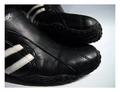
Black is beautifulby FyzarlComment: Good textur caught well by the focus, but the composition doesn't take advantage of the stripes. With such a close shot a more abstract composition may be more effective... perhaps even closer. |
| Photographer found comment helpful. |
Home -
Challenges -
Community -
League -
Photos -
Cameras -
Lenses -
Learn -
Help -
Terms of Use -
Privacy -
Top ^
DPChallenge, and website content and design, Copyright © 2001-2025 Challenging Technologies, LLC.
All digital photo copyrights belong to the photographers and may not be used without permission.
Current Server Time: 08/22/2025 03:37:54 PM EDT.