| Image |
Comment |
| 06/02/2006 08:26:19 PM |
|
 Photographer found comment helpful. Photographer found comment helpful. |
| 06/02/2006 01:06:36 PM |
|
| Photographer found comment helpful. |
| 06/02/2006 10:05:34 AM |
|
| Photographer found comment helpful. |
| 06/02/2006 10:02:47 AM |
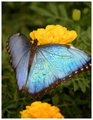
Here's Lookin' at Yaby jpochardComment: I feel its a bit soft. did you sharpen after resize ? also you can get better attention at the buttefly by darkening the background |
| Photographer found comment helpful. |
| 06/02/2006 03:14:27 AM |
|
| Photographer found comment helpful. |
| 06/02/2006 03:13:52 AM |
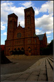
Cathedral Squareby sysopComment: somehow the sky is overpowering the building... need more light. a little dodge might help |
| Photographer found comment helpful. |
| 06/02/2006 03:12:53 AM |
|
| Photographer found comment helpful. |
| 06/02/2006 03:09:14 AM |
|
| Photographer found comment helpful. |
| 06/02/2006 01:15:16 AM |
Skinny dippingby DogAngelComment: ** Critique Club **
First impression; nice looking model :)
You are able to draw the attention to you subject very well by a good placement and the backgroung being mostly black, the only thing that distracts me is the blown out sky. the image would look much better if you crop the top part IMO.
Overall, I like the technical quality of the image.
if you have any questions, feel free to pm me
-Gaurawa |
| Photographer found comment helpful. |
| 06/01/2006 10:13:45 PM |
Loungingby _eugComment: **Critique Club**
My first impression is that it looks flat. The lighting is too even.. also it seems to miss the brighter zones.
I like the perspective used here. the crop though seems odd with the right top corner un-necessarily being added to the image. It may work better with a tighter crop on right making it portrait frame.
Even though flat, I like the even skin tones in the image.
I would add a bit of contrast to the image.
If you have any questions, feel free to pm me
-Gaurawa |
| Photographer found comment helpful. |
Home -
Challenges -
Community -
League -
Photos -
Cameras -
Lenses -
Learn -
Help -
Terms of Use -
Privacy -
Top ^
DPChallenge, and website content and design, Copyright © 2001-2025 Challenging Technologies, LLC.
All digital photo copyrights belong to the photographers and may not be used without permission.
Current Server Time: 12/21/2025 07:44:15 PM EST.