| Image |
Comment |
| 05/10/2006 07:35:21 PM |
Sleep Like a Babyby margiemuComment: Comment from a member of your own commenting club :-)
First impression
1. Good Cliché
2. Beautiful girl
3. Lighting and colours are good.
What could you do better?
1. I am not sure on this but the focus is good but there is something blurred. Maybe sharpening a bit would do the trick.
2. There is something missing. Perhaps a small toy or something that hold your attention to the picture. My eyes tend to go away from the picture. Maybe just a solid frame would do the trick!
As you can see, I am not good in judging pictures like this one (if I am good in any).
Hope you forgive me on this.
P.S. I gave you a 6. Message edited by author 2006-05-10 20:29:21. |
 Photographer found comment helpful. Photographer found comment helpful. |
| 05/10/2006 07:20:46 PM |
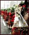
Sinulog Festivalby blackenedwhiteComment: Comment from a member of your own commenting club :-)
Congratulations on your highest score. This is quite good.
First impression
1. Good rithm
2. Bright and lovely colours
3. Good applying of rule of thirds and leading lines.
4. Contrast and focus good on main subject.
What could be better?
1. The houses are a bit to bright.
2. I would like to see a bit more of the others in focus. Probably not possible.
3. The person to the right looks a bit grainy. Maybe applying of NeatImage would have helped.
4. Try to care for the score - that helps make improvements :-) Message edited by author 2006-05-10 20:28:59. |
| Photographer found comment helpful. |
| 05/10/2006 07:09:10 PM |
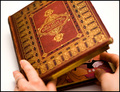
You can't judge a book by its coverby alexgarciaComment: Comment from a member of your own commenting club :-)
Congratulations on this high scoring picture and top 20 finish.
First impression
1. Superb selection of a Cliché
2. Nice looking book
3. Good selection of a "inside" book.
What could be better
1. I would like to see more of the book in focus. Mainly the near things.
2. Try to use a bit more of the rules of thirds and leading lines. This could possibly be accomplished by rotating the book a bit counter clock wise.
3. The background colour is to white for my taste. Makes the book kind of in the air.
But again, congratulations on this fine picture. Message edited by author 2006-05-10 20:28:44. |
| Photographer found comment helpful. |
| 05/10/2006 05:55:53 PM |
|
| Photographer found comment helpful. |
| 05/10/2006 04:10:47 PM |
|
| Photographer found comment helpful. |
| 05/10/2006 04:09:50 PM |
|
| Photographer found comment helpful. |
| 05/10/2006 04:07:57 PM |
|
| Photographer found comment helpful. |
| 05/10/2006 04:00:47 PM |
|
| Photographer found comment helpful. |
| 05/10/2006 03:50:09 PM |
|
| Photographer found comment helpful. |
| 05/10/2006 03:46:07 PM |
|
| Photographer found comment helpful. |
Home -
Challenges -
Community -
League -
Photos -
Cameras -
Lenses -
Learn -
Help -
Terms of Use -
Privacy -
Top ^
DPChallenge, and website content and design, Copyright © 2001-2025 Challenging Technologies, LLC.
All digital photo copyrights belong to the photographers and may not be used without permission.
Current Server Time: 08/06/2025 05:49:54 AM EDT.