| Image |
Comment |
| 10/26/2005 12:12:06 AM |
|
 Photographer found comment helpful. Photographer found comment helpful. |
| 10/26/2005 12:10:41 AM |
|
| Photographer found comment helpful. |
| 10/26/2005 12:07:42 AM |
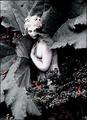
No Reverseby holdingtimeComment: *Critique Club*
I like the pride you were able to capture. The image does not look forced or fake. I just wish the image was a little stronger, the colors seem to light or dull. I would just hope with an image like this the black and silver were able to pop of the photo. I defiantly liked the lighting that you used, not over the top and not a spot light drawing attention to the wrong things. Awesome job capturing the subject. |
| Photographer found comment helpful. |
| 10/25/2005 11:35:10 PM |
Lesbian Prideby kylhComment: *Critique Club*
Good shot for the challenge, it defiantly fits into the pride category. I really think that your border emphasized the photo but took away from the attractiveness of your shot. Something about the border is just a tad to bold for a shot that does not contain colors that strong. Also within the image itself the colors appear to be un-natural. I might have even tried this shot in black and white just to see the contrast so the voter could focus on the subjects. I do think without the border you would have scored higher. It is very nice that you were bold enough to post the image, I think a lot people may not have been so. |
| Photographer found comment helpful. |
| 10/25/2005 10:51:26 PM |
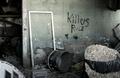
Killer Prideby nephotoComment: *Critique Club*
Wow I do remember seeing this photo during the challenge and wondering if you painted the wall? Also if it was supposed the to be the band or not? I guess if it was the band it would say The Killers. As for the photo itself, this is an excellent first attempt. I would have never guessed this was your first submission. The composition is one of the best things about the image. I love how dark the overall image is. It would be interesting to see in black and white, but I think I personally would have stuck with the color like you did. The lighting that appears on the wall is also very interesting. I like how it is not overwhelming and doesn't give too much light to the image, also that you didn't just spot light the words themselves. The only thing I would change is in the right bottom corner the image looks like it has gone out of focus. The depth of this photo is extremely great. Keep up the good work!! |
| Photographer found comment helpful. |
| 10/25/2005 09:44:57 AM |
Nix-and-Bear.jpgby SinkyComment: Wow this is very well done. Exceelent job, I am sure you will be a strong photograper here. |
| Photographer found comment helpful. |
| 10/24/2005 12:15:45 PM |
|
| Photographer found comment helpful. |
| 10/24/2005 12:12:13 PM |
by arpitaComment: Wow this is an excellent shot, the colors are prefect. |
| Photographer found comment helpful. |
| 10/24/2005 12:11:46 PM |
|
| Photographer found comment helpful. |
| 10/22/2005 08:13:58 PM |
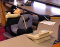
Newest Employeeby LadeeMComment: Oh I love this, I work on the phones a wish we had an employee this good looking. |
| Photographer found comment helpful. |
Home -
Challenges -
Community -
League -
Photos -
Cameras -
Lenses -
Learn -
Help -
Terms of Use -
Privacy -
Top ^
DPChallenge, and website content and design, Copyright © 2001-2025 Challenging Technologies, LLC.
All digital photo copyrights belong to the photographers and may not be used without permission.
Current Server Time: 08/09/2025 03:33:18 AM EDT.