| Image |
Comment |
| 02/19/2006 07:31:50 PM |
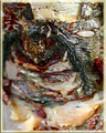
Natural curvesby eliniasComment: *Critique Club*
"Natural curves" is a great example of abstract, taking something ordinary and creating the unusual out of it. 52nd isn't too bad of a placement for your first challenge. The lighting makes this shot amazing, the softness it is able to create. The use of a t-shirt to create the backdrop, is great. I doubt many people could make such a nice shot with such basic elements. Like "beggs" said love the negative space, it really allows the viewer to focus on the subject. The use of black and red allows the image to stay basic and still look intriguing. I also like the softness and overall composition of "Natural curves". This is a very professional looking shot and I could easily see it used in advertisements. I personally can't think of anything I would like to see changed, great work! |
 Photographer found comment helpful. Photographer found comment helpful. |
| 02/19/2006 07:20:55 PM |
Tubesby ColeyComment: *Critique Club*
Well top 100 isn't too bad even though I was sure you would be top 10 or 20. "Tubes" is a prefect addition to the Abstract challenge. I really love how fluid and complete this shot feels.
I would have never guessed during the challenge that this was hair gel, what an excellent use of the resources that you had. I also think the bubble is a great addition to shot like something is moving through these amazingly clear tubes. Also I like the use of red for the background. I wonder if the shot was completely filled with gel and no empty spaces about the background it would have scored higher by others. I do think the include of the reflection towards the bottom was important to leave in. Great work. |
| Photographer found comment helpful. |
| 02/19/2006 07:01:02 PM |
would i?by madison461Comment: *Critique Club*
"Would i?" is an extremely interesting piece in the abstract challenge, I had no idea exactly what it was. After reading your comments I can see the eye and get the title but during the challenge I completely miss it.
This is defiantly an abstract piece. It is almost haunting and enchanting at the same time trying to figure out the image. I am not quit sure what I would recommend because it is so unusual and I am sure you use the blur on purpose to enhance the subject. Maybe crop the image down and make it tighter for the subject to be the complete focus. Good out of the box thinking. |
| Photographer found comment helpful. |
| 02/19/2006 06:39:54 PM |
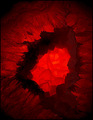
Planetaryby PainielComment: *Critique Club*
"Planetary" is a very attention grabbing piece with its bright red center. This is a nice addition to the Abstract challenge. Looking at this shot, I wasn't quite sure what it was, which makes it fit into the abstract even more for me.
The image itself defiantly could use to be bigger, I sometimes have a hard time with the resizing, but the closest you can get it too be to the 150 the better. I think if you were able to submit a higher quality shot the image itself might have looked clearer and scored higher. After looking at a few of your other shots maybe it is the resolution on the camera. Well regardless of that this shot was a nice and different entry to see. I like the overall placement of the focus and composition. Good work. |
| Photographer found comment helpful. |
| 02/19/2006 06:06:31 PM |
Blown Energyby tonyvComment: *Critique Club*
"Blown Energy" is a nice fit into the abstract challenge, it is a different and unusual piece. After reading your deception I would have never guessed that this is how you create the image (very good thinking).
The image is self is overall pleasing. Nice use of contrasting colors to grab the viewers attention. The flow of the image is nice and pleasing to the eye to go from the left to the right. I also like the grainy appearance of the the light in comparison to the smooth glass in the upper part. I have noticed sometimes people will vote lower because of a grain not realizing it was put there internationally. Good use of a black background instead of trying to put another color into the shot. I think the idea and implementation of Blown Energy was a really good idea, maybe it just not as appealing to voters as some of the other images. |
| Photographer found comment helpful. |
| 02/18/2006 11:33:32 AM |
Faith and hopeby BrinComment: Lovely shot, nice use of shadow to let us focus on the overall feel. |
| Photographer found comment helpful. |
| 02/18/2006 11:19:01 AM |
|
| Photographer found comment helpful. |
| 02/18/2006 11:18:44 AM |
Justiceby michael_pComment: This is excellent piece. I love the strength of this shot. Great use of black and white. |
| Photographer found comment helpful. |
| 02/18/2006 10:43:07 AM |
|
| Photographer found comment helpful. |
| 02/18/2006 10:42:16 AM |
|
| Photographer found comment helpful. |
Home -
Challenges -
Community -
League -
Photos -
Cameras -
Lenses -
Learn -
Help -
Terms of Use -
Privacy -
Top ^
DPChallenge, and website content and design, Copyright © 2001-2025 Challenging Technologies, LLC.
All digital photo copyrights belong to the photographers and may not be used without permission.
Current Server Time: 08/17/2025 08:53:33 AM EDT.