| Image |
Comment |
| 03/05/2006 05:43:47 PM |
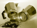
Bitter Coffee Makerby Asainz320Comment: *Critique Club*
"Bitter Coffee Maker" does meet the Duotones requirement of the challenge. I think was an extremely hard challenge based on the challenge itself and so many entries, but everyone has to start in one challenge or another. At least know you have gotten past that first entry and can go on from there.
The image itself is an interesting idea. I like the concept of the spilled coffee. Also I think the lighting you use is prefect for the shot, not too much shine but enough glow. Good positioning of your pieces to provide a nice balance. I think it might be interesting to try a few different perspectives with this shot, possible a lower angle and lowing the grounds to be the foreground. The overall composition is good and doesn't leave empty spots.
I think because there were 610 entries the subject really has to be spectacular and stand out for voter. I think you had a great idea and good first challenge. Also after peaking at your post about the Painting With Light score, I am sure you will be on your way up. Best of luck. |
 Photographer found comment helpful. Photographer found comment helpful. |
| 03/04/2006 10:55:58 PM |
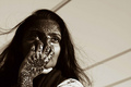
Designer Thoughtsby honikumComment: *Critique Club*
"Designer Thoughts" is a very nice entry into the Duotones challenge. I think the two tones you selected was very appropriate for the image, I think black and white would not have done this justice. I really like the warm feel from this color.
The image is very striking. The patterns in this piece are the first things that grab my attention as a viewer. The deep henna is a wonderful contrast between the beautiful girl and background lines. The lighting is also very prefect, I love how it captures her eyes. Even with the henna the focus for me is her engaging eyes. I also like that her hair is free and flowing giving a nice soft movement, transisitoning us to the background. The score you received seems pretty decent, I am sure it would have scored better with a bigger image. Overall this is a great piece and the textures are just amazing. |
| Photographer found comment helpful. |
| 03/03/2006 11:55:00 PM |
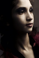
Ne me touchez pasby EnnilComment: *Critique Club*
"Ne me touchez pas" is a very striking piece, much like the title says I see a very hands off look. The one thing that I think probably hurt this the most is that it really does hit a voter as more of a portrait more then a fashion. After looking at some of the highest rated images from the challenge, I am seeing a pattern of common images you would see in a magazine. Possible most voters where looking for that very commercial looking image.
I personally would have to say this is an amazing portrait and beautiful model. Technically it is one of the best I have seen. I learned awhile ago how important lighting the short side is to enhance the face and you had defiantly nailed it. The lighting is absolutely beautiful. The photo does seems so prefect, like something you would see in a museum. I think in a free study challenge it would have placed much higher. Keep up the excellent work. |
| Photographer found comment helpful. |
| 03/03/2006 11:05:16 PM |
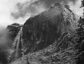
Moody Mountainby BaldurTComment: *Critique Club*
Ok, I just opened up a brand new photo to critique and I received this amazing image. My first impression is defiantly wow. "Moody Mountain" is great title for Dutone entry, which meets the challenge.
This is a very dramatic piece. I really like the use of layers to show the depth of the the landscape. What great timing to have to clouds or fog roll by to give more layers to the piece. The include of the foreground with the tree was something that allowed me to vote this image higher. I personally think the composition of the shot is excellent, I am very fond of a nice full frame. I see some of the comments referring to the image being to dark but I think if you went lighter the image would not be as expressive as it is.
At little bit of the subject but I just recent read an article about a training class in either Yellowstone or Yosemite that said on of the most important things was to use layers, lay out the foreground, middle ground and background and make sure you are able to tell the difference between where they fall. The teacher was using this method to capture different aspects and I think he would have really liked yours. Good work! |
| Photographer found comment helpful. |
| 03/02/2006 01:22:01 AM |
|
| Photographer found comment helpful. |
| 03/02/2006 01:14:49 AM |
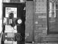
Payphone in Newark, NJby xoxotemberComment: *Critique Club*
"Payphone in Newark, NJ" does defiantly fall within the Duotones challenge. One thing that is great is I do believe this was the only phone as opposed to when you see the same shot over and over.
The image itself is interesting and look like something on a book cover or the news. I really like that our focus in on the phone and how soft this makes the background look. I don't mind that it look like horizontally the box is leaning but I think it may have scored a little higher with the vertical being straightened, but maybe that is what you were trying to achieve. This challenge was so huge I think it is really hard for voters to go through and give the time they would want to, to each piece. Also even though we were looking a Duotones I think people were also looking for something is very striking and possibly more contrast. This is really a great first challenge entry and I am sure we will see many things to come from you. Keep up the good work. |
| Photographer found comment helpful. |
| 03/02/2006 12:53:43 AM |
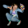
Rock On!by angela_packardComment: *Critique Club*
"Rock On!" looks like it does really fit into the 80's challenge. Nothing says the eighties like jean jackets and crazy rolled up pants. I had almost forgotten about rolling up my pants until I saw this shot.
The image itself is very different, I think that the burning of the background altered the image a bit. I would be curious to see a before and after picture, just to see how the lighting hit the backdrop originally. The lighting is very interesting, it feels like a funny glow. The glow is on of my favorite parts of this work. Its like the image has a vibe of its own. I have no idea what tape case she is holding but it didn't effect my vote, because it look liked the right era to me. Good placement of the subject and use of a different pose to grab attention. Keep up the good work, I look forward to your entries. |
| Photographer found comment helpful. |
| 03/01/2006 11:21:51 PM |
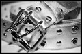
The beltby marvinComment: *Critique Club*
"The belt" is fit into the 80's challenge in my opinion, I am wondering if many voters were not hip in the 80's and don't remeber the belts, or possibly not old enough to remember.
This photograph is a very interesting piece. I really like that you did choose black and white, it really give the viewer that metallic feel. Great use of lighting to enhance the belts features. Also a very interesting use of focus, I think a lot of people would have just have used the buckle as the focus not behind it. The composition of "The belt" just prefect for me, the image is just tight enough. I think the border was nice on this piece to enhance the metal as well and bring the image in even more. There are a few minor spot that are showing up in the image, but nothing distracting enough to take away from the subject. Good work! |
| Photographer found comment helpful. |
| 03/01/2006 10:57:40 PM |
80's chicby KitaComment: *Critique Club*
"80's chic" is a great fit for the 80's challenge. Ok I always look at the profile and boy did you shock me, 8 years old, that is so cool! You defiantly have got some talent in your hands!
The image itself is extremely clean. The white background is extremely crisp and enhances the skates, which really showing a main piece of our focus. Excellent choice of clothing colors and hair do. I love the long flow of hair to the side, great idea. Also good use of the 3/4 head shot, I really think the helps with portraits. I think you received a fairly decent score for such a clean image. The placement of the subject is also pleasing, she is not too centered. The photograph is basically cropped perfectly in my opinion. I also like how soft her face feels, nothing in the photo seems harsh. Keep up the wonderful work! |
| Photographer found comment helpful. |
| 03/01/2006 10:26:09 PM |
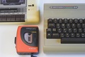
Sony Walkman and Commodore 64by visaksenComment: *Critique Club*
"Sony Walkman and Commodore 64" is a nice fit the 80's challenge. Great use of some "antique" items to truly capture the era.
The image itself is very direct and to the point. I really don't think any voter would have confusion or question what you were taking an shot of. I do really like the placement of the subject, excellent use of the odd numbers. One thing I have noticed is a lot of the higher scoring images really use vibrant colors or images that tend to capture your eye. Your shot seems a little dull, with the coloring; maybe try to increase the contrast to see if it makes any of the object pop for the voter. I might even try to avoid the shadows since it feels like you were going for a very clean shot. Nice capture of the arena. Hopefully after the challenge you were able to pack these back up. Good work, can't wait to see what the future holds for your work. |
| Photographer found comment helpful. |
Home -
Challenges -
Community -
League -
Photos -
Cameras -
Lenses -
Learn -
Help -
Terms of Use -
Privacy -
Top ^
DPChallenge, and website content and design, Copyright © 2001-2025 Challenging Technologies, LLC.
All digital photo copyrights belong to the photographers and may not be used without permission.
Current Server Time: 08/18/2025 11:42:35 AM EDT.