| Image |
Comment |
| 03/06/2006 11:52:01 PM |
|
 Photographer found comment helpful. Photographer found comment helpful. |
| 03/06/2006 11:51:03 PM |
|
| Photographer found comment helpful. |
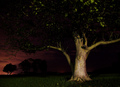
| 03/06/2006 11:50:16 PM |
In the Parkby owenComment: Wow I really love this shot. The lighting is prefect and the tree is amazing. |
| Photographer found comment helpful. |
| 03/06/2006 11:50:01 PM |
|
| Photographer found comment helpful. |
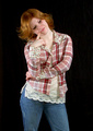
| 03/06/2006 11:13:01 PM |
Teen casualsby DirtypainterComment: *Critique Club*
"Teen casuals" is nice addition into the Fashion challenge. Right of the bat I liked this shot. You could see this in a very natural magazine or even something like an Eddie Bauer catalog.
The shot itself is very nice and clean, which a key for a challenge like this one. I think the black was great choice for the subject. The lighting is very nice gives highlights the enhances the hair. I personally being a red-head with this complexion can understand how hard to shot in the studio as opposed to the outdoors with all the natural colors. I like the overall composition of the shot, it feels very complete. I like the fun and youthful expression of the shot, instead of trying to be all serious. I really don't see anything I would change. I would be curious to see a face shot, but it probably would have taken away for the goal of a fashion entry.
I will be very interested to see your future shots, keep up the good work. |
| Photographer found comment helpful. |
| 03/06/2006 10:59:57 PM |
Back in the dayby moniepennyComment: *Critique Club*
"Back in the day" is a vintage look in the Fashion challenge. I think voters were looking for a very commercial looking image, like something you would see in Cosmo or see on an MTV commercial. But it was refreshing to see your entry.
The image itself is very different from the rest. Very interesting idea to go back into the day to take a fashion shot. I was reading your comments and that is always interesting. It sounds like you had put a lot of work into getting a shot for this challenge, which always makes the results more rewarding.
Technically the ligating is nice and even, no major shadows that are distracting. I personally would have liked to have to top of her head included in the shot, it just feels like it was cut off. I can tell you wanted to leave the gloves inside the shot but it would have been awesome if you could have included both the gloves and the top of her head. I like the focus on her face, I wish the gloves were still in focus. The feather does draws attention to the gloves and unfortunately the blur. Her expression is very interesting and does grab attention.
It is always a good sign when your first challenge allows you to be in the upper half of the competition. I think you have great ideas and will be on your way. Keep up the good work. |
| Photographer found comment helpful. |
| 03/06/2006 06:36:35 PM |
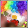
Profileby naomikComment: Great shot, I love the vibrant colors. Good use of the square. |
| Photographer found comment helpful. |
| 03/06/2006 06:32:45 PM |
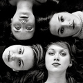
donna quadroby kiwinessComment: Awesome shot, I love all the hair. Excellent use of black and white. |
| Photographer found comment helpful. |
| 03/05/2006 06:28:30 PM |
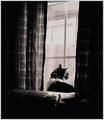
Break Freeby gurlwithapenComment: *Critique Club*
"Break Free" is a nice entry into the Duotones challenge, good use of the two tones.
I was reading your comments about how you felt the image didn't do the reality justice. I really think this is one of the hardest things to learn (and trust me I am far from mastering it), being able to capture what you see through the eye of the camera.
The image itself is interesting. I think you had an excellent idea of trying to capture the light between the windows and allowing the focus to remain on the kitty. I like the patterns of the curtains and how you can see some light coming though them not just the window. I personally like the composition, I am sure there are people who would like a tighter crop but I think that would take away from the idea of being trapped and wanting to break free. I would also be curious to see the image in a warmer set of colors like a warm sepia.
I know it couldn't have been easy jumping into a challenge with over 600 images. I think voters really do get burned out after so many images. But we can only learn if we enter right?
Good work and best of luck in the future. |
| Photographer found comment helpful. |
| 03/05/2006 06:14:58 PM |
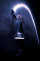
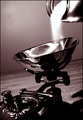
Primitive Light Meteringby tryggunnzComment: *Critique Club*
"Primitive Light Metering" is a nice addition to the Duotones challenge. Not a bad first challenge at all. It is really hard in the challenge that have over 500 entries like this one. There are so many images to vote through I think an image just has to ump out to the voter after the swift through the first few hundred shots.
The image itself, is interesting and works for me. I really like the idea and the way you were able to implement a few different things. Primitive Light Metering Like the reflection on the bowl and the movement of the sugar being poured. I really like the placement of the subject and overall composition of the shot. The only thing I am really seeing in the shot is the sensor dust and it even looks like maybe you tried to adjust it or something to create the additional smudges in that area. Probably without those spots your entry would have a bit higher.
I personally would be very proud, this is a great first entry. I am looking forward to seeing what you create for us in the future. Good work and good luck.
|
| Photographer found comment helpful. |
Home -
Challenges -
Community -
League -
Photos -
Cameras -
Lenses -
Learn -
Help -
Terms of Use -
Privacy -
Top ^
DPChallenge, and website content and design, Copyright © 2001-2025 Challenging Technologies, LLC.
All digital photo copyrights belong to the photographers and may not be used without permission.
Current Server Time: 08/18/2025 03:39:09 PM EDT.