| Image |
Comment |
| 05/07/2006 01:13:23 AM |
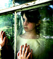
daydream by CalliopeKelComment: *Critique Club*
"Daydream" is obviously an amazing shot. You have clearly meet the challenge requirements. Congratulations on your ribbon!!!! That must be so exciting!
The image itself is clearly a great interpretation of window framing. I think what really strikes me as a voter is the connection you made between the two on both sides of the mirror, I really don't think we saw too many of these during the challenge. Being able to connect to people through the pane of glass gives this shot more emotion then the basic lake out the window. The green tint really gives an increased grunge feeling, almost like an unreal place (very ghostly). This is a very nice and artist shot. It looks like you have put a lot of effort into the shot, which is defiantly worth the time.
Overall you did an amazing job, just look at those stats.... 35 favorites, wow! Keep up the outstanding work.
|
 Photographer found comment helpful. Photographer found comment helpful. |
| 05/07/2006 12:50:58 AM |
Admiring...by harmsusmcComment: *Critique Club*
"Admiring..." is an interesting twist on to the Window Framed challenge.
One of the hardest things I have learned is that even if you have a good shot if voters do not feel the shot fit the category your score will tank. I really think that is was has happened here.
As for the photo itself.... I really like the idea and implementation. The composition is prefect. I love the reflection and it looks crystal clear (in the reflection specifically) from where I am sitting. I would be curious to see the castle itself, it looks amazing. The dof looks just right for a nice tight shot like this. I do like the border that you included, it tends to balance out the closeness. Overall this is a very nice shot, I think it may have done better in a different category.
Keep up the good work! |
| Photographer found comment helpful. |
| 05/07/2006 12:43:32 AM |
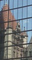
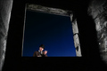
Trinity Reflectedby DigiClikMAComment: *Critique Club*
"Trinity Reflected" is a very interesting addition in the Window Framed challenge. I really do like the shot, and I guess you had a different interpretation of the challenge which is always good in my opinion.
The overall image is a great idea and I really like the frame being as full as you could fill it with the building. I think you might have placed higher if you increased the colors either by the levels of the contrast. This was a very natural looking shot, I read your comments and for not really meaning to take the shot it looks pretty good. Also I understand that you were able to make it bigger because of that, but because you are pretty close I don't think it hurt your score as much as it could of if the image were much smaller.
I am very glad you took the time to enter this challenge and I look forward to your future challenges. |
| Photographer found comment helpful. |
| 05/06/2006 11:59:05 PM |
Window on Dreams gone Byby yetiComment: *Critique Club*
"Window on Dreams gone By" is nice addition into the Window Framed challenge. It was really nice because this was something different from what the majority of challengers entered.
I really like the different perspective from the car to capture a window. I really like the different perspectives from the mirror and the actual background. The contrast between the greens right in between the two red barns is prefect. The include of the horse is nice to show the area. I would prefer to be able to see the whole horse, but I could image how hard it would be to get everything included in the shot. I really do like the overall feel of the shot, all the lines really do create a nice definition. I would agree with comments left by Spurs about the fringing. That would have probably increased your score.
Overall I think you have an excellent eye and I really do look forward to your future entries. Also I wanted to say congradulations on your new highest rated photo. |
| Photographer found comment helpful. |
| 05/06/2006 11:39:12 PM |
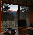
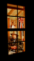
Morning Coffee with Viewby hahn23Comment: *Critique Club*
"Morning Coffee with View" is a very nice addition into the Window Framed challenge. You have defiantly meet the challenge requirements.
The image is very pleasing to look at. What an amazing view, it does look like possibly the sun was getting ready to go down. The sunset is making the shot look a little dark to me and doesn't bring out the richness of the wood as much as it could. The other thing I am seeing is that the shot does look a little cluttered, it would probably be ok with either the stuff on the desk of the patio furniture. Overall the shot does have a nice natural feel to it.
Keep up the good work! Message edited by author 2006-05-06 23:39:59. |
| Photographer found comment helpful. |
| 05/06/2006 11:02:53 PM |
|
| Photographer found comment helpful. |
| 05/05/2006 11:45:42 PM |
|
| Photographer found comment helpful. |
| 05/04/2006 01:50:24 AM |
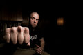
The Man In The Windowby TUBORGComment: *Critique Club*
"The Man In The Window" was a prefect addition into the Window Framed challenge. The strong colors just grab my attention right of the bat.
The image is something you can easily become engrossed in. The window frame itself is pretty interesting, especially with the deep blue sky. But the include of your friend, Wow, great thinking! I love the outfit. The depth of the shot is really great, it doesn't feel flat. The layers between the frame, its edges, the blue sky and your friend really enhance the work. Your composition and lighting are excellent. You have taken a great completely shot, nothing is missing. I wish I had more to say but this is just an excellent photo and I have to say congratulations. |
| Photographer found comment helpful. |
| 05/04/2006 01:43:46 AM |
In from the rain.by mysticredComment: *Critique Club*
"In from the rain." is a nice addition into the Window Framed challenge. I personally really liked the perspective of this shot.
Overall this is a striking image because of the warm colors you choose. I think the warmth comes from the coloring of the wood. The gentleman's expression is very interesting. I also thought like some voters that you were going for more of a historical piece probably from the red, white and blue in contrast to his outfit. I think the focus could have been a touch sharper , especially on his face. But working through a pane of glass (I assume) could make the focus really challenging. Overall this is a nice shot. Personally I thought it would place higher, but I am a huge fan of warm, rich images.
Good work and I am glad to see a new personal best for you! Keep up the good work. |
| Photographer found comment helpful. |
| 05/04/2006 12:44:41 AM |
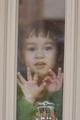
Who came home to see me?by meyersComment: "Who came home to see me?" is a cute addition into the Window Framed challenge.
The image itself grabs attention because it is such a cute little boy looking at us (the voters). You have meet the challenge by framing our subject. I personally had a hard time with the challenge because none of my windows came out as clear as I wanted, so I choose not to enter. I had a hard time voting on shot like yours because I know how hard it was to try and get the shot, but the glare/haze takes away from the shot. I think the shot would have scored higher if the glass had been clear to the viewers. I am not sure how much straightening the frame would help out the score. I think I probably would have voted the same either way.
Keep up the good ideas! |
| Photographer found comment helpful. |
Home -
Challenges -
Community -
League -
Photos -
Cameras -
Lenses -
Learn -
Help -
Terms of Use -
Privacy -
Top ^
DPChallenge, and website content and design, Copyright © 2001-2025 Challenging Technologies, LLC.
All digital photo copyrights belong to the photographers and may not be used without permission.
Current Server Time: 08/21/2025 02:18:49 AM EDT.