| Image |
Comment |
| 08/03/2005 03:21:37 AM |
Wretched Excessby RKTComment: i love this picture. i like the contrast of the dark hair/nail polish and the bling of the diamonds. great lighting and detail! |
 Photographer found comment helpful. Photographer found comment helpful. |
| 08/03/2005 03:19:54 AM |
|
| Photographer found comment helpful. |
| 08/03/2005 03:19:28 AM |
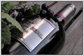
The Real Affluence by greslizzzComment: awesome picture! i love the purple/plum hues and the angle works great! nice lighting too. i like wine... |
| Photographer found comment helpful. |
| 08/03/2005 02:18:28 AM |
|
| Photographer found comment helpful. |
| 08/03/2005 01:23:43 AM |
360 Modena Spiderby wmprkgComment: very interesting!-i like the approach of adding in the stallion on the wall. i like the reflection and the overall hue of your photo. |
| Photographer found comment helpful. |
| 08/03/2005 01:21:35 AM |
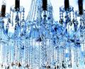
Crystal Clear!by dockieComment: very cool picture! i like the bluish hue and the vertical angle of the crystals. maybe cropping off the black candlelights would give it an even more interesting approach. |
| Photographer found comment helpful. |
| 08/03/2005 01:18:20 AM |
Aspirationsby OdysseyF22Comment: nice sky. the upper left is a bit distracting-cropping it would have been beneficial. also whatever is on the left side (sign, wall?) should have been cropped too. |
| Photographer found comment helpful. |
| 08/03/2005 12:59:16 AM |
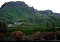
Weekend cottage.by tasha4pawsComment: nice picture. maybe you could have cropped the bottom a bit though-it's a little distracting. |
| Photographer found comment helpful. |
| 08/03/2005 12:49:08 AM |
Glitterby janskuComment: i think the coins should be more in focus-especially the front ones. |
| Photographer found comment helpful. |
| 08/03/2005 12:23:34 AM |
Platinum by sibelingComment: i like the curve of the building and the rich silver color. i do think the bottom right causes static in the composition. maybe a different angle? |
| Photographer found comment helpful. |
Home -
Challenges -
Community -
League -
Photos -
Cameras -
Lenses -
Learn -
Help -
Terms of Use -
Privacy -
Top ^
DPChallenge, and website content and design, Copyright © 2001-2025 Challenging Technologies, LLC.
All digital photo copyrights belong to the photographers and may not be used without permission.
Current Server Time: 08/01/2025 06:59:08 PM EDT.