| Image |
Comment |
| 01/18/2006 02:13:09 AM |
She loves you...by ergoComment: I've seen another of these "love" ones, but your shot is better (much better). Great work (it looks as though it should be in a "New York Life" commercial [which it not a bad thing])! |
 Photographer found comment helpful. Photographer found comment helpful. |
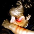
| 01/18/2006 02:11:08 AM |
A Sign of Love?by willagherComment: Great picture; it really works within the challenge. Also, good make-up work. Of course, the red is not very "natural," but then I'm sure it's not supposed to "look real," but just emphasize the situation (which it succeeds in doing). Technically, the lighting, composition, etc., are all great. You know what would be teriffic: using selective color. Make it a black-and-white picture, with just the bruises left red. (I understand that you might have been unable to do that for this challenge.) The title, too, works quite well. Great work. |
| Photographer found comment helpful. |
| 01/18/2006 02:05:19 AM |
The First "SIGN" of Freedomby bmoraComment: Very clever picture. Technically, it's perfect: great focus and sharpness, warm colors, perfect compostion. Not a thing wrong with this one: excellent job. |
| Photographer found comment helpful. |
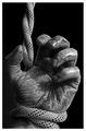
| 01/18/2006 02:02:27 AM |
Signs of a Struggleby front_elementComment: Oh, man, truly great, Such detail (I take it you had a pretty small aperture [I could be wrong]), yet such a sharp, focused image. I love the strong contrasts, as well. Teriffic work. |
| Photographer found comment helpful. |
| 01/18/2006 02:01:10 AM |
Peaceby Shan2112Comment: I like it. Unfortunately, the contrast between the room and the outdoors is just too great for your camera to handle. I honestly can't say that you should have "sacrificed on the side of..." as the dark is too dark, and the bright is too bright. Maybe a little additional lighting in the room could have helped even things out (though, then, white balance might have presented a problem). As it stands, it's a good idea, and a good photograph, but not much more. |
| Photographer found comment helpful. |
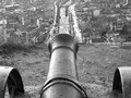
| 01/18/2006 01:59:22 AM |
Sign of warby jeeptuningComment: Your focus seems a bit off: neither the canon nor the landscape is perfectly clear. I love the compostion, but a tighter aperture might have made this picture truly great. |
| Photographer found comment helpful. |
| 01/18/2006 01:58:32 AM |
|
| Photographer found comment helpful. |
| 01/18/2006 01:57:21 AM |
Her Signby radioninComment: Nice shot. Great clarity, cool subject, appealing composition, and strong colors. I like it. |
| Photographer found comment helpful. |
| 01/18/2006 01:55:55 AM |
|
| Photographer found comment helpful. |
| 01/18/2006 01:54:50 AM |
Sign Eating Treeby umbrisComment: Great shot. I think there's just a little too much empty space at the top, but it's better that you left a bit too much than cropped off some. |
| Photographer found comment helpful. |
Home -
Challenges -
Community -
League -
Photos -
Cameras -
Lenses -
Learn -
Help -
Terms of Use -
Privacy -
Top ^
DPChallenge, and website content and design, Copyright © 2001-2025 Challenging Technologies, LLC.
All digital photo copyrights belong to the photographers and may not be used without permission.
Current Server Time: 08/06/2025 03:38:59 AM EDT.