| Image |
Comment |
| 10/12/2005 04:38:31 PM |
lonelyby DetrelasComment: Not really sure what I'm seeing here. The contents of the frame are really dark and I feel that is a problem. Also, the dead flowers are taking all my attention and I don't feel that it is good for something that is not in focus to take up most of my attention. JMO. |
 Photographer found comment helpful. Photographer found comment helpful. |
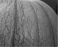
| 10/12/2005 04:32:58 PM |
Veins of timeby KivetComment: I see what you're trying to do here. Technically, I feel that this photo could be improved. The lighting and contrast, to me, seem week. Overall, the image appears flat to me and I find that my eye is wandering around the image looking for a strong central subect. JMO. |
| Photographer found comment helpful. |
| 10/12/2005 10:48:48 AM |
|
| Photographer found comment helpful. |
| 10/12/2005 10:43:56 AM |
Protector of Allby buddybuddy1226Comment: The quality of this photo doesn't quite look right. The child's face looks to me to be over-exposed and the entire image appears to have quite a bit of noise. |
| Photographer found comment helpful. |
| 10/12/2005 10:35:50 AM |
Human Like Qualities!by usiaComment: The focus could be stronger IMO. Perhaps the lighting was working against you as most of the photo is in shade. |
| Photographer found comment helpful. |
| 10/12/2005 12:22:03 AM |
Band of Seagullsby NeethComment: Sorry, I have to say that I'm not a big fan of this pic. I feel that the lighting is very strong, with a fairly bright area along the top of the image that is distracting for me. The gull along the left edge that has been cut off by the crop is also a distraction and leads the eye out of the photo, IMO. My personal preference would have been to have had a littl more DOF. I searched for quite some time to find the focused gulls. JMO. |
| Photographer found comment helpful. |
| 10/10/2005 09:41:38 PM |
Plains Sightby tuffyComment: WooHoo ... top 10 finish!!!! Way to go Tina!! I love this shot. It's very nice!!! Congrats on the fine showing!!! Keep up the good work. |
| Photographer found comment helpful. |
| 10/05/2005 09:36:16 AM |
Skyward Mapleby MarkComment: Mark, I think you have a good start for this challenge. It would have also fit in the recent perspective challenge. A couple of things to try that may make the photo a little more dynamic:
- The main trunk branches out right in the centre of the photo. While the branches do help to take the eye out from the centre point, an off-centred orientation of the point might make a more pleasing composition. Maybe even combine that with a portrait layout instead of a landscape layout and see what you get.
- Try different lighting. For example, try early morning or near sunset for a warmer feeling photo. The other bonus to that might be a nicer contrasting colour for the sky. The lightin the way it is gives a bit of a washed out sky instead of an eye popping background.
As for the score, don't worry about the score. Ranking high is a great thing, but not the only thing. There are many factors to the score, including peoples perception of how a photo meets the challenge, photo quality and voter mood. Keep clickin'. |
| Photographer found comment helpful. |
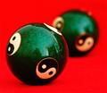
| 10/05/2005 12:54:51 AM |
Yin Yangby maryannComment: Nice strong colours and I like the creative use of DOF. |
| Photographer found comment helpful. |
| 10/05/2005 12:53:30 AM |
Orange on Blueby persimonComment: I was thinking of doing this same thing ... in the same colours, but I got too lazy to figure out how to fold the bird. So, I really like the idea and the colours. I think I would have done the lighting a little different to reduce the shadow a bit. Nice composition. |
| Photographer found comment helpful. |
Home -
Challenges -
Community -
League -
Photos -
Cameras -
Lenses -
Learn -
Help -
Terms of Use -
Privacy -
Top ^
DPChallenge, and website content and design, Copyright © 2001-2025 Challenging Technologies, LLC.
All digital photo copyrights belong to the photographers and may not be used without permission.
Current Server Time: 08/23/2025 11:31:12 PM EDT.